Atibra
Atibra: in four months, VRental got a name, an identity, a full brand rollout and a booth at Paving Expo to present itself as a heavy-asset manager.
Framework
Atibra
Your success is our asset.
Industry
Construction & Engineering · Heavy equipment rental and pre-owned sales
What we did
Immersion and market research
Naming
Support on positioning, created by handz
Change narrative
Visual identity, sub-brands and brand manual
Logo animation and launch film
Brand kit: apparel, PPE, merchandise, stationery and presentations
Machine wraps
Interior and facility design for the Recife pilot site
Social, email and digital switchover
Booth, LED screen and quiz at Paving Expo 2026
Ongoing media, CRM and content
Research
Before changing the name, we measured where VRental stood.
VRental rents and sells heavy machinery for infrastructure, sanitation, agribusiness and mining projects, and is based in Indaiatuba, São Paulo. When the project began in May 2026, the company already ran long-term contracts and maintained every unit it owned. The name, however, described only the transaction: V + Rental.
Research compared VRental with 14 rental companies in the sector through four lenses: positioning, commercial, voice and visual. It showed a market where players looked alike, most of them selling fleet and price, with VRental in the middle of the pack.
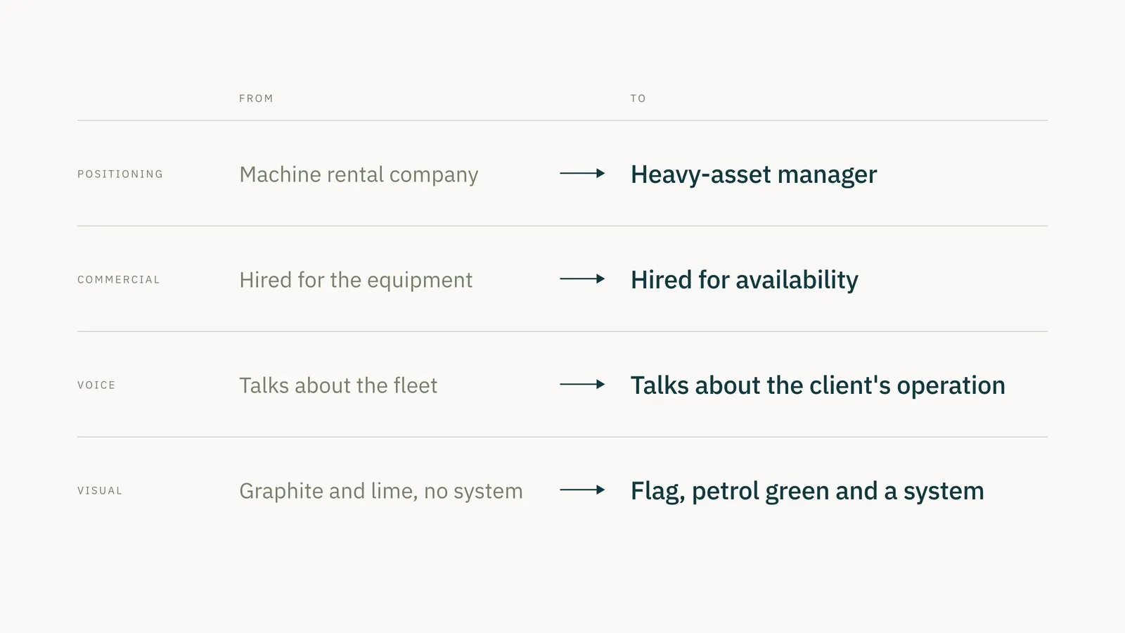
These findings fed the positioning that handz, the agency running Atibra’s marketing, built for the new brand with support from Headcore. Atibra positions itself as an asset manager, is hired for machine availability, talks about the client’s operation and gets an identity the sector did not have.
The yellow-equipment market study showed the sector coming out of the 2025 downturn and contractors switching from buying to renting to protect cash. The audience split in two. For rental, infrastructure, sanitation, agribusiness and mining companies with complex operations and long contracts. For pre-owned, buyers looking for used machines with documented origin and warranty.
Naming
A name for what the company manages.
Naming ran from May 28 to July 16. Before any creative work, the canvas set out what the name had to solve: move the company off the traditional rental shelf, mark its professionalization, cover both rental and pre-owned sales, and hold up under national expansion. It also listed the trademark classes to protect in Brazil, with class 37 (rental and maintenance of construction machinery) first.
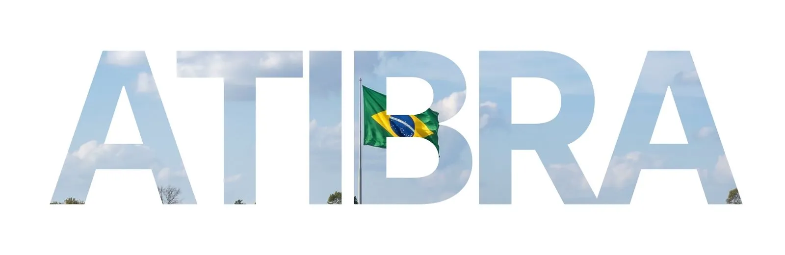
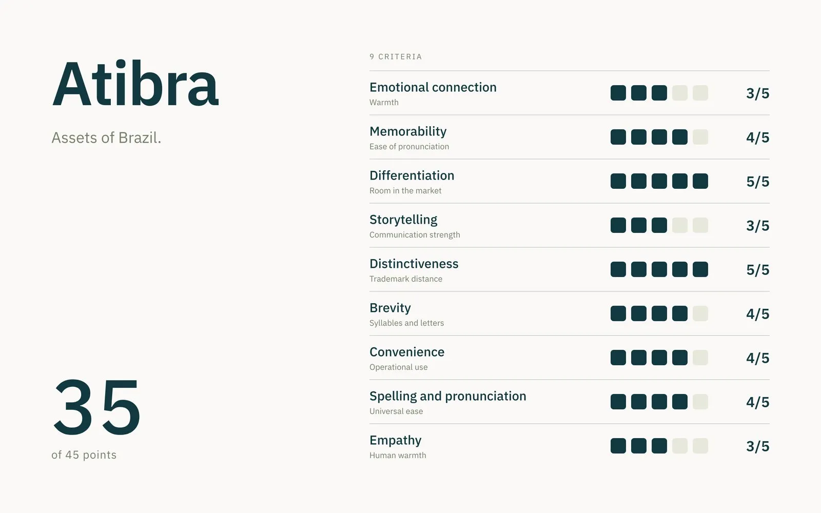
Atibra combines ativos (assets) and Brasil in a proprietary construction, under the concept asset management for smart operations. A-TI-BRA has three short beats, stressed on the first syllable with a strong finish on the last, and sounds like someone who arrives to solve things. In the final evaluation it scored 35 of 45 points across nine criteria, with top marks in differentiation and distinctiveness.
Positioning and narrative
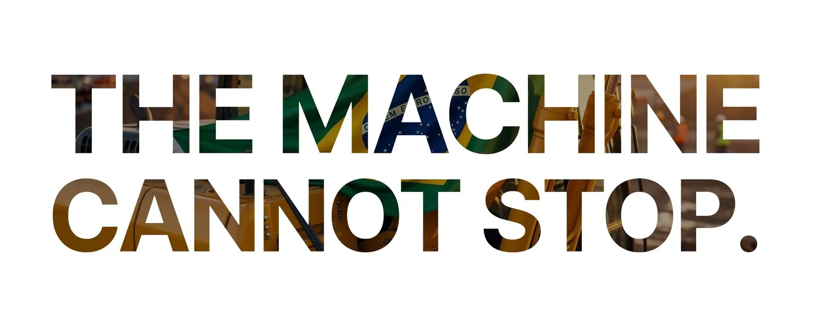
The machine cannot stop.
The positioning was shaped by handz, with Headcore alongside. The line that opens this act was something the leadership said long before the project; it only needed a place of honor. And it makes sense: anyone renting an excavator for a sanitation project counts on it until the last day of the contract, because one idle machine holds up the whole front. That is why Atibra comes to market as a heavy-asset manager, with preventive maintenance, every machine’s record at hand and people by your side during operation.
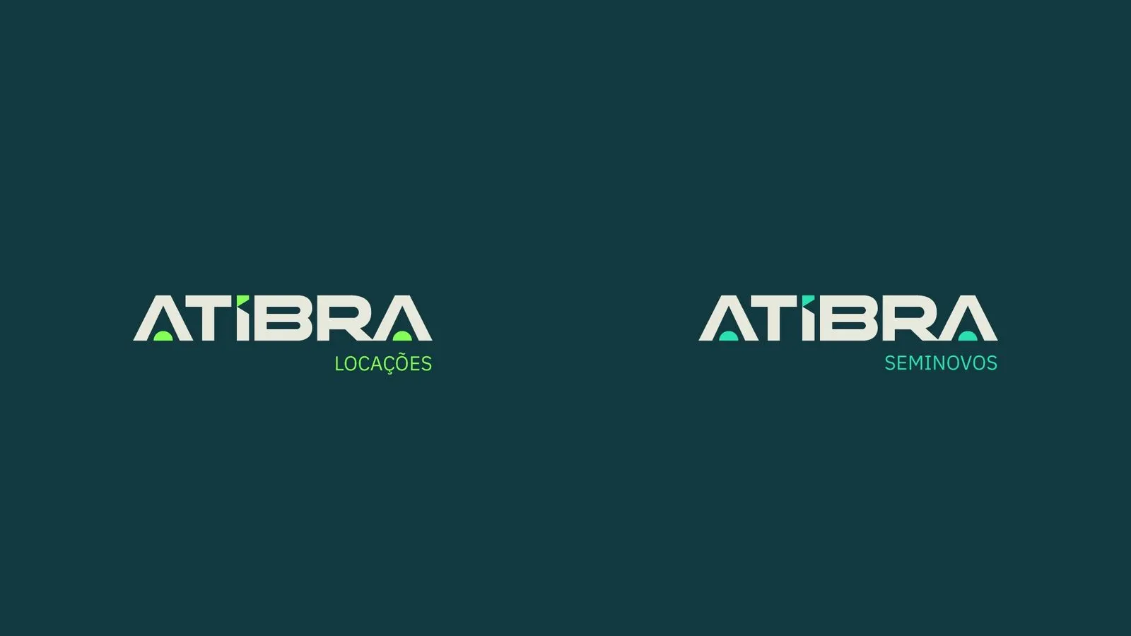
Both business units sit under one brand, named for what they do. Atibra Locações handles equipment in operation. Atibra Seminovos sells machines with documented origin and history. Life-cycle management of the asset connects the two.
Visual identity
The Brazilian flag, reduced to shape.
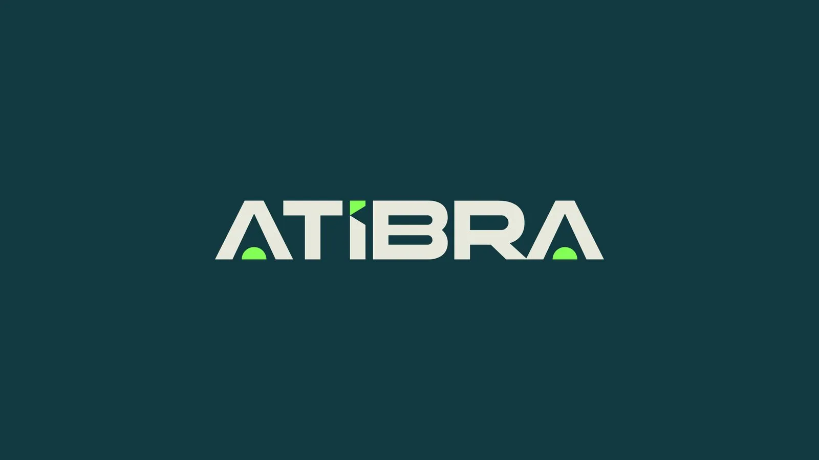
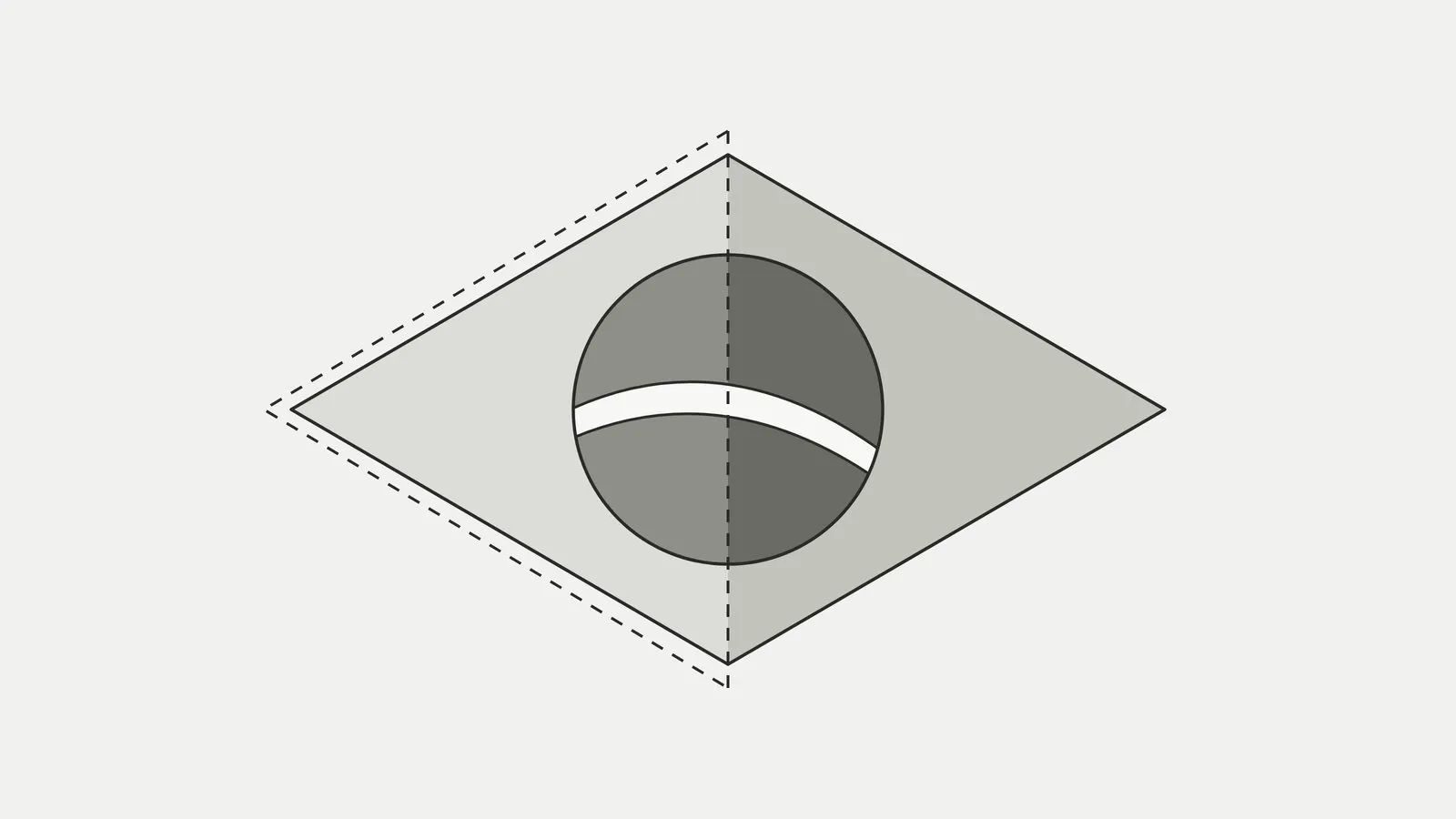
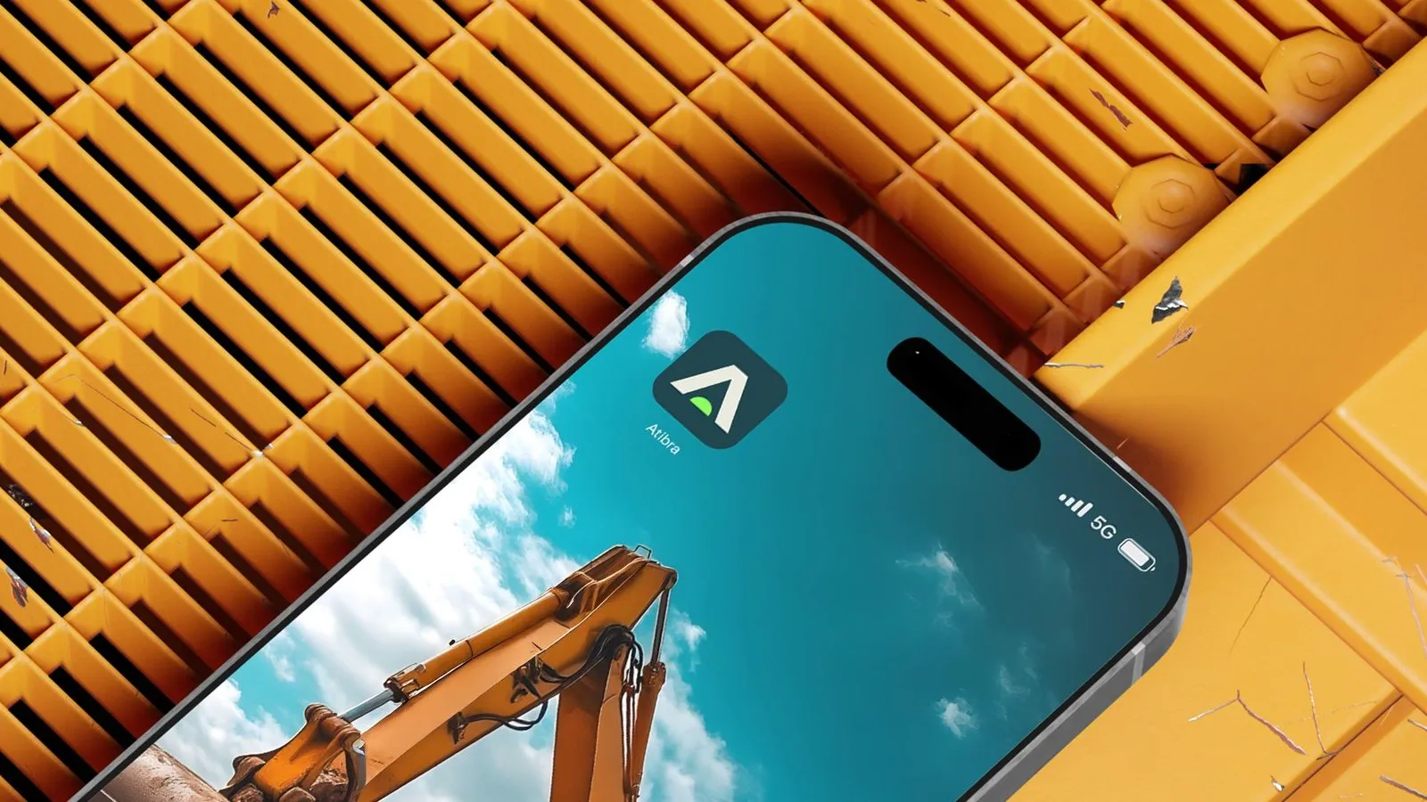
The visual system starts from the Brazilian flag, redrawn as flat shapes with no literal green and yellow. The diamond sits inside the A’s of the wordmark, and digital-green semicircles mark the dot of the Í and the feet of the A’s. There are only two logo versions: light with the green accent, for dark backgrounds, and single-color petrol green, for light backgrounds. For avatars and icons, the short version keeps only the A and the semicircle.
Concrete, geometry and Brazil.
Atibra’s geometry speaks to a tradition Brazil knows well: brutalism. From the 1950s on, architects such as Vilanova Artigas, Lina Bo Bardi and Paulo Mendes da Rocha embraced exposed concrete and visible structure, solving form together with engineering. MASP, opened in 1968, rests the museum on four pillars and leaves a 74-meter free span over Avenida Paulista.
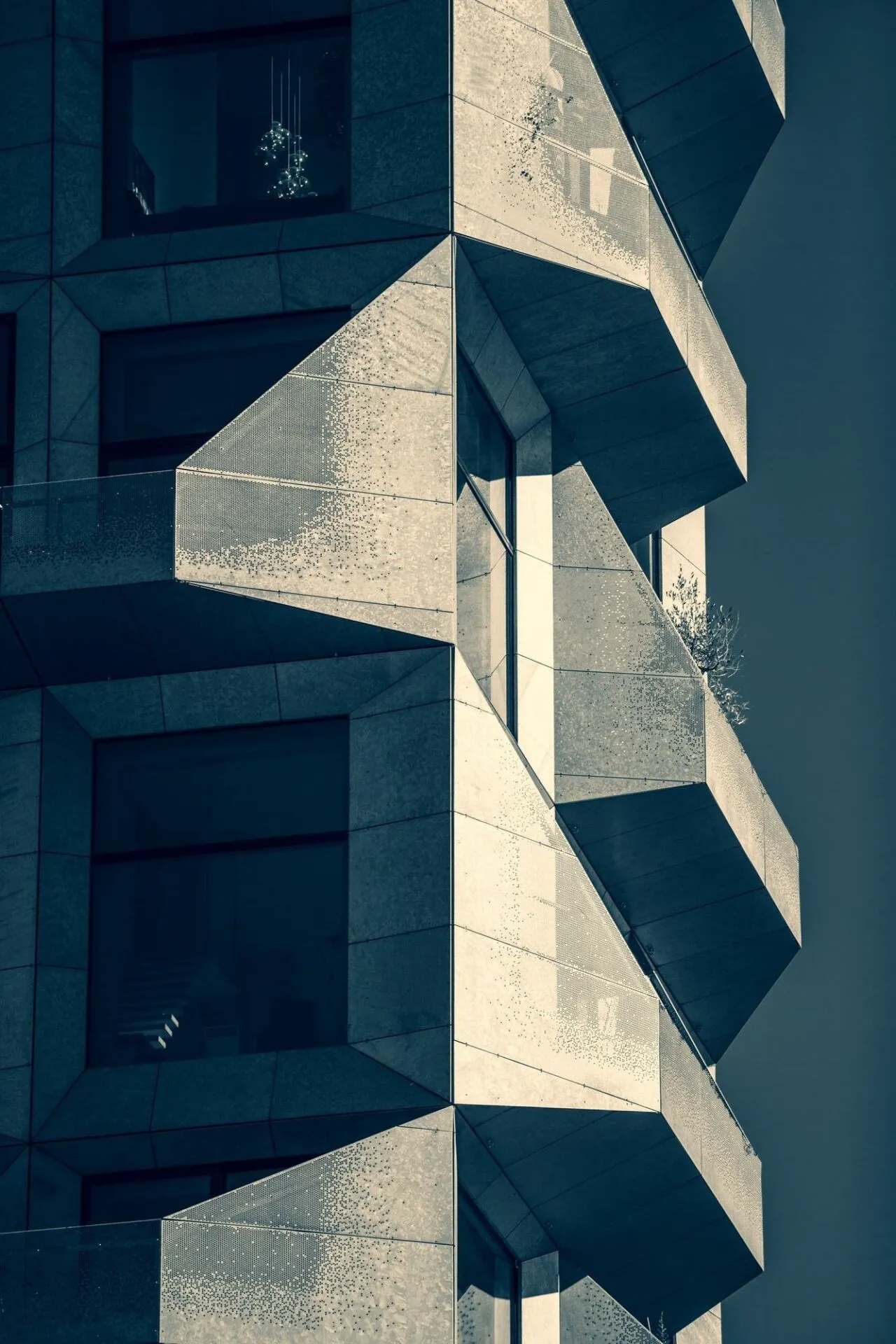
This architecture grew hand in hand with civil engineering and with the country’s development project. Brasília, inaugurated in 1960, stood up on Joaquim Cardozo’s structural calculations, and roads, dams and cities came in the same push. In 2006, Paulo Mendes da Rocha won the Pritzker, architecture’s most important prize.
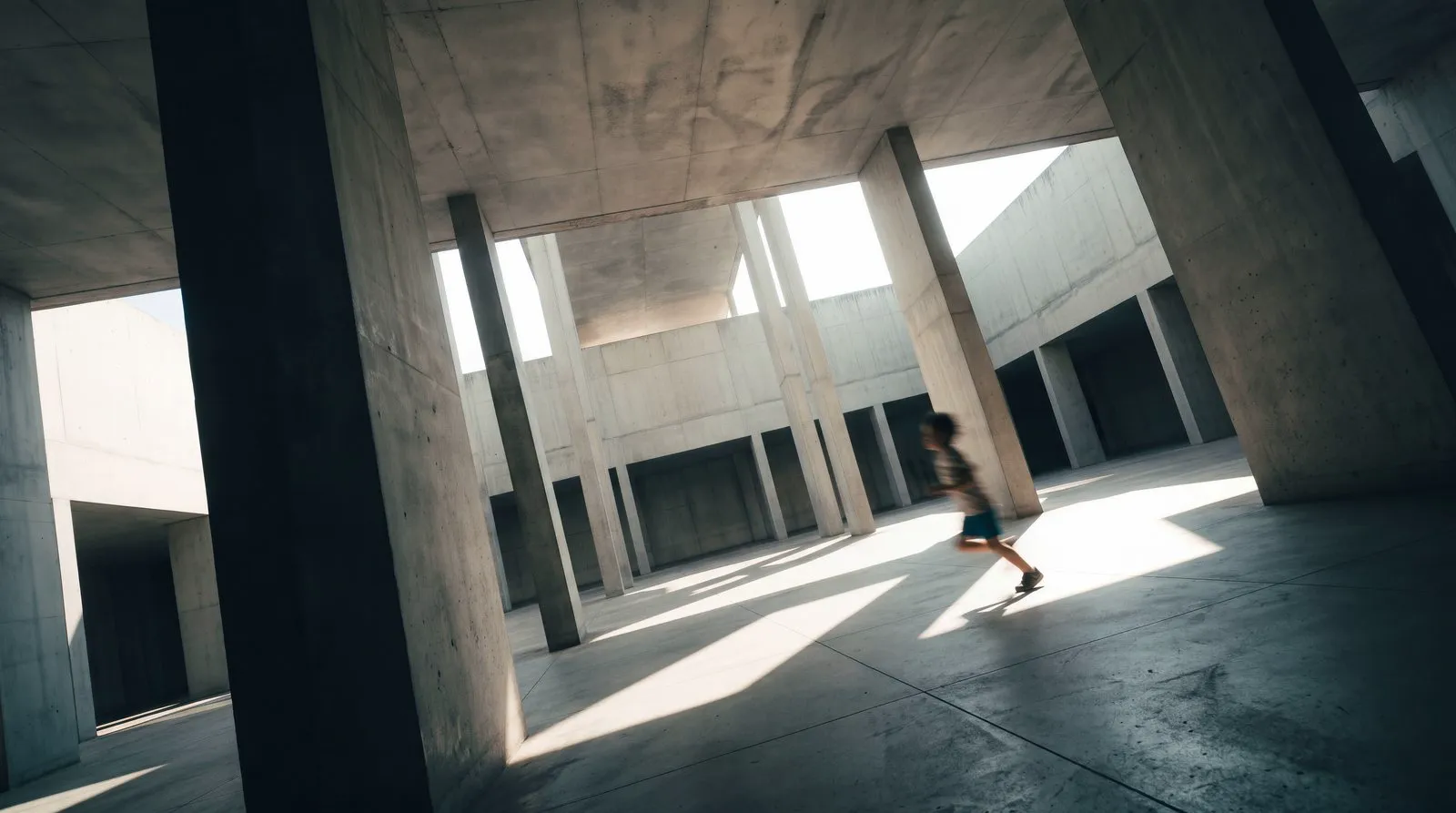
It is the same chain Atibra works in today: heavy construction, machines on site and infrastructure that keeps the country moving. That is why the brand’s shapes are flat, unornamented and angled like structure. The identity moodboard brought in concrete facades, and one of the images prepared for the Paving booth shows concrete pillars in raking light, with a child running between them.
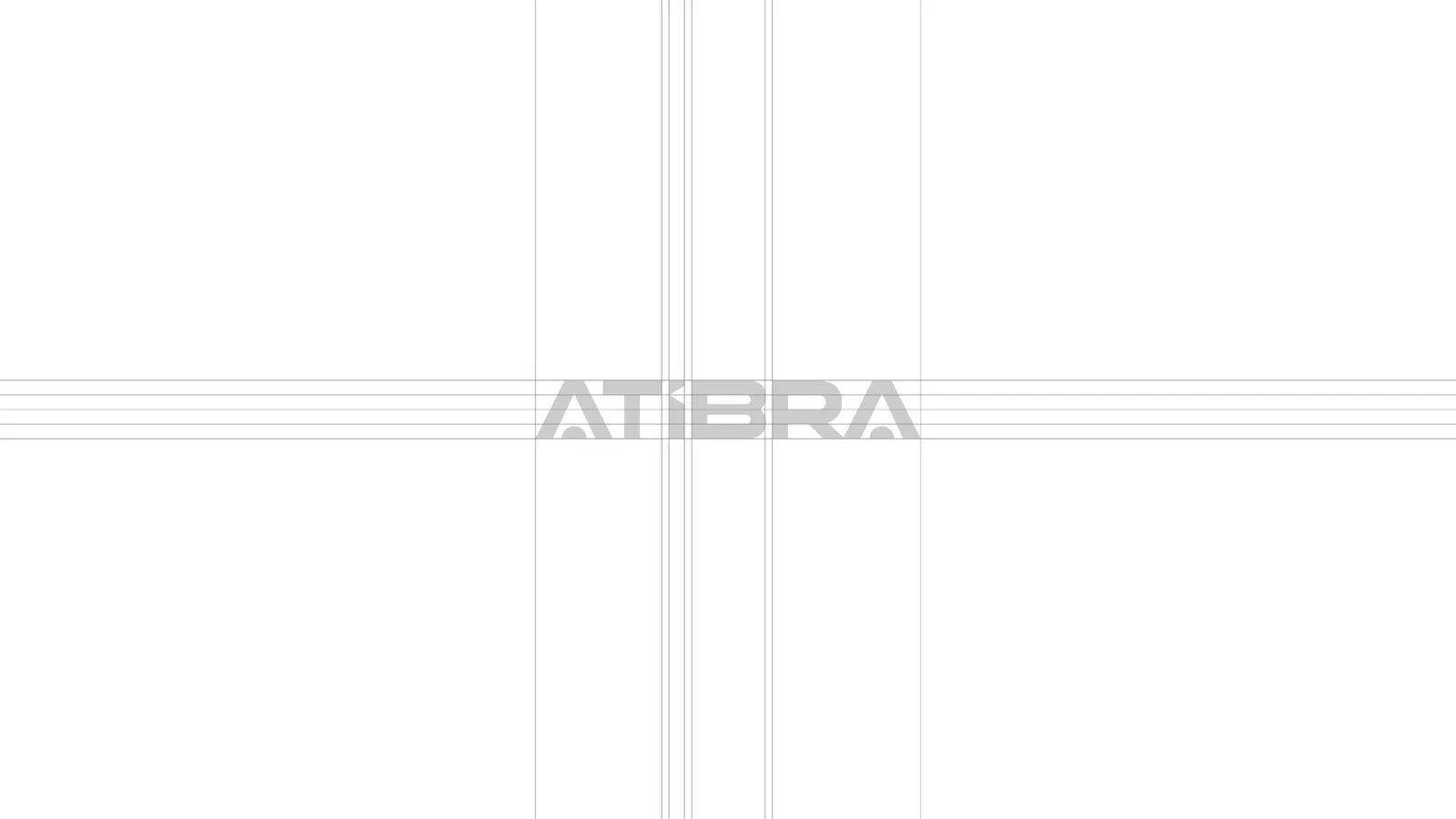
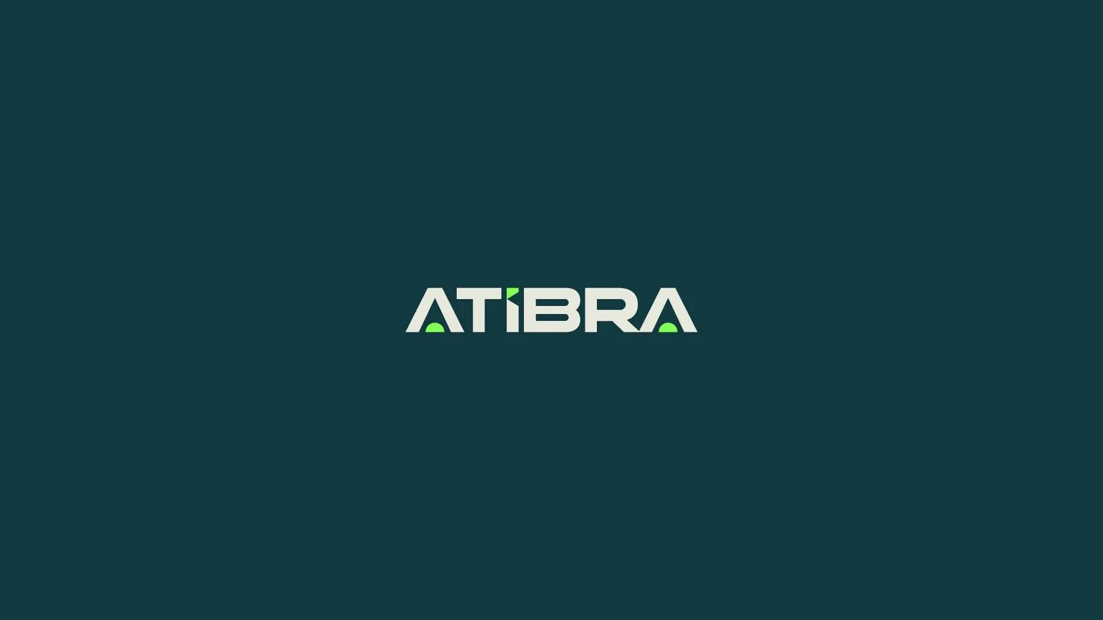
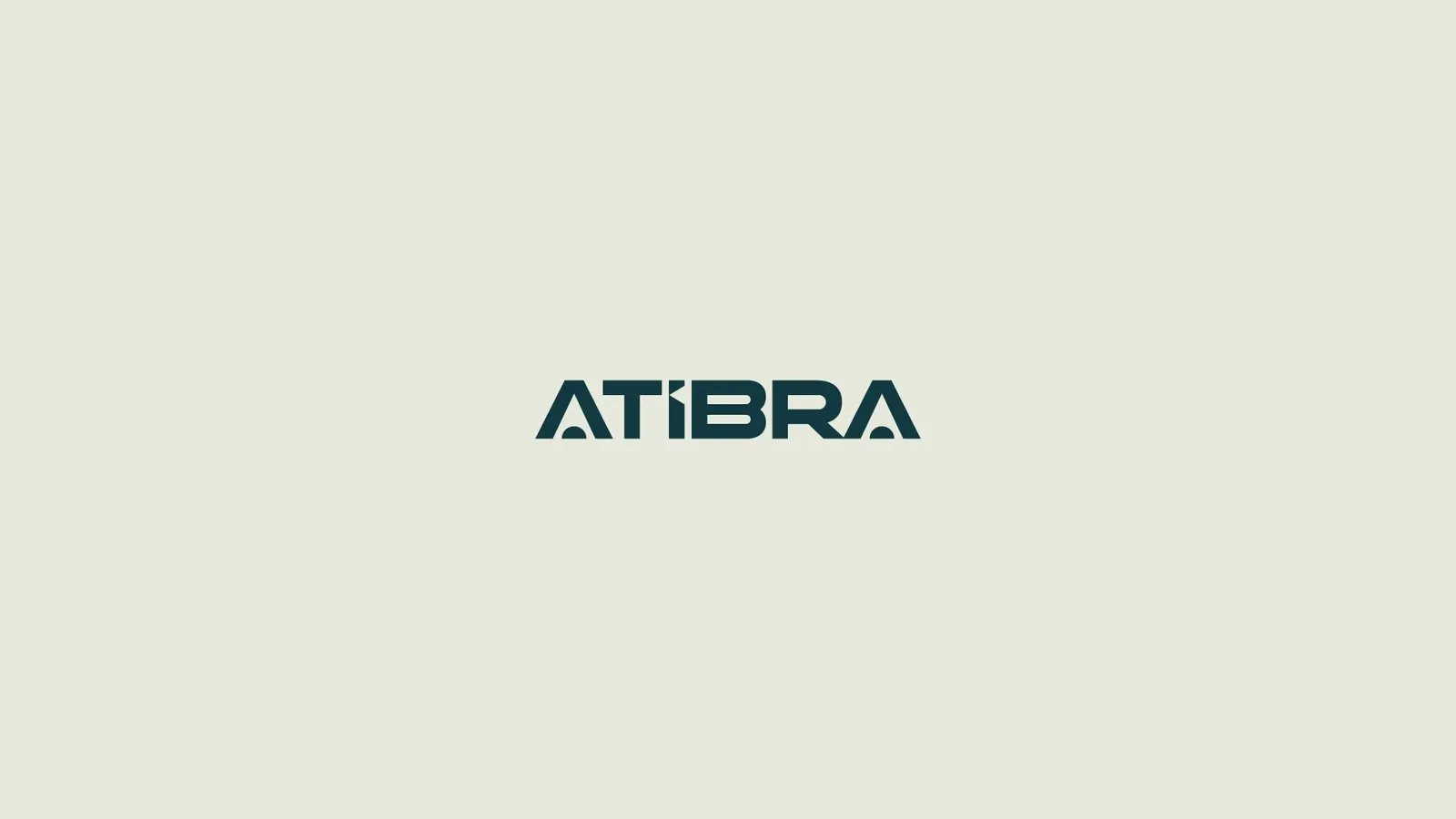
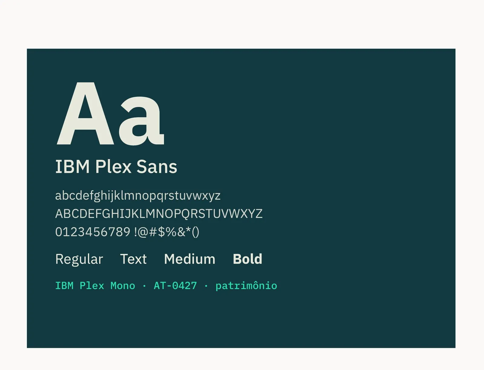
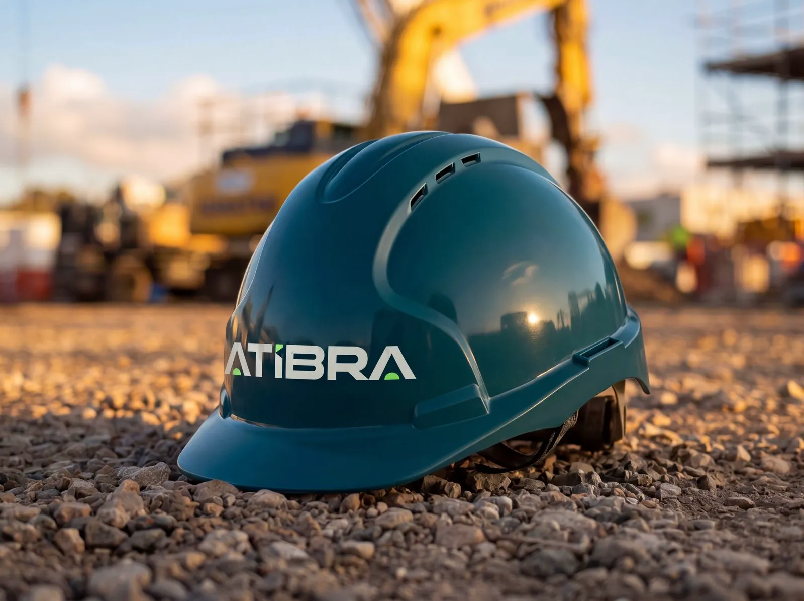
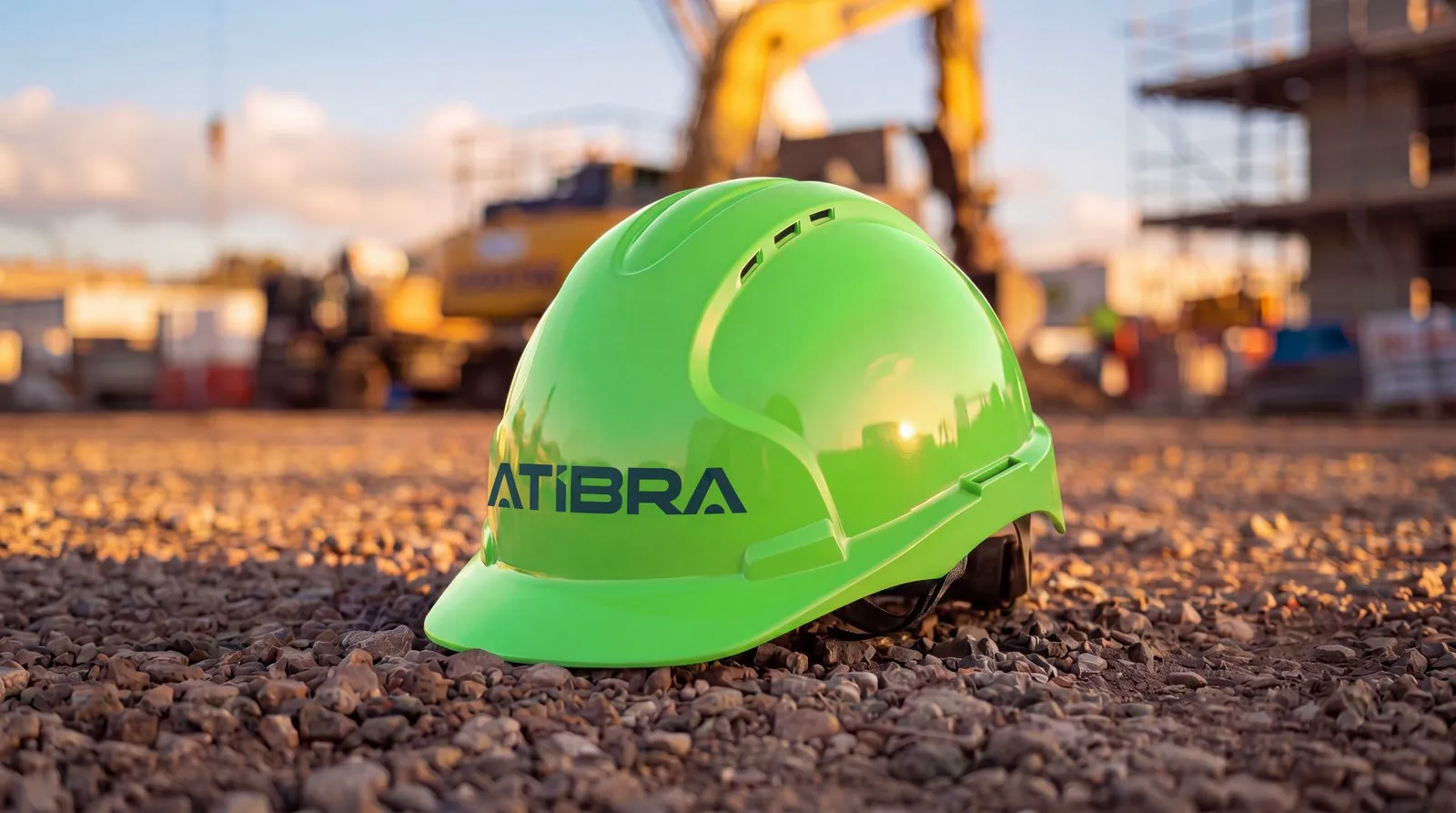
The IBM Plex Sans typeface came from VRental and stayed, because it was the only element of the old brand the market recognized. Graphite #1F2126 gave way to petrol green #123940. Acid lime #B0F730, which had been used as decoration, was replaced by digital green #84FF56, which at Atibra appears only where it means availability or safety. It is the color of the PPE.
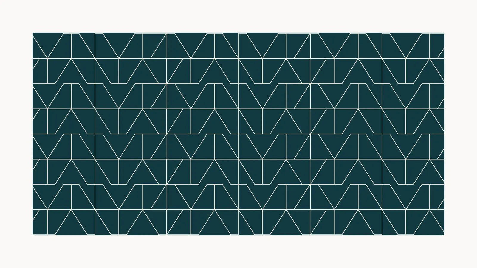
There are four palettes (main, neutral, signal and Seminovos) applied in a 60/30/10 ratio: greens as the base, neutrals for structure and signal colors for calls to action and warnings. The graphic assets are fragments of the diamond, half-diamonds and chevrons that form bands, line patterns and a halftone for large areas.

Materials
Everything carrying the brand, ready the day before the show.
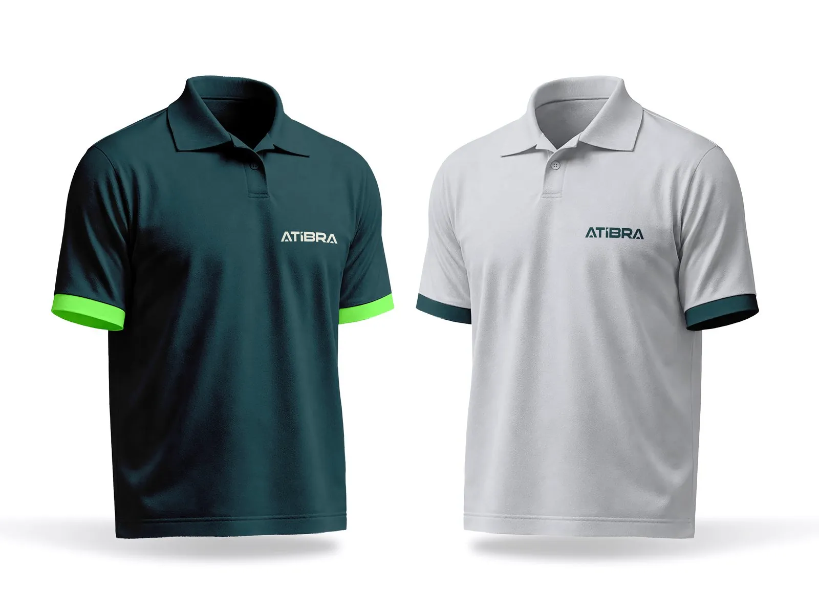
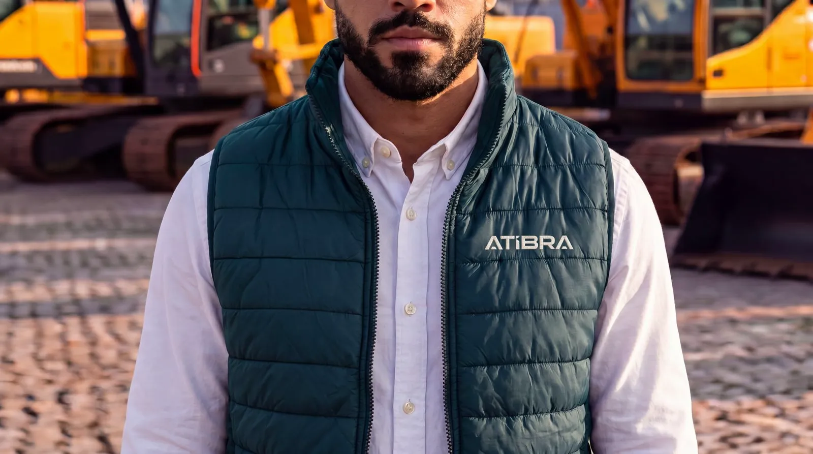
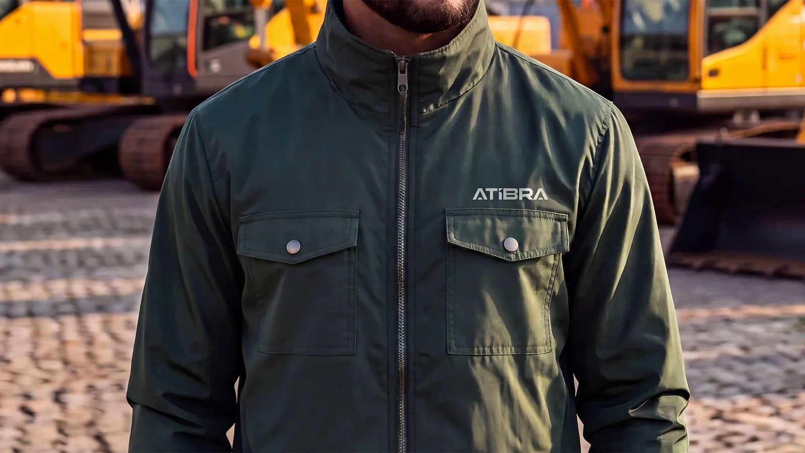
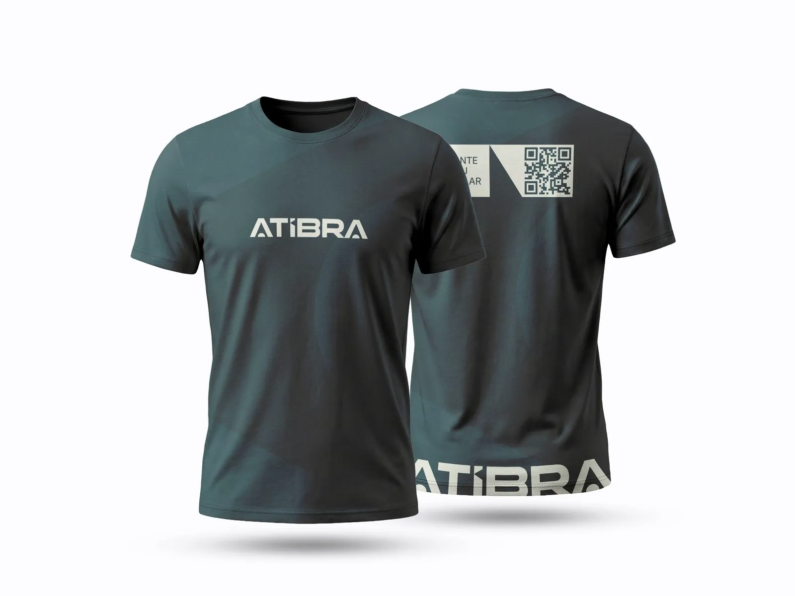
Everything carrying the brand had to be ready the day before the trade show. Apparel and merchandise had the tightest deadline: the supplier needs 30 to 40 days of production, so artwork had to be final by August 20. The line comes in two colors, institutional gray and petrol green, and the garment depends on who wears it. T-shirts for promoters, polos for sales, dress shirts for the board.
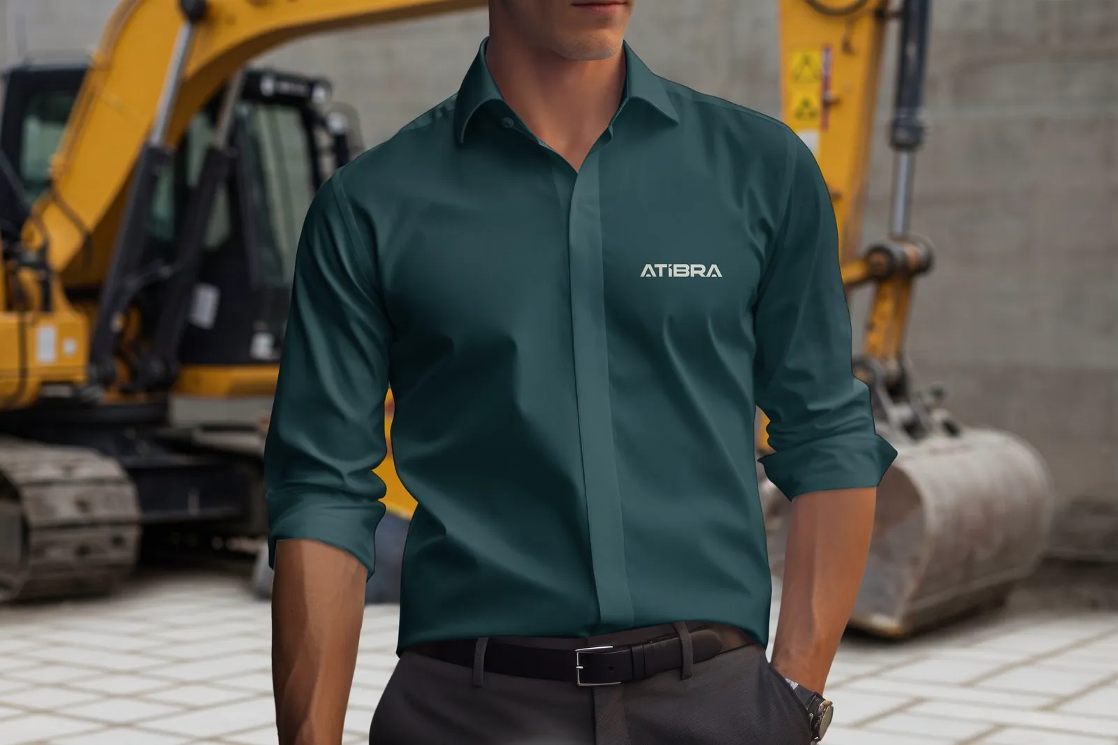
For PPE, the helmet was studied in petrol and in digital green. The vest and jacket follow the line’s two colors, and the promoters’ T-shirt carries a QR code on the back.
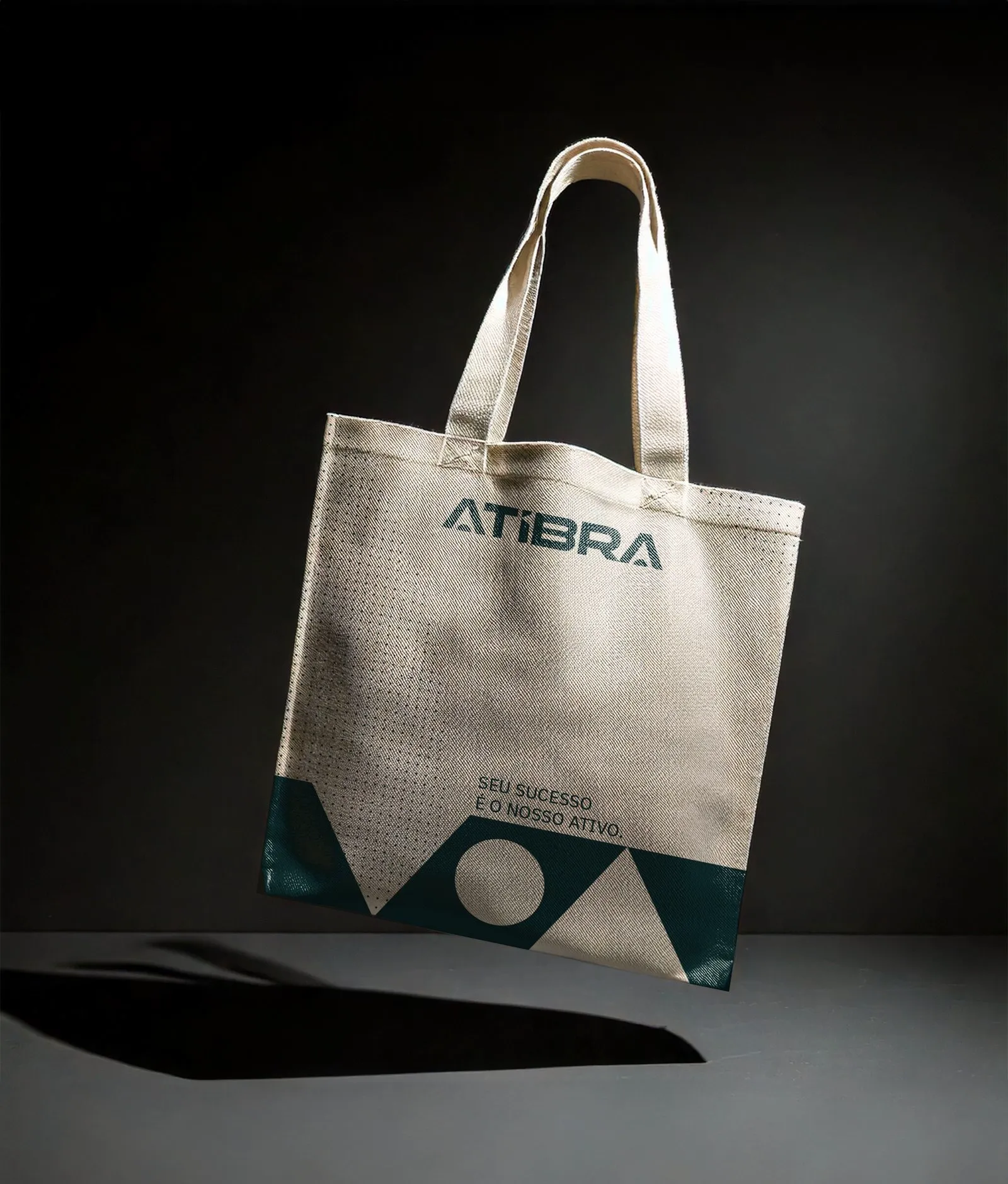
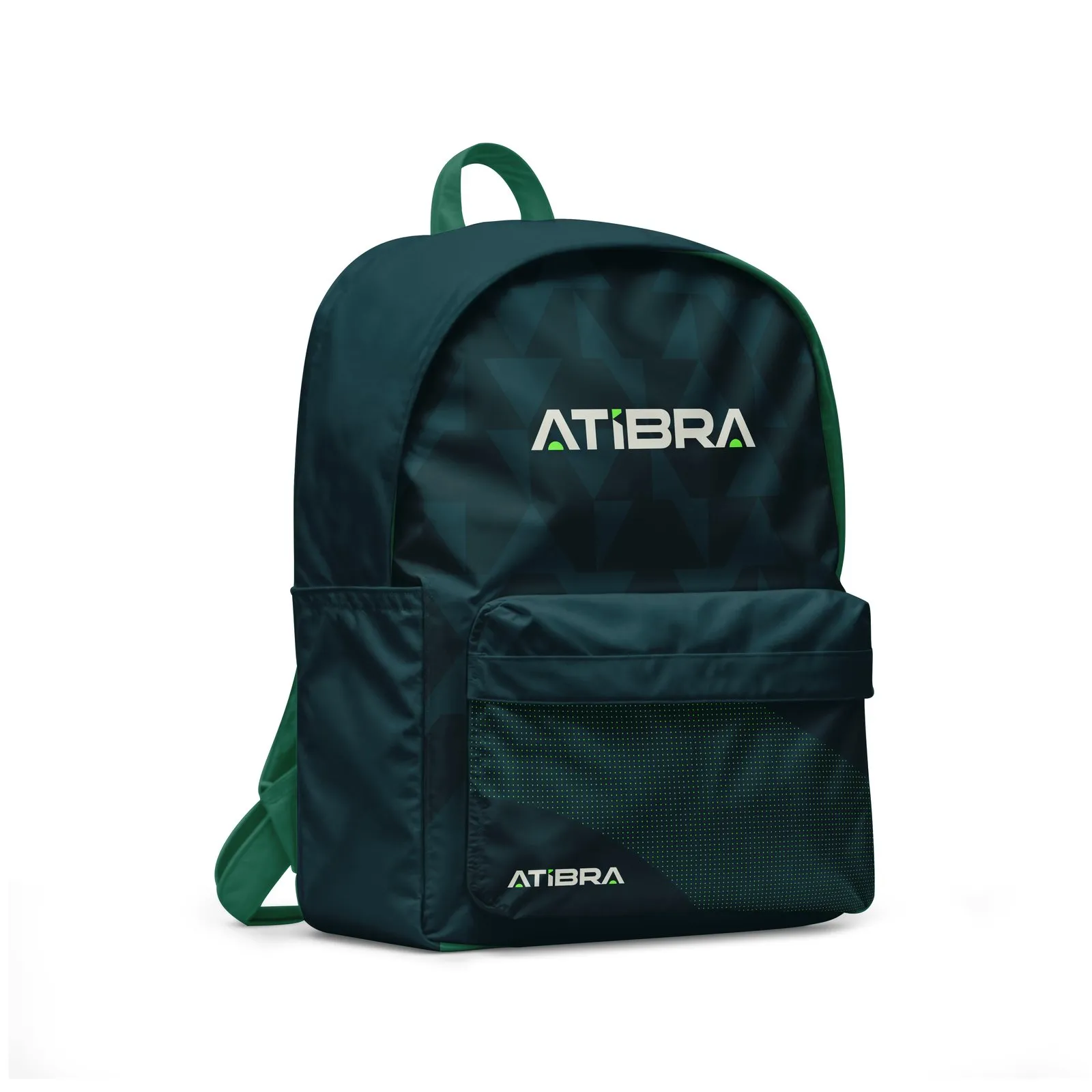
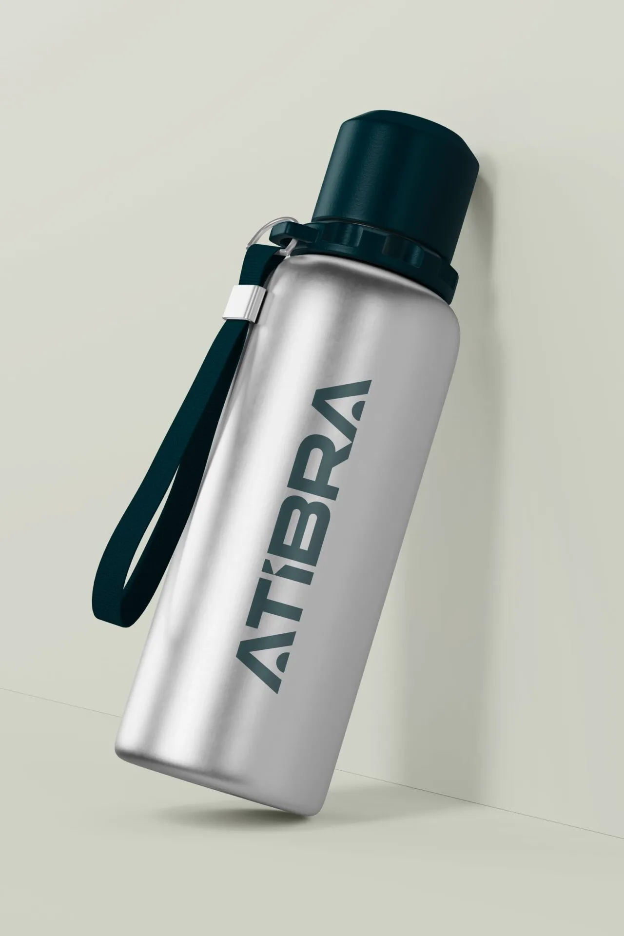
Tote bag, backpack, water bottle and notebook make up the trade show kit.
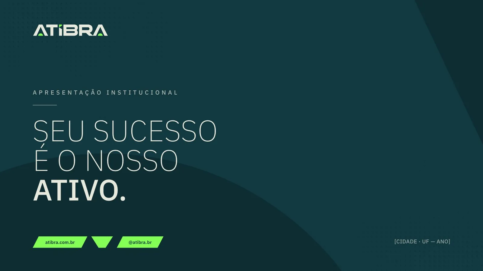
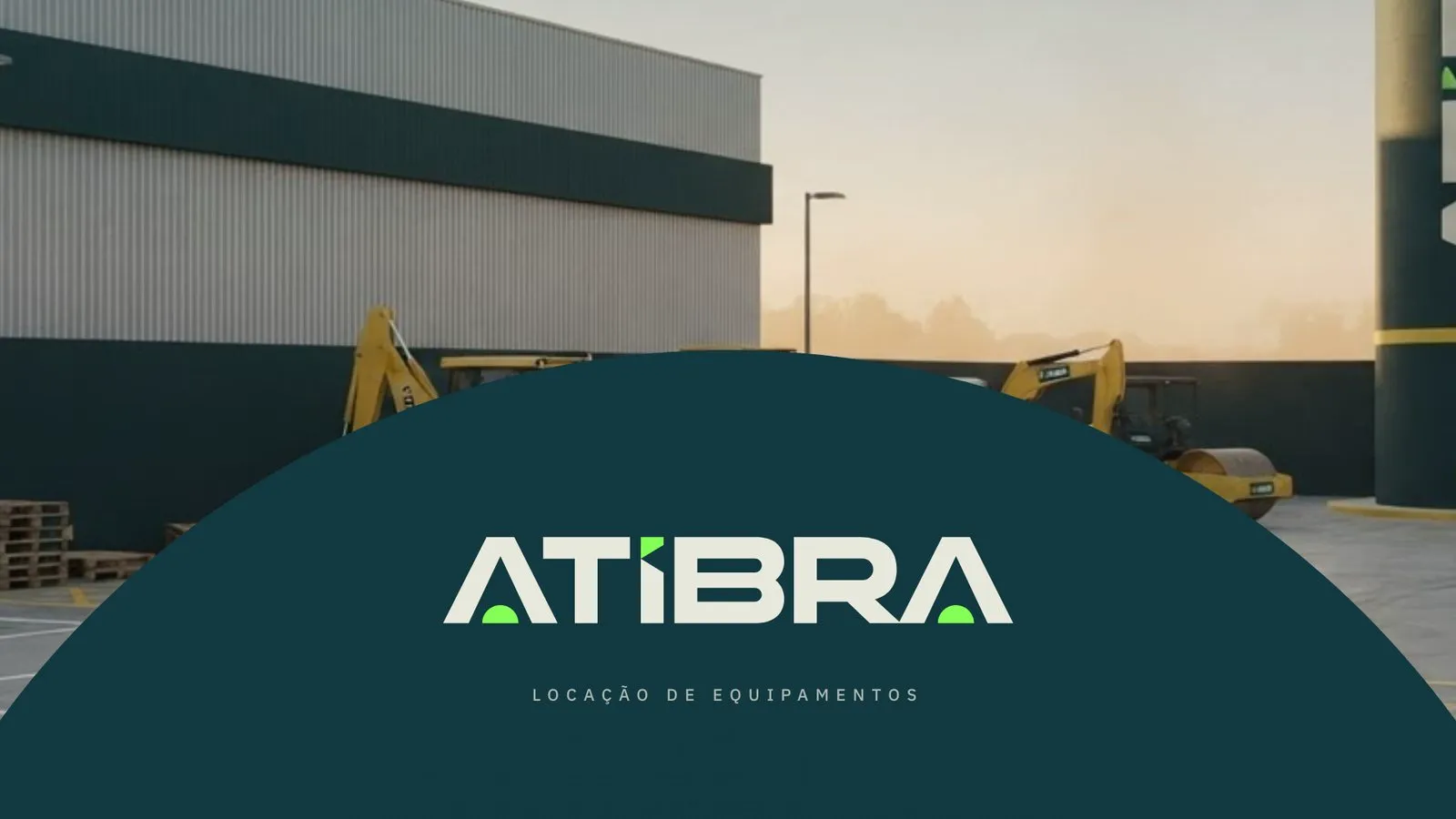
For presentations, a master template with covers for each business unit, back covers and inside slides, in editable PowerPoint.
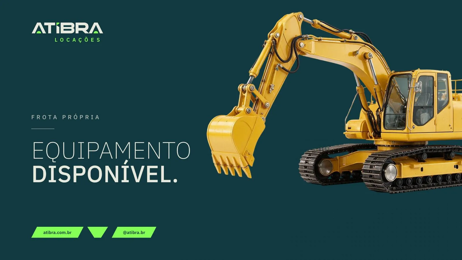
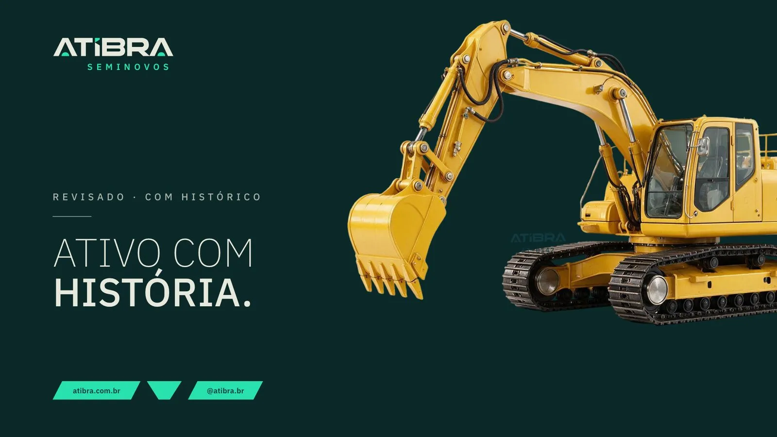
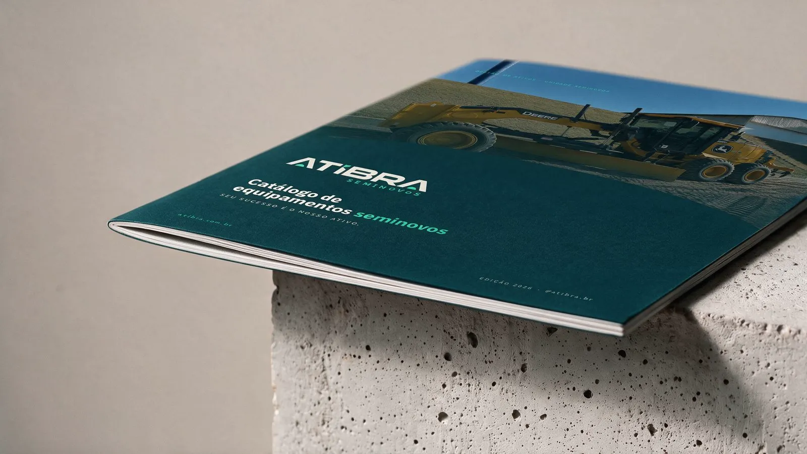
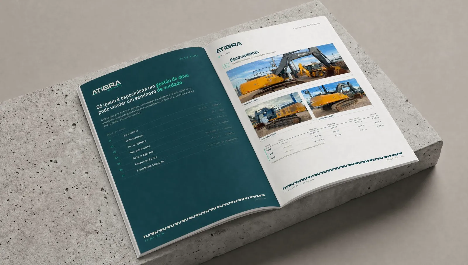
The Seminovos catalog lists excavators, motor graders, wheel loaders, backhoe loaders and tractors with specs for each unit, in a screen version and a PDF/X-1a version for print. One page explains origin, warranty and life-cycle management.
The machine as media.
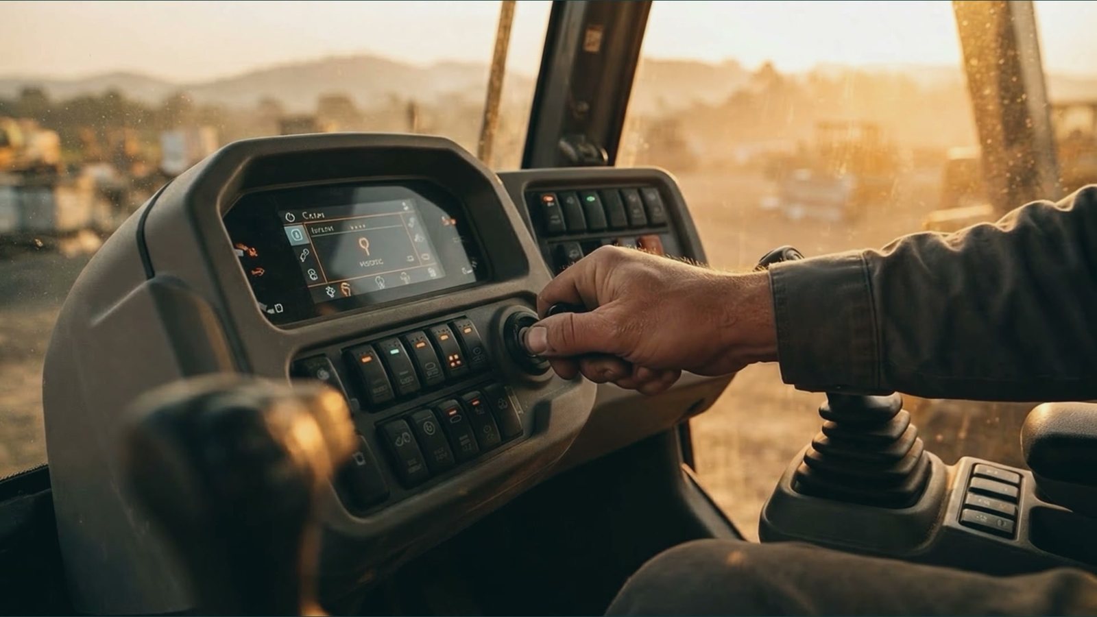
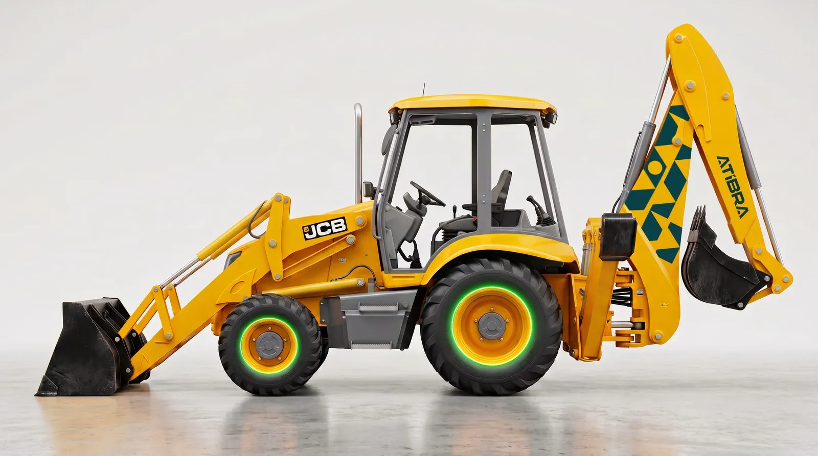
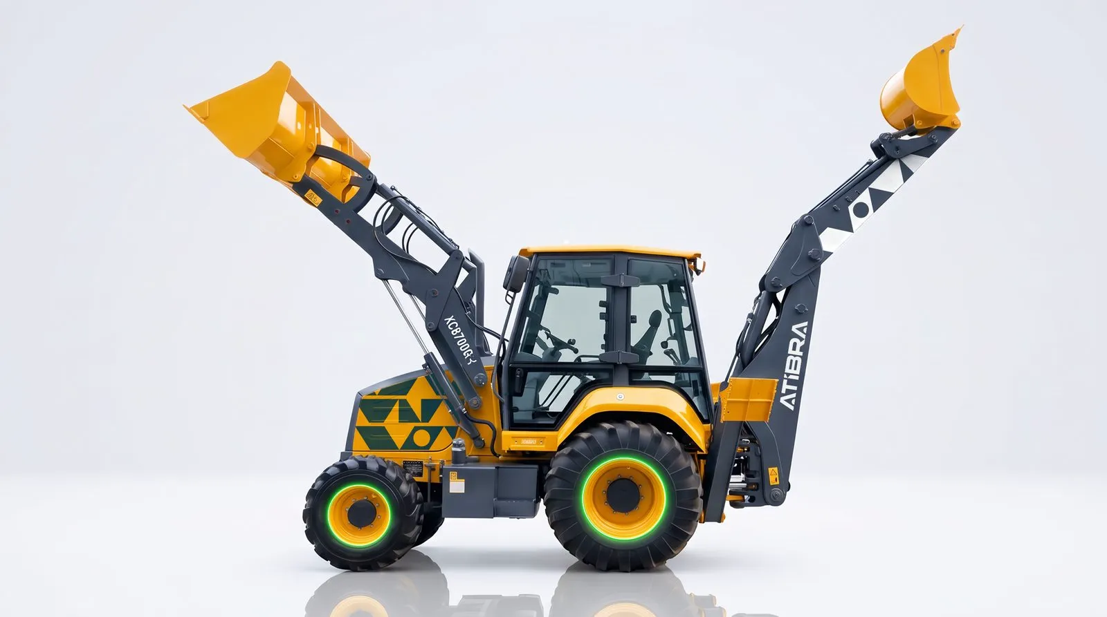
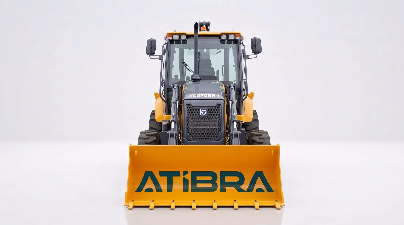
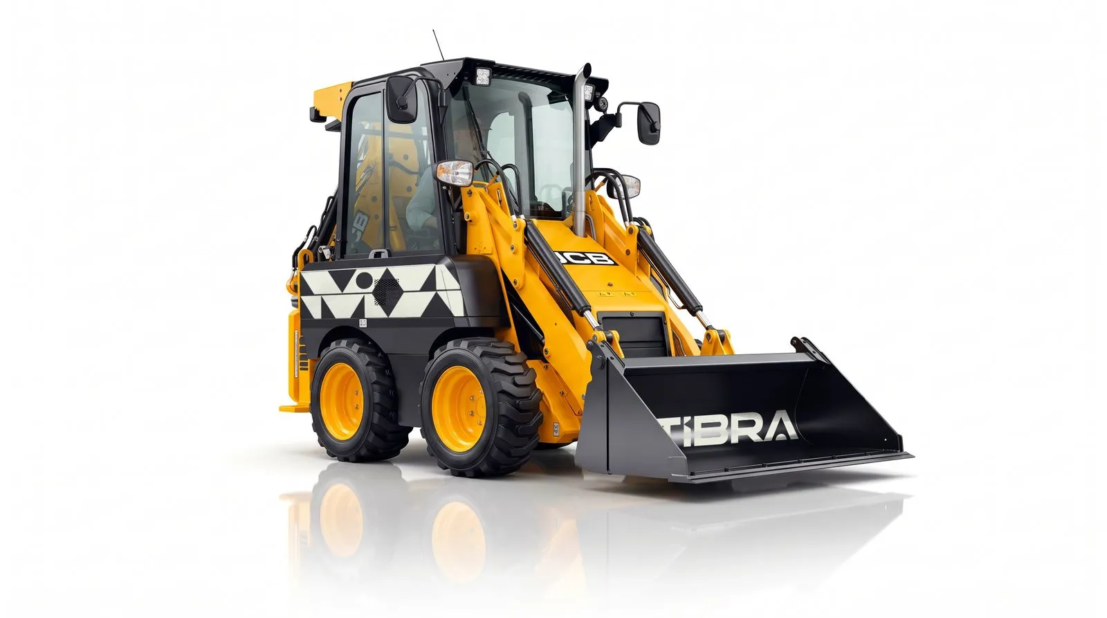
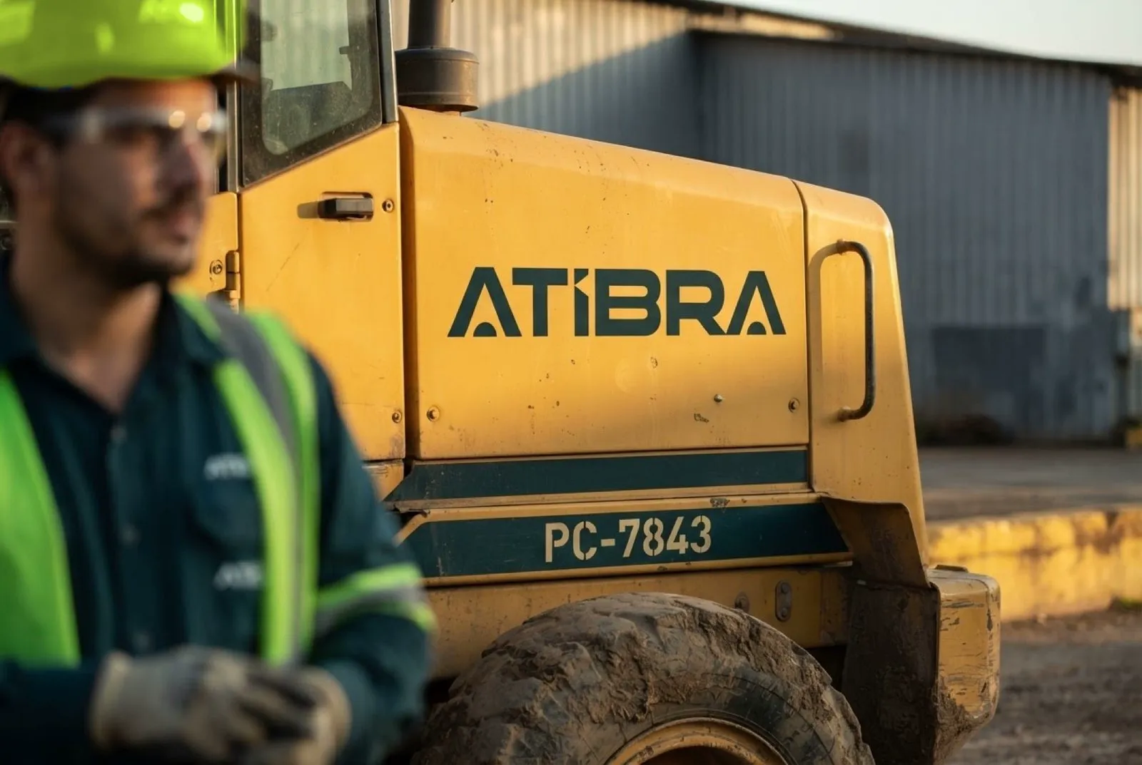
The wrap rule was settled in August: every machine that goes through the workshop comes out with the new brand, nothing is changed in the field, and rented units switch when they come back. For the trade show, three demo machines got a full design, with the logo on the bucket, the diamond graphic on the arm and a QR code in the cab. On the machine’s yellow, the logo always goes in the petrol version.
Space
Recife, the pilot site.
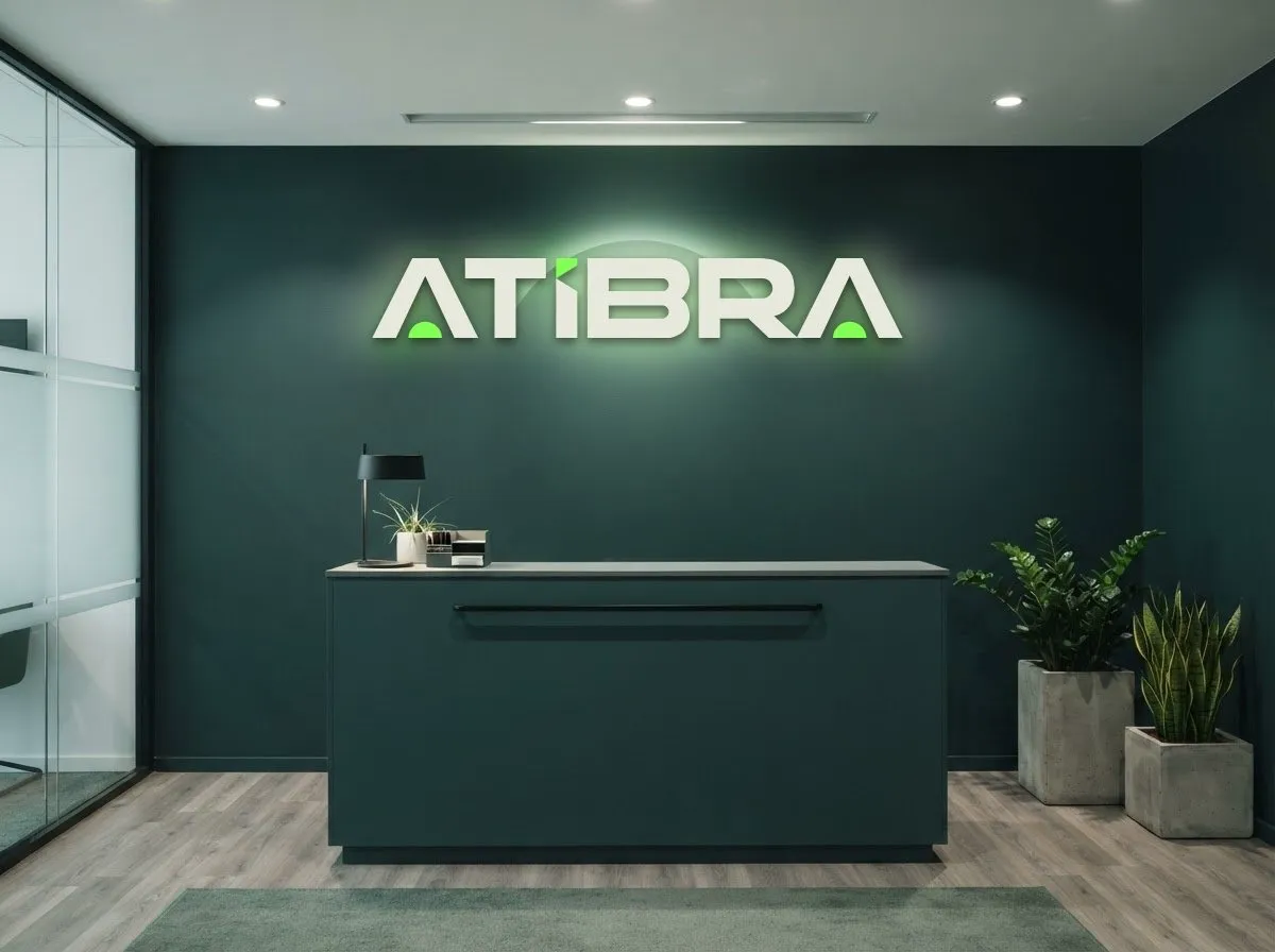
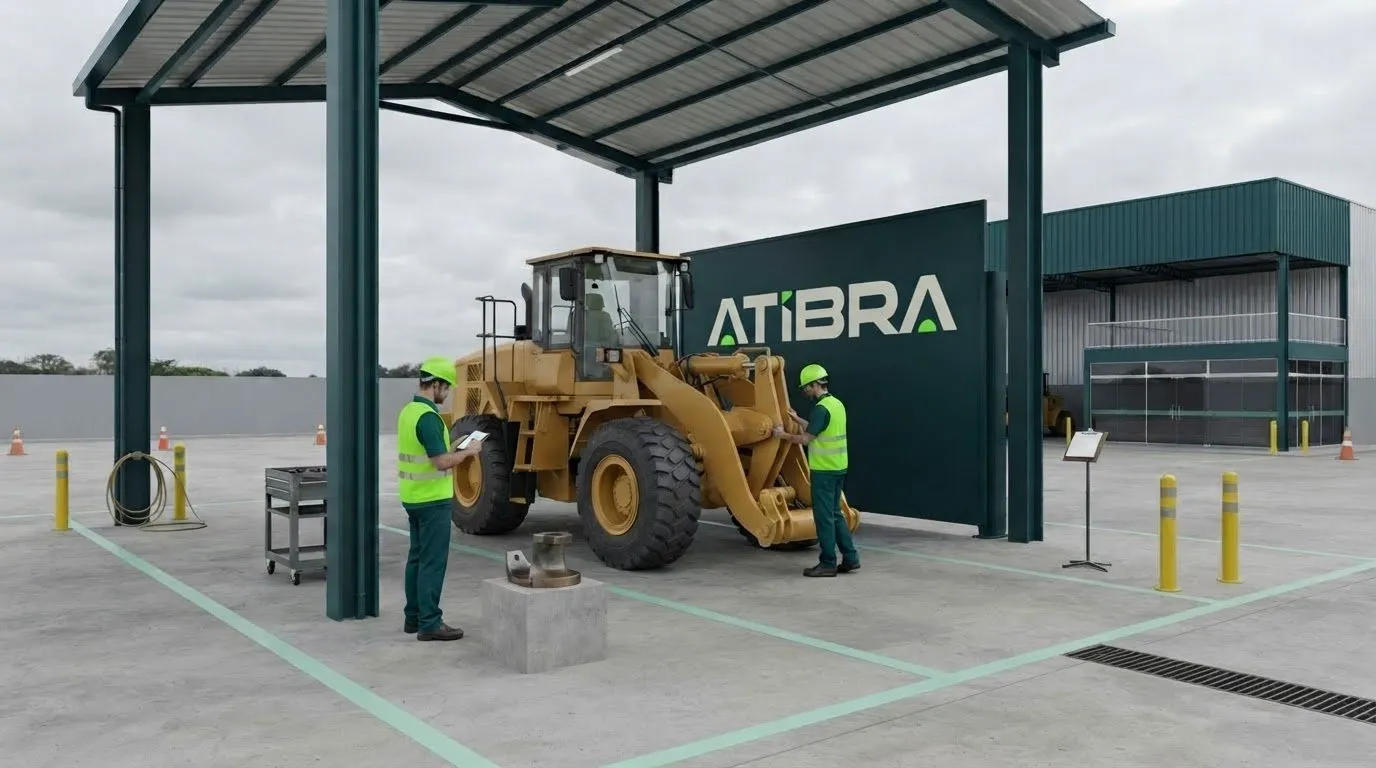
The Recife site is the pilot for the physical rollout. The study covers ten zones, from the gatehouse to reception, including the warehouse fascia, yard, water tower, workshop, inspection bay and offices. The images are simulations built on the site’s plans and serve as a reference for construction and suppliers; execution continues in the 90-day rollout.
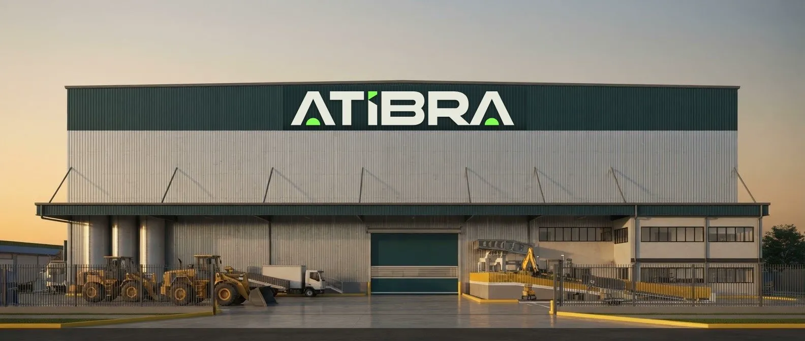
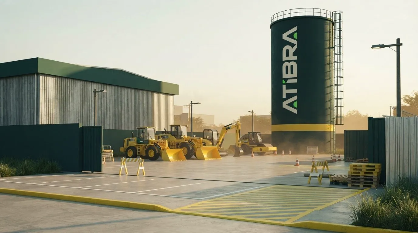
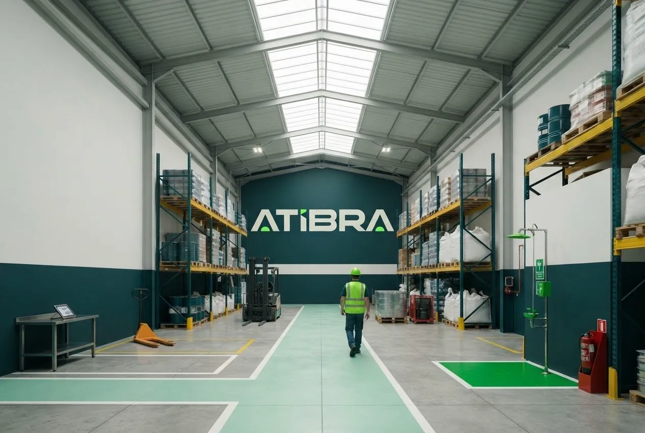
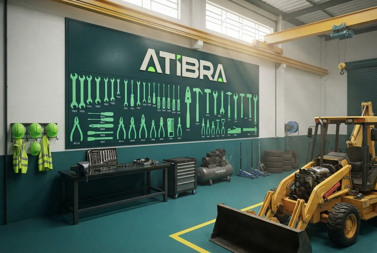
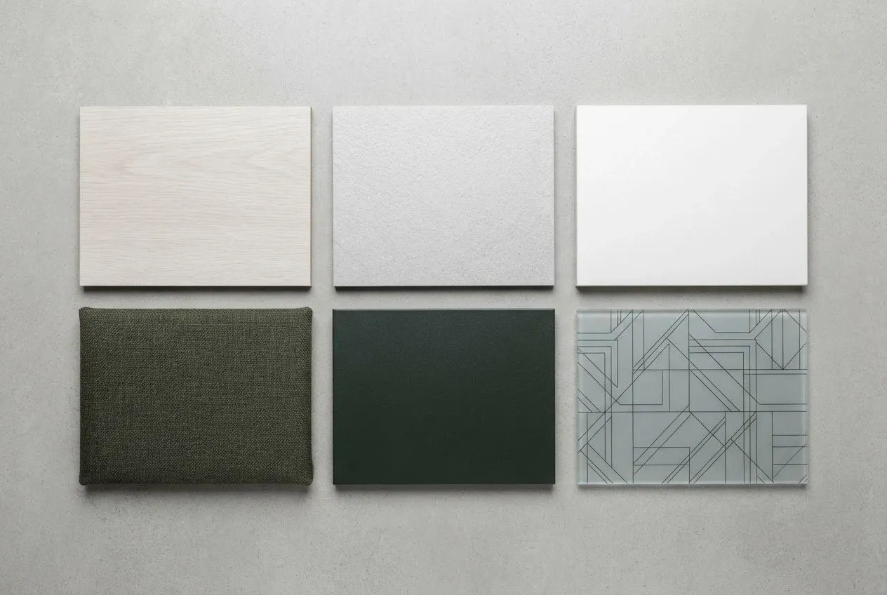
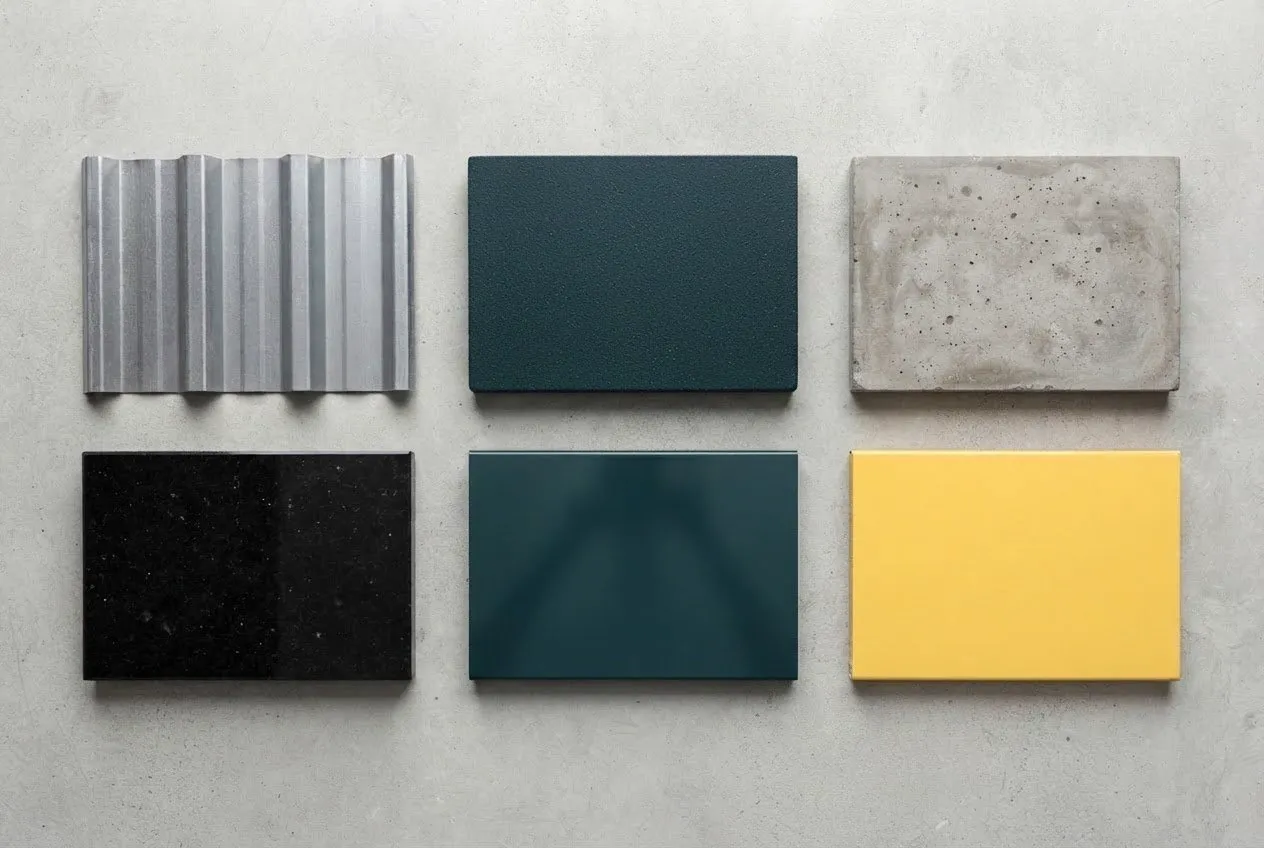
Indoors, petrol green runs as a wall band and the diamond becomes a tonal mural in the hall. Materials were chosen by area: light surfaces and green fabric in the offices; metal sheet, concrete and safety yellow in operations.
Film
Two minutes to tell the switch.
Launch and event
The team knew before the market.
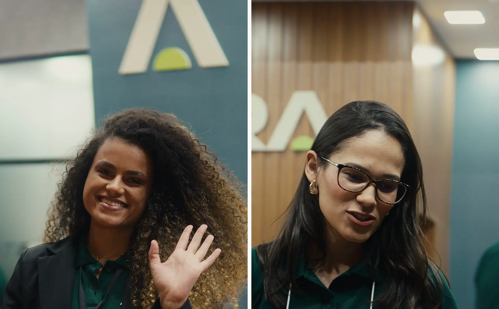
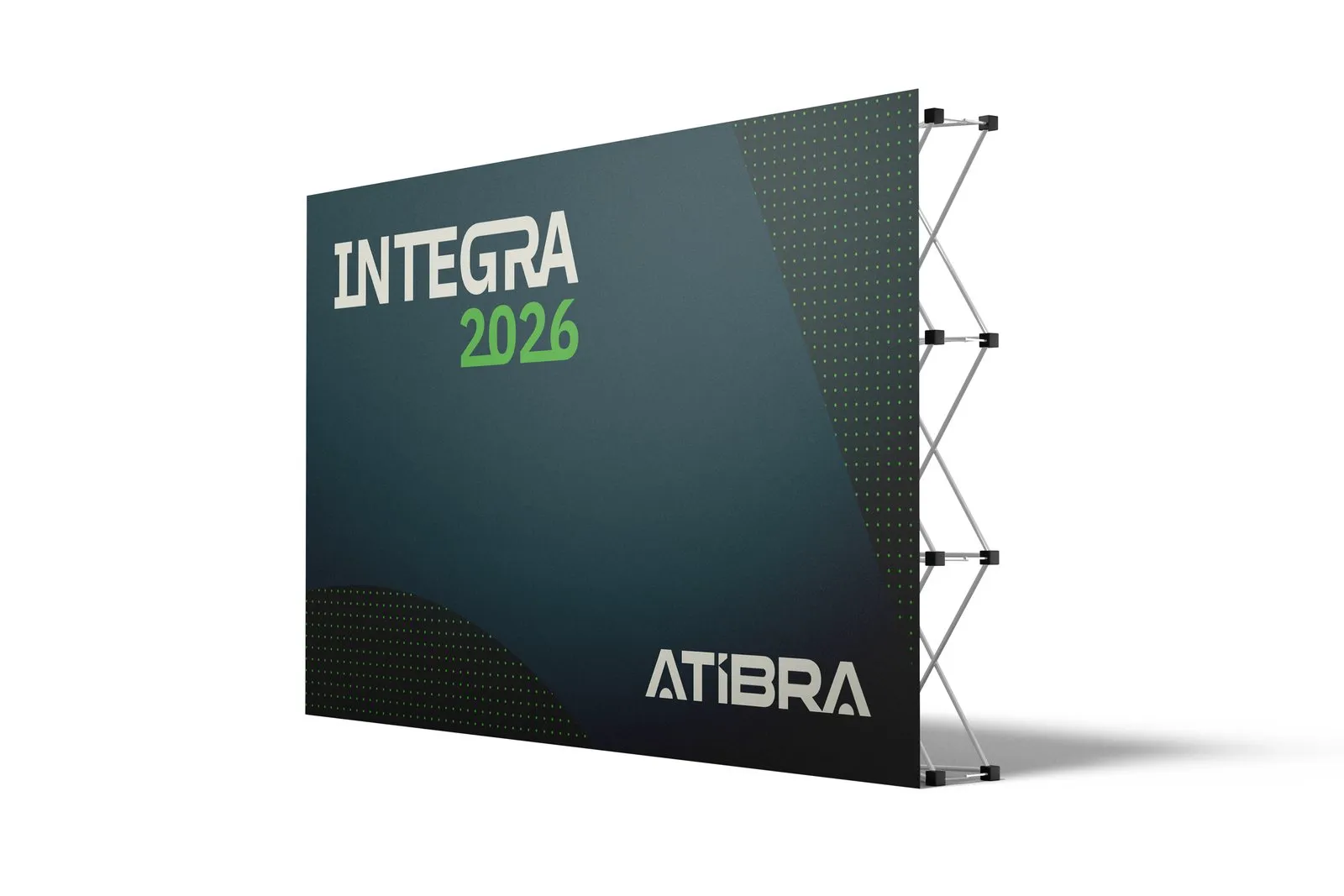
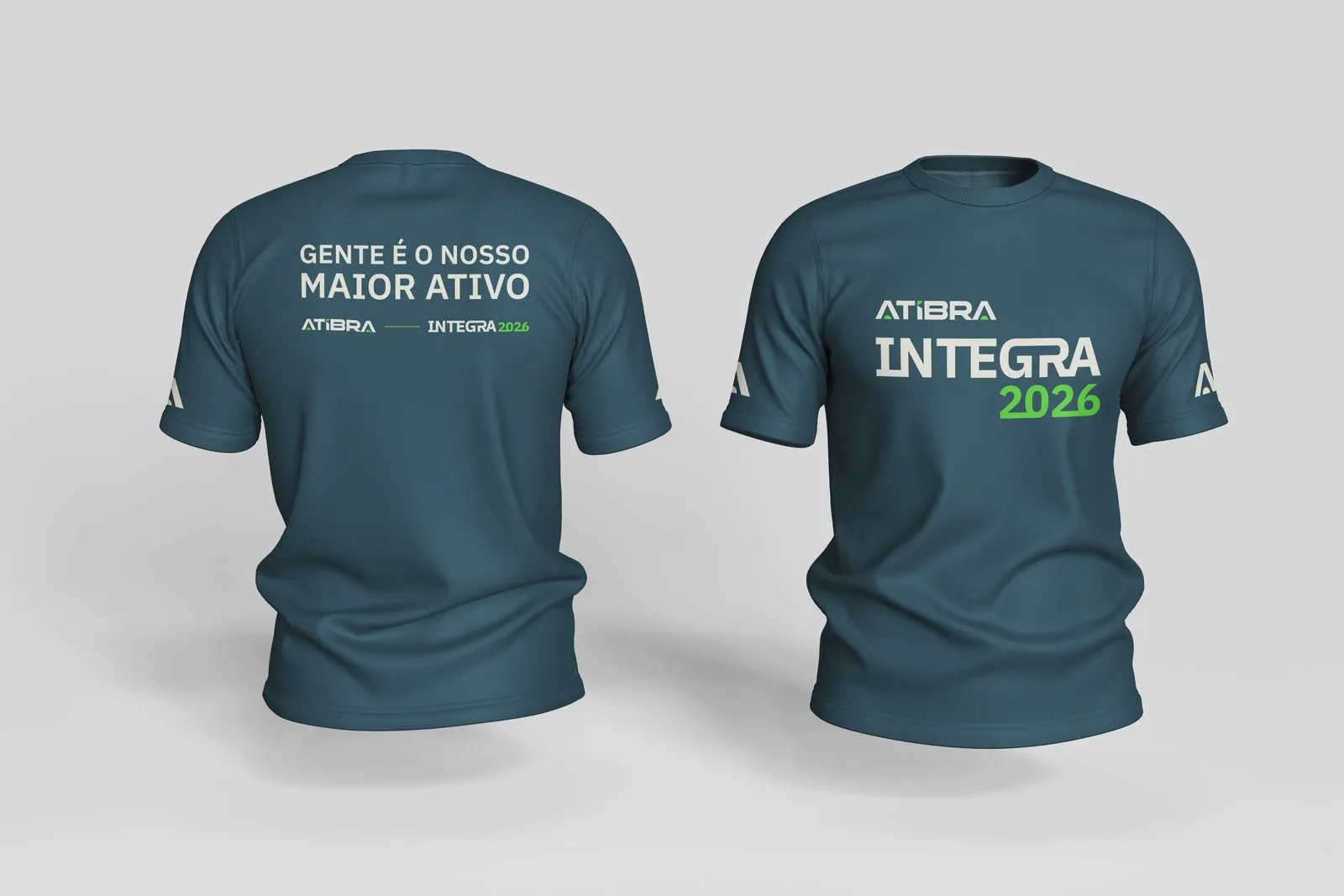
The rule was agreed with leadership. The internal narrative went out in August, before any public piece, explaining the name and giving guidance on uniforms and fleet stickers. Integra 2026, the internal meeting in September, got a backdrop and a T-shirt reading Gente é o nosso maior ativo, “people are our greatest asset”. The animation that opens this case turns VRental into Atibra in just over 30 seconds.
For clients, partners and press, the September 18 press release separates what changes (name, logo, palette, domain and social profiles) from what stays the same (the company, contracts, commercial terms and teams). Ad platforms require this document before renaming a large advertiser account.
The digital switchover.
All public channels switched together: social avatars, covers and highlights, email signatures, QR codes and the atibra.com.br microsite. The profile became @atibra.br. Locações and Seminovos got their own social kits.
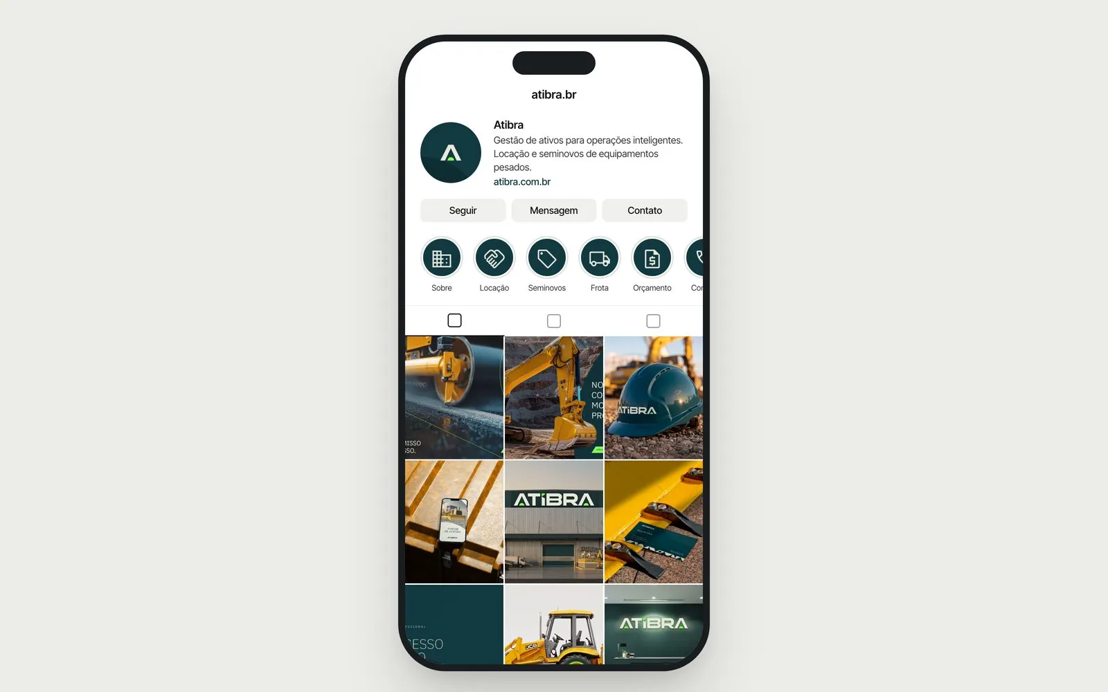
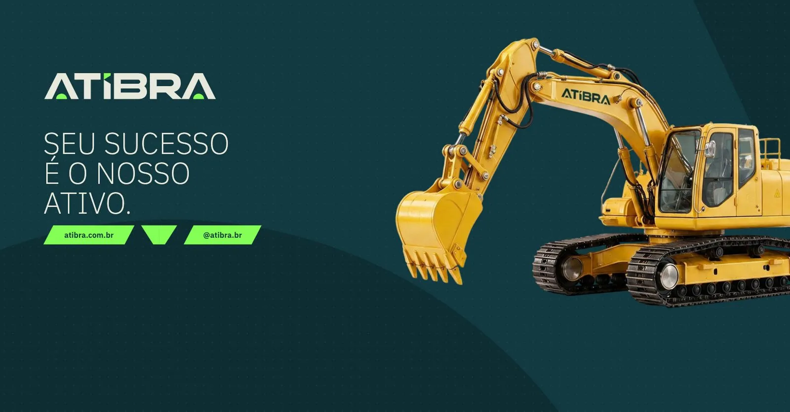
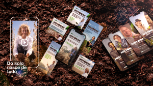
Before the show, the client base received two emails: a save the date and, on opening day, É hoje (“it’s today”), with a map of the hall to booth 37A drawn over the event’s official floor plan. On social, a teaser still carrying the VRental brand announced the change, and a short video invited people to visit.
The event.
Atibra appeared in public for the first time at Paving Expo 2026, from September 22 to 24 at Distrito Anhembi in São Paulo. The show brings together builders, contractors, toll-road operators and public road-infrastructure agencies. Booth 37A covers 150 m², with a wrapped backhoe loader up front, reception, lounge and an LED screen. Below, the design render and the booth as built.
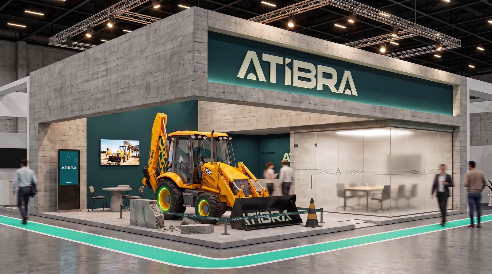
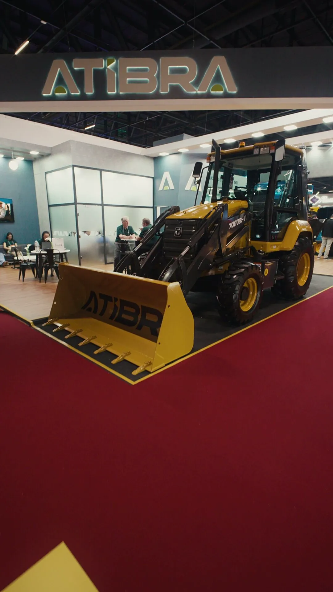
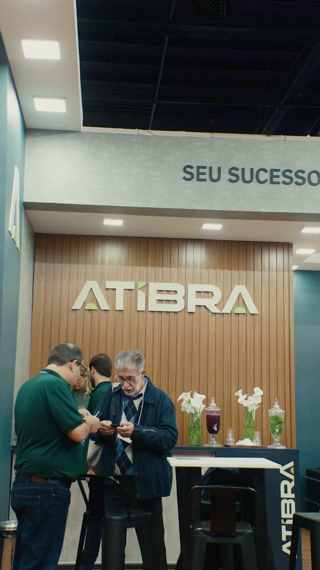
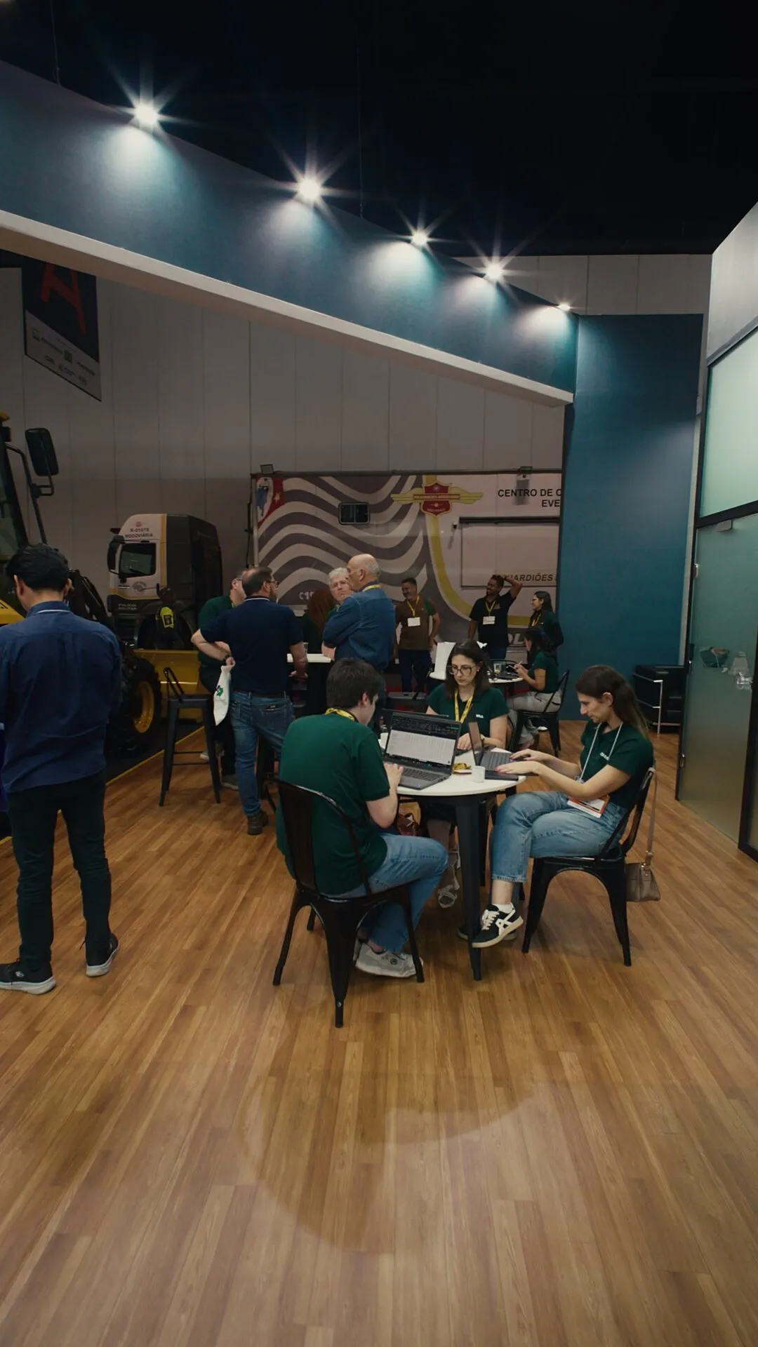
The LED screen animation came out of our motion engine, which reads colors, fonts and timing straight from Atibra’s Brand Brain. The same engine produced the vertical brand video, also shown at the booth, which introduces the company in 30 seconds, and the social reel with four brand lines over footage of operations.
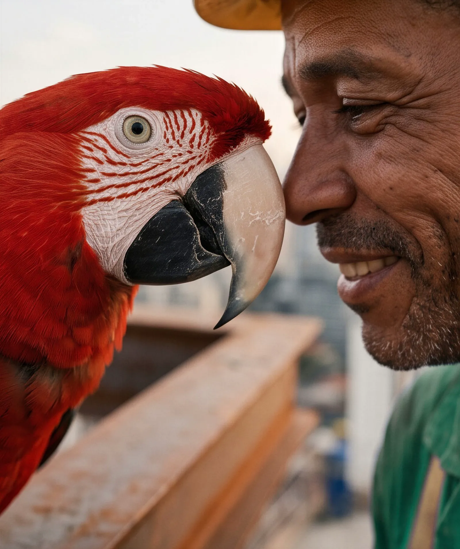
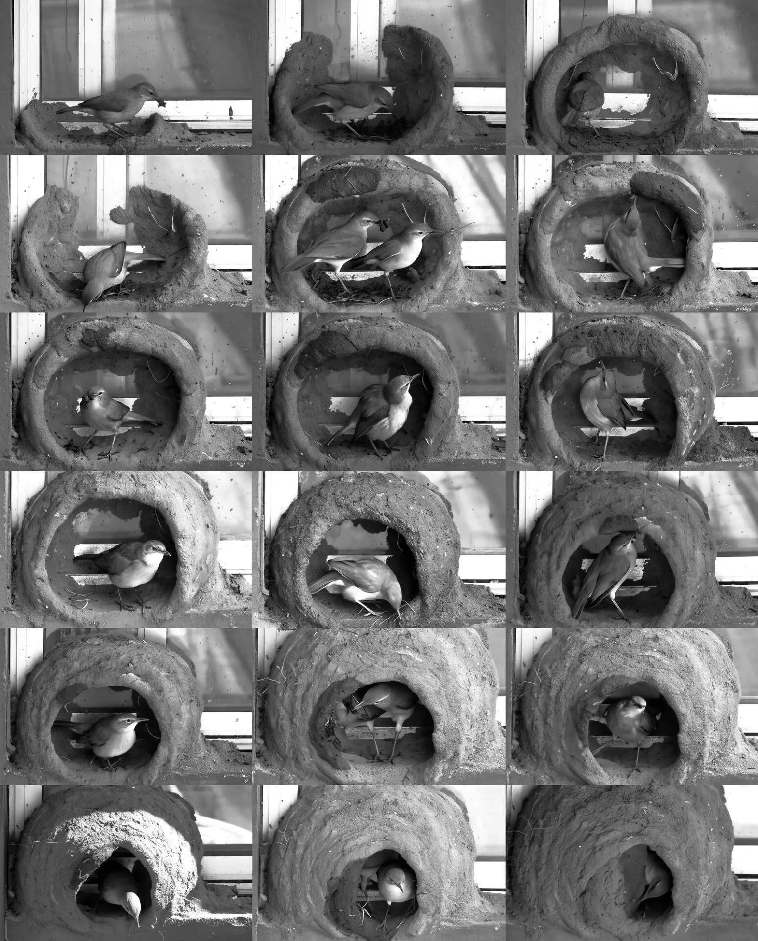
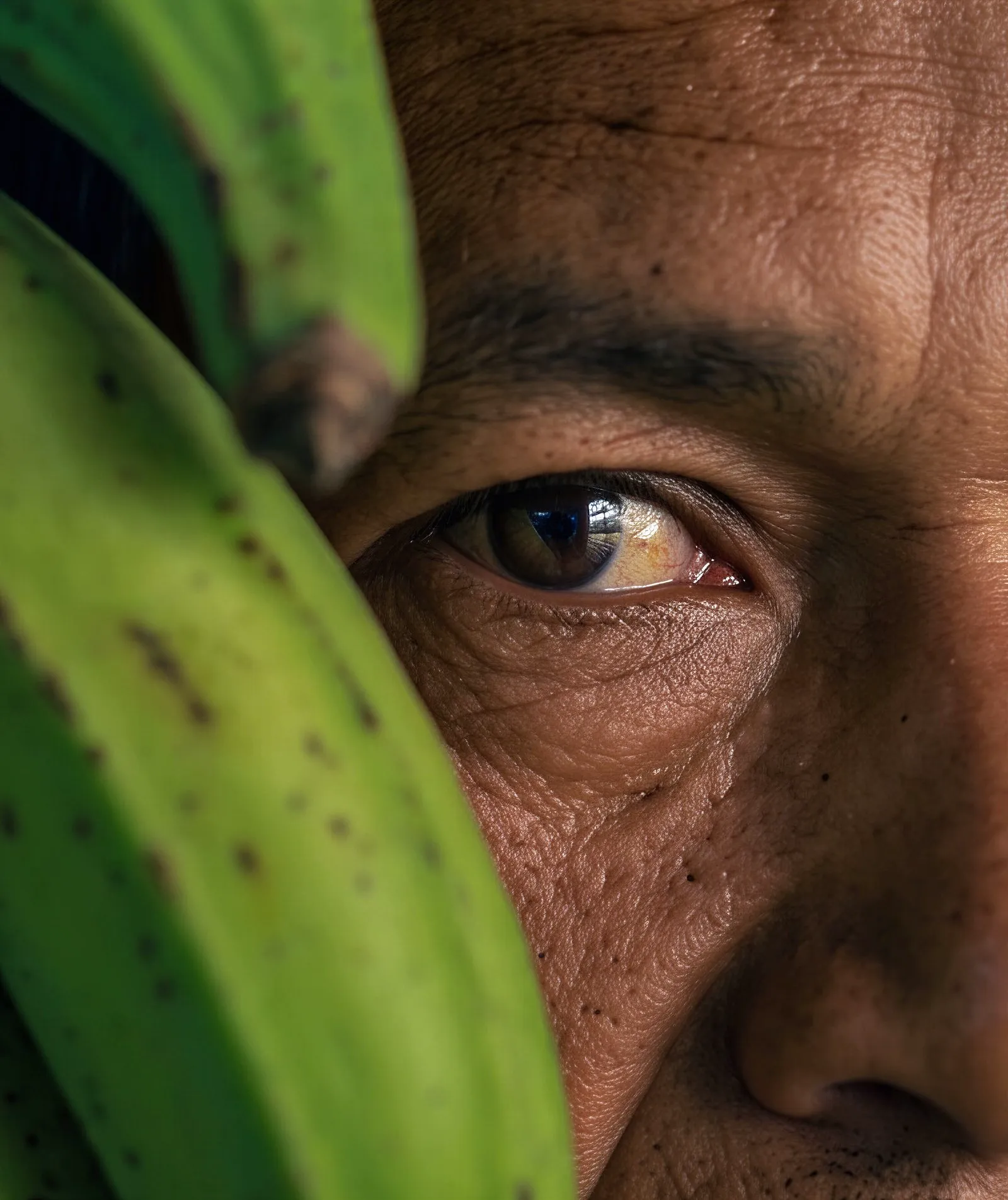
For the walls, we prepared five images at panel resolution that open a new visual repertoire for the brand: Brazilians working and building, like the ovenbird that raises its own nest.
A quiz kiosk tested visitors on machinery and on buying a pre-owned unit, and captured their contact at the end. Over three days, 218 people played and answered 1,744 questions with 81% correct; 169 left a valid WhatsApp number.
The video below was shot on day three, with directors and staff talking about the new brand inside the booth. The CEO’s speaking guide started from one line: the brand is new, the transformation started long before.
Ongoing operation
The new brand already runs in media and CRM.
Headcore already ran VRental’s media and content before the name change, and the work carried on with Atibra. When Paving Expo closed its doors, the conversation with everyone who stopped by the booth picked up the very next day.
Booth visitors got a thank-you with a single question: is your interest rental, pre-owned or both? One click, no form. The answer takes each person to the right content and the right sales team, and those invited who could not make it received their own version to stay in touch.
On social, October’s ads put the booth team in front of the camera to talk about the new brand and opened with the VRental agora é Atibra animation. The brand switch across the remaining touchpoints continues as a rollout through the end of the year.
Results
The brand arrived ready, and the conversation goes on.
Before.
VRental: a name that only told the rental story, a logo with no symbol, colors without rules and two fronts, rental and pre-owned, each speaking its own way.
After.
Atibra: ATIvos and BRAsil in the name, asset management as the promise, the flag’s diamond drawn into the logo and a full system ready to grow. From the team’s uniform to the machine on site, from the booth to the film, the brand leaves the house fully dressed.
Atibra arrived at Paving Expo in new clothes: on the booth, on the team’s uniforms, on the machine up front and on the big screen. And it left with an open conversation with everyone who stopped to meet the brand.
Your success is our asset.
Start now
Accelerate your results.
Talk to our team and get a free diagnosis.