Avantar
Avantar: a regional insurance network that needed to become a national franchise brand.
Avantar · formerly Rede RSup
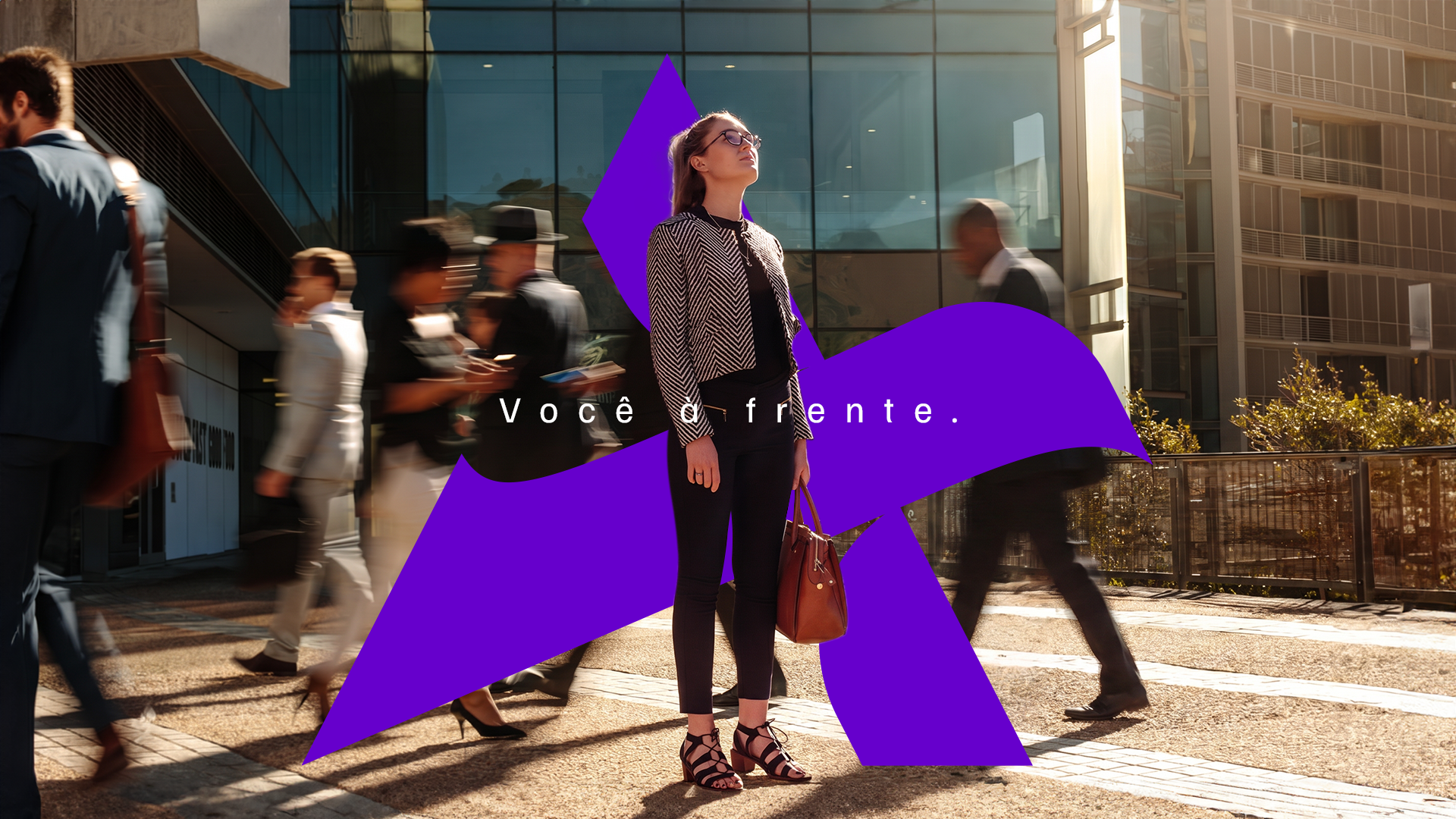
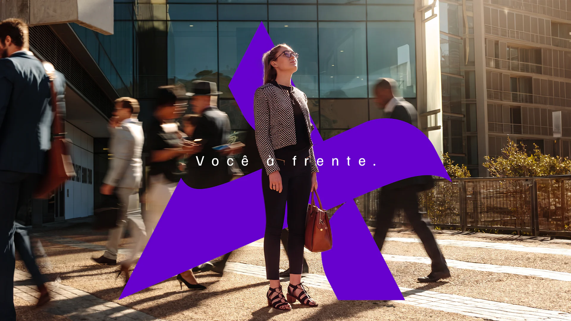
Você à frente. (“You ahead.”)
Industry
Insurance · Group Financing · Health Plans (franchise model)
What we did
Naming
Branding and brand architecture
Interior branding and signage
Brand applications
The challenge.
Rede RSup still carried in its name traces that came from the founder’s father. Daniel was the second generation of the “Roberto Seguros” brokerage, where he gained the experience to build the franchise network. A brand like that grows up to a certain point, but it had to explain itself too much. Past that, the name really starts to get in the way.
Daniel Neves and Natália Paiva, the entrepreneur couple leading the network, wanted a franchise that could open in any city in the country. And one that would say, before explaining the product, what the customer gains there: getting ahead.

The name.
That is where the name came from. Avantar crosses avante (forward) with avatar: forward motion and the idea of someone acting on your behalf. The tagline simply completes the sentence: “Você à frente.” (“You ahead.”)

The symbol.
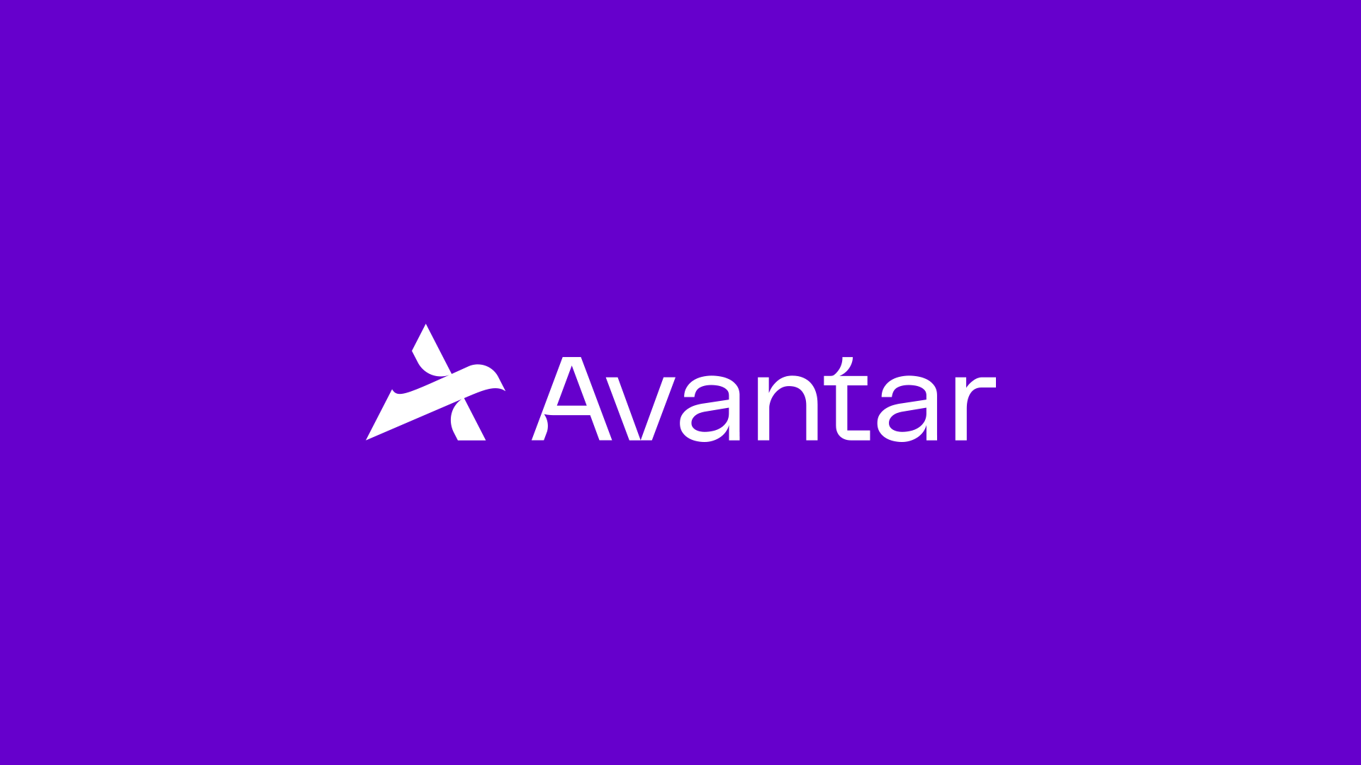
The symbol follows the same logic. A bird in flight drawn over the letter A, where the wingtip becomes the letter’s diagonal stroke. You can read it as a bird or as typography, and both readings work.

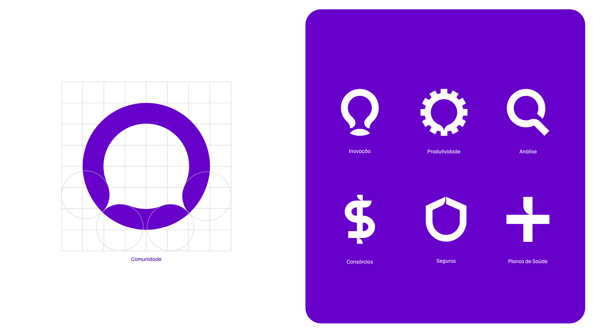
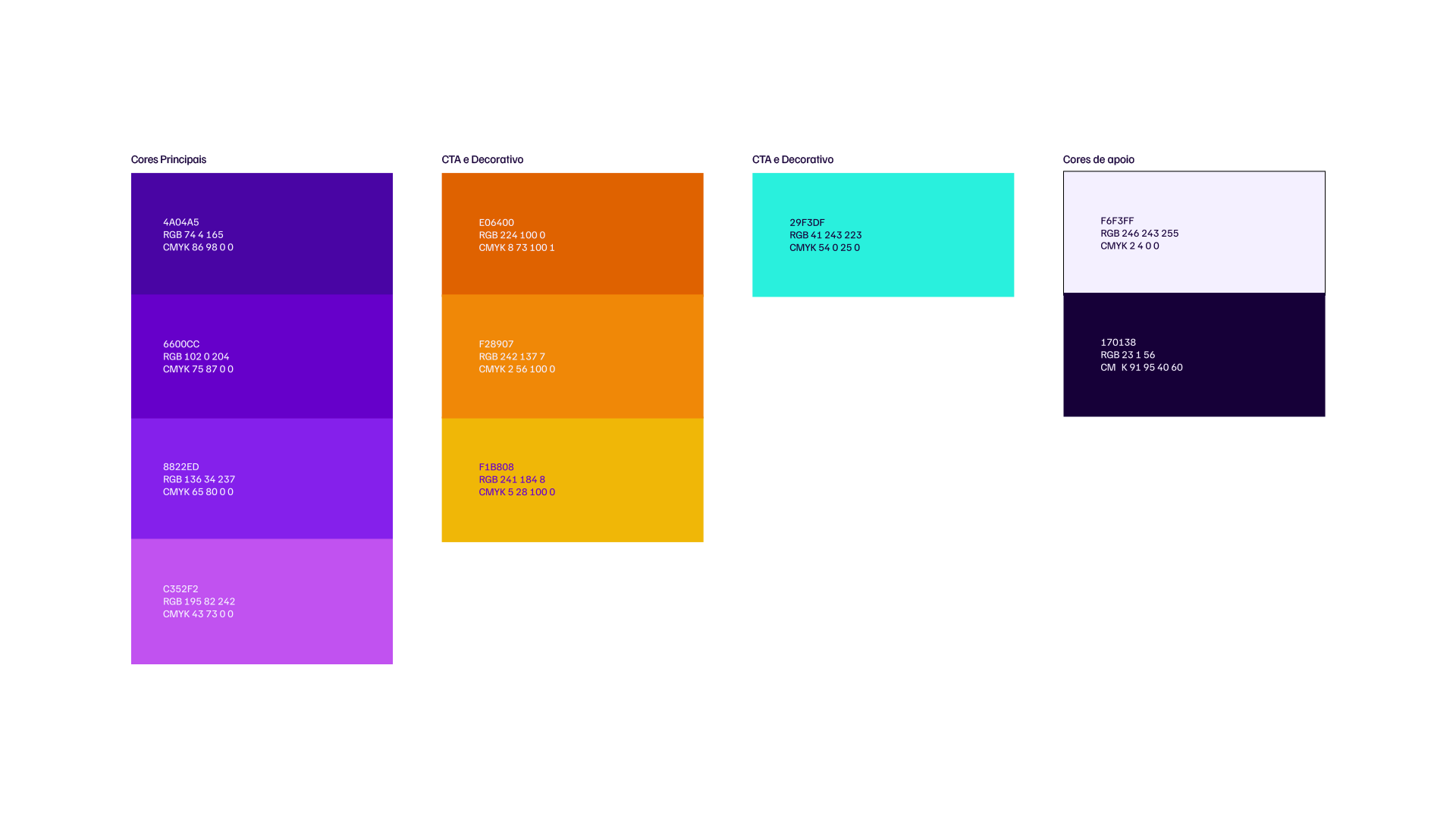

From paper to architecture.
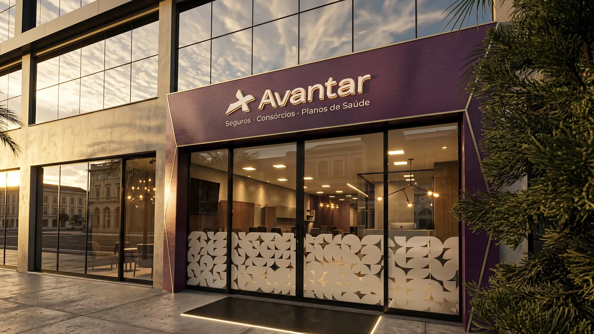
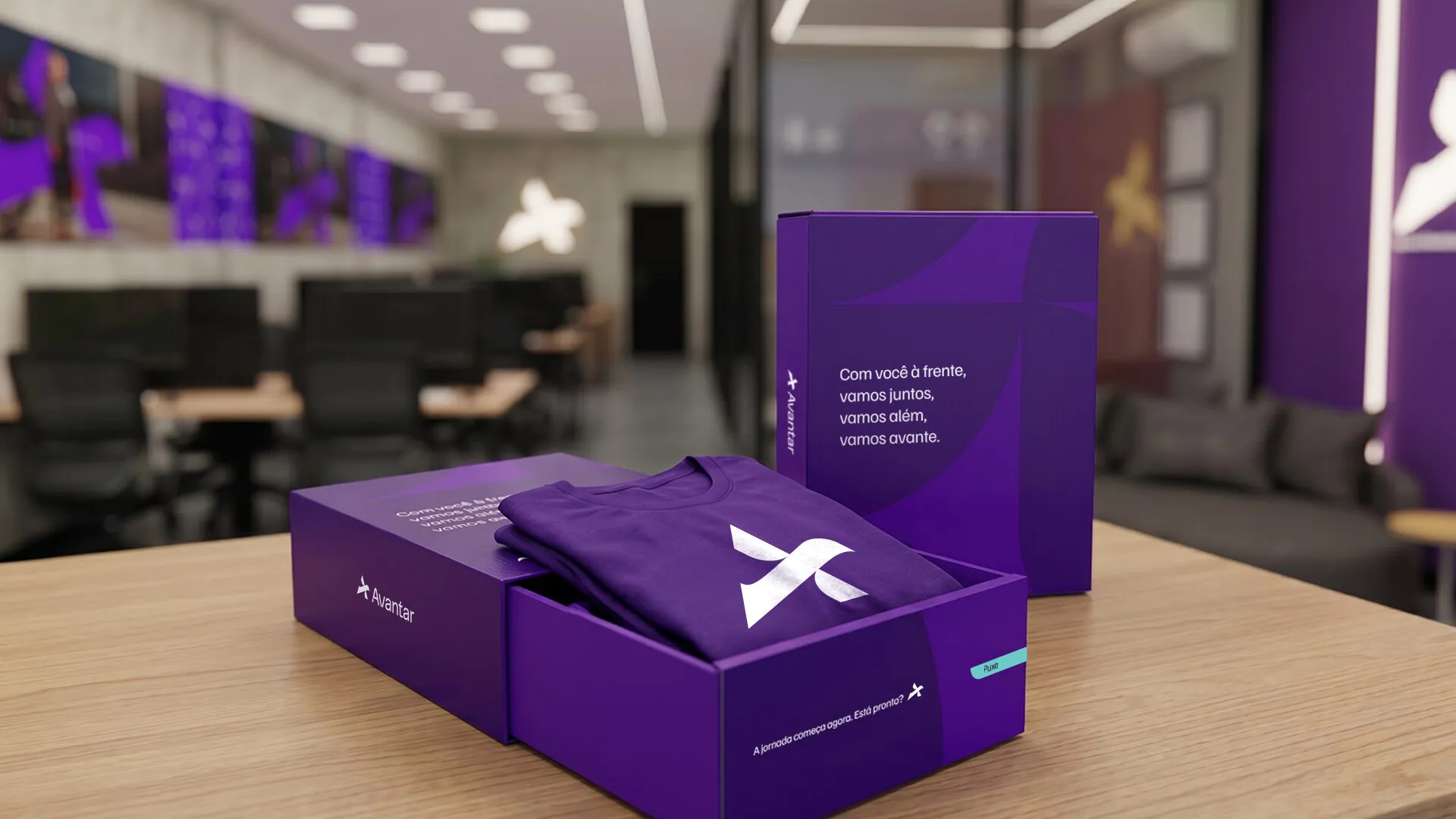
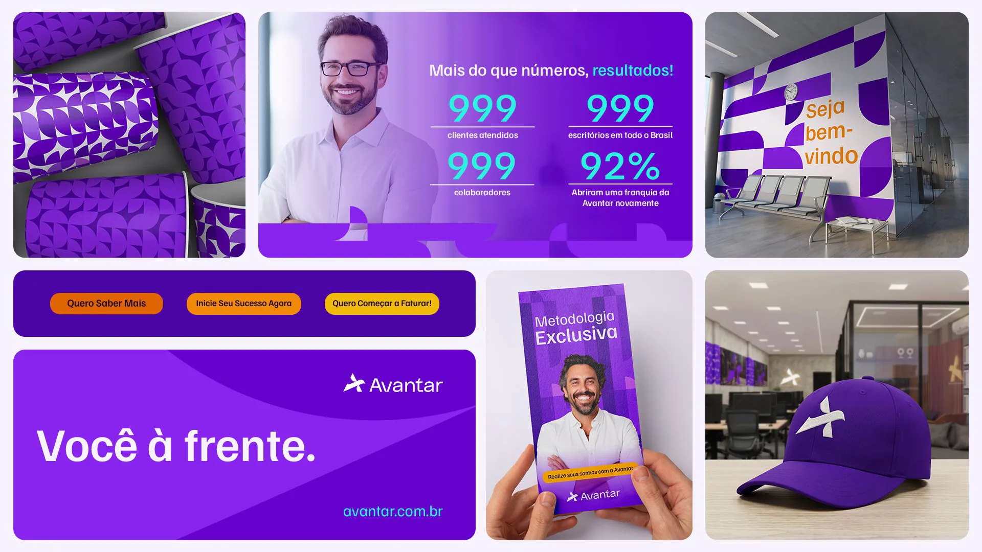
The visual system did not stop on paper. The purple geometric shapes became reception walls, dimensional facade signage, glass partitions and door decals. The identity started working as architecture, not just as a brand book. Every new unit opens already recognizable.

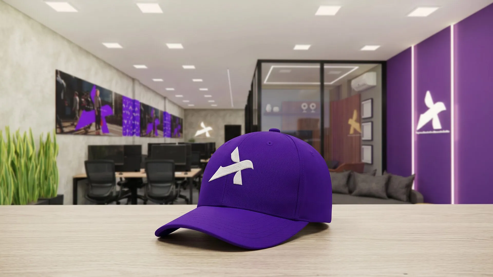
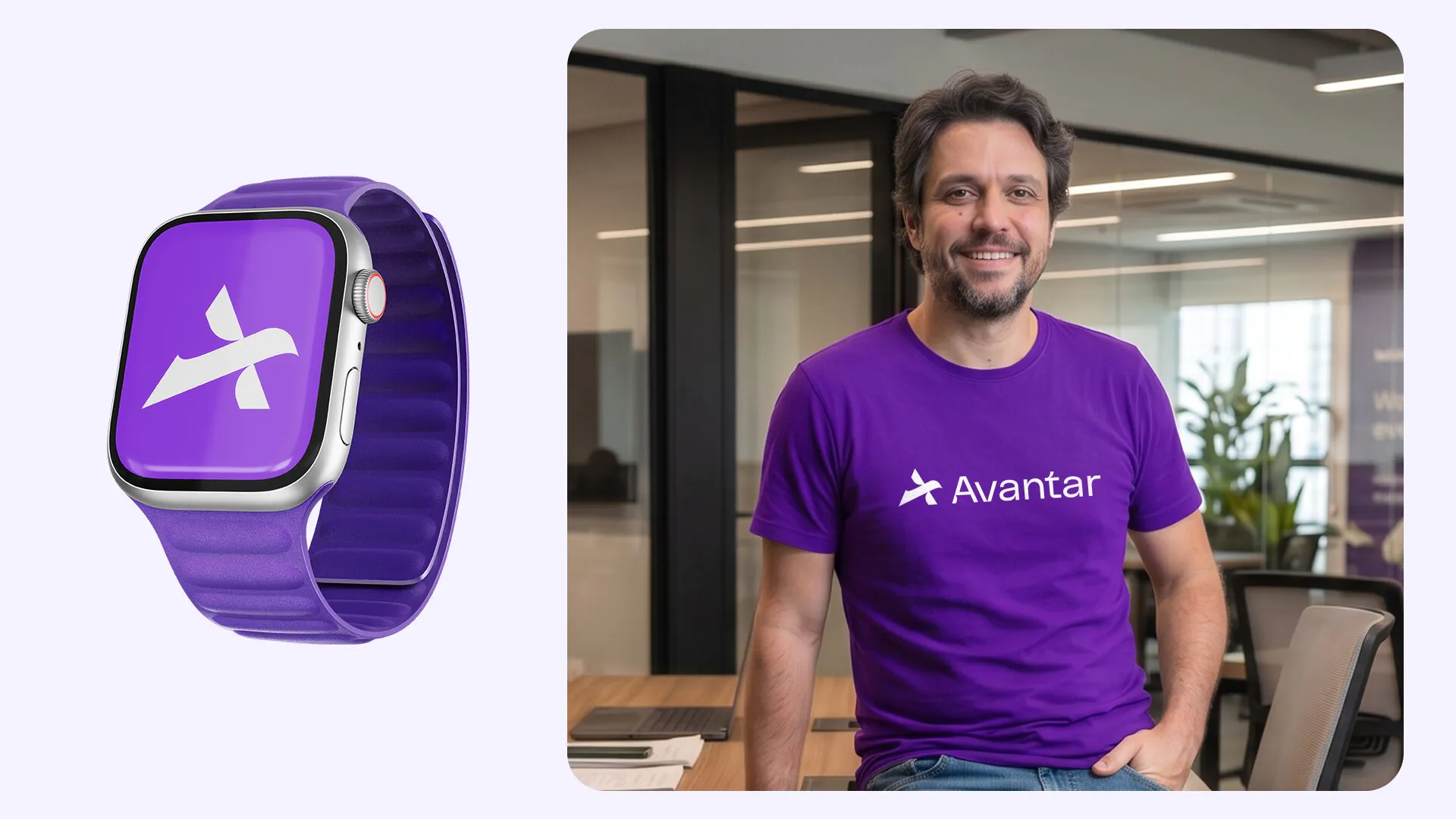
The applications.
Stationery, uniforms, point of sale and launch media: a system that installs physically and travels to any city without depending on local creative decisions.
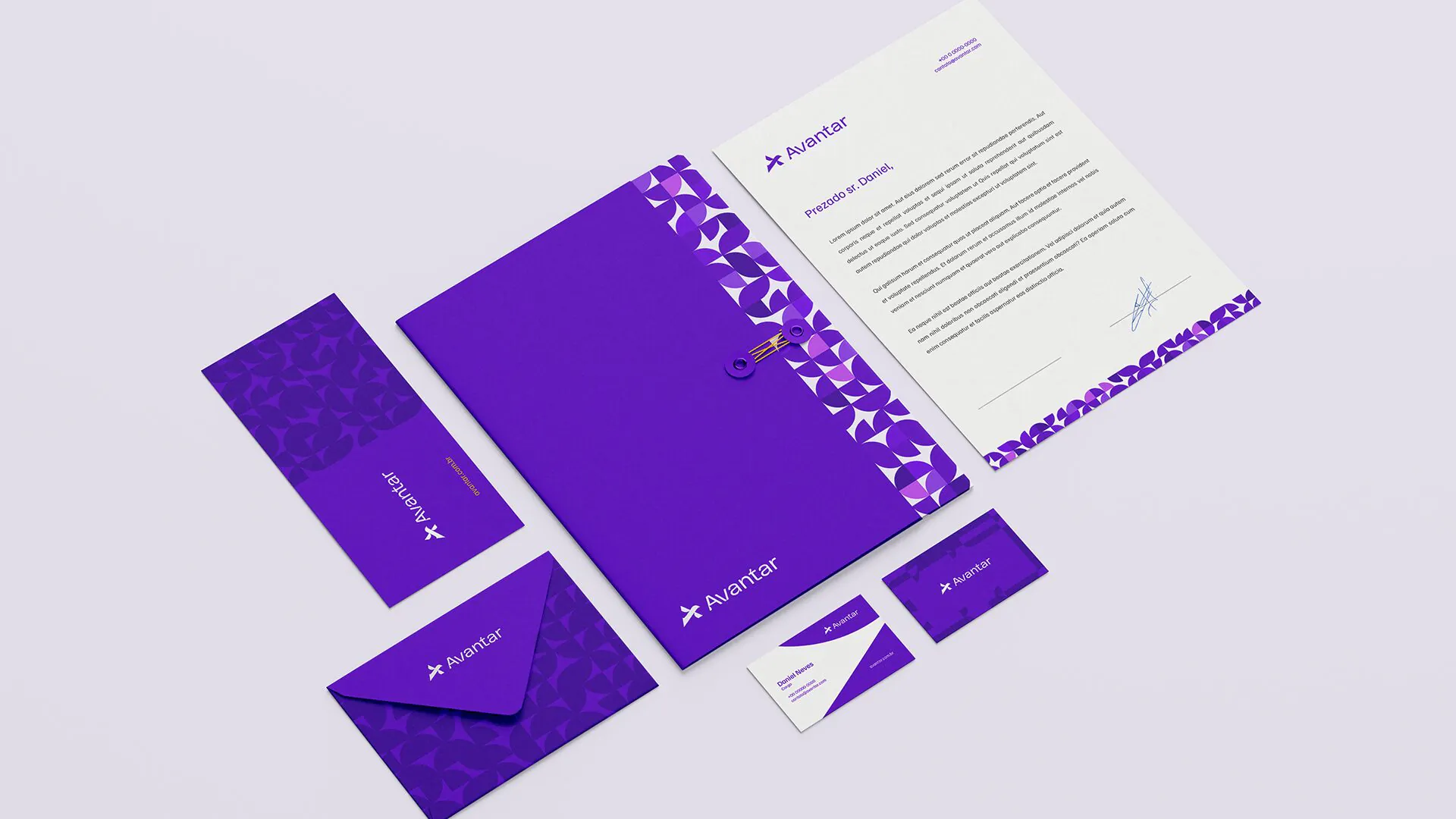
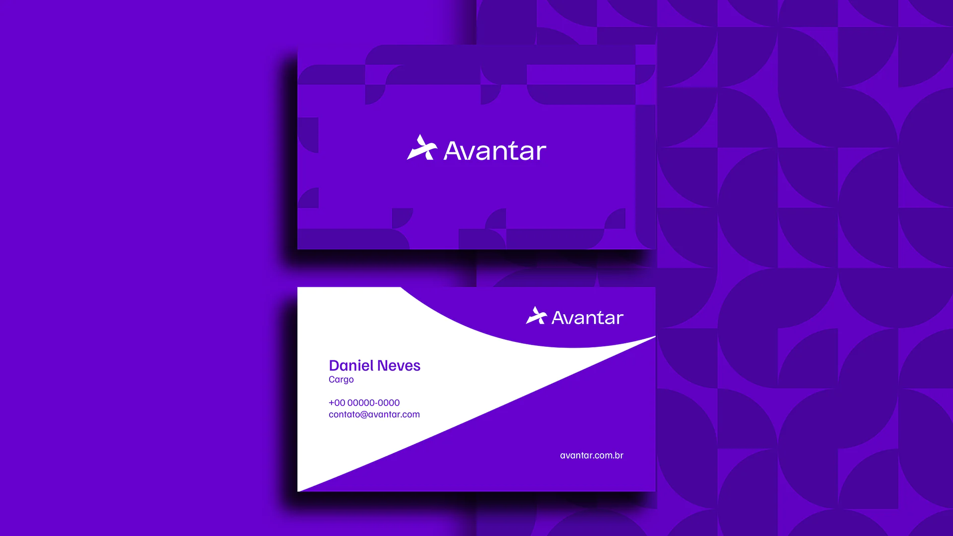
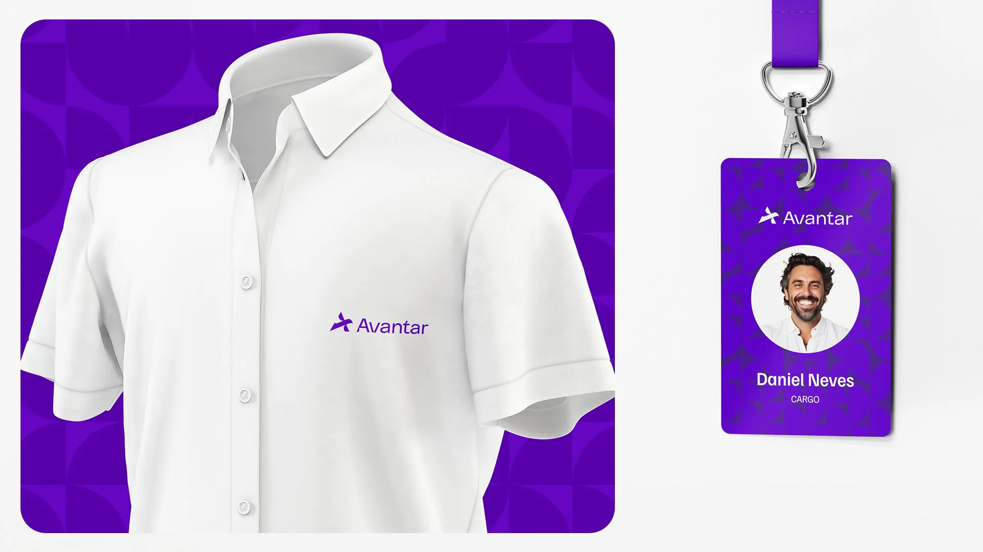
Before.
A state acronym that did not travel, with no proprietary symbol and no defined visual territory.
After.
A trademarkable name that fits all of Brazil, an original symbol, a proprietary purple palette and a system that installs physically. A franchise opens in any city with standardized facade, interior branding and signage, without depending on local creative decisions.

Avantar gave the network what it needed to scale: a name that works far from home, a symbol you recognize before you read it, and a space that communicates on its own.
Now it’s just a matter of opening the next unit.
Start now
Accelerate your results.
Talk to our team and get a free diagnosis.