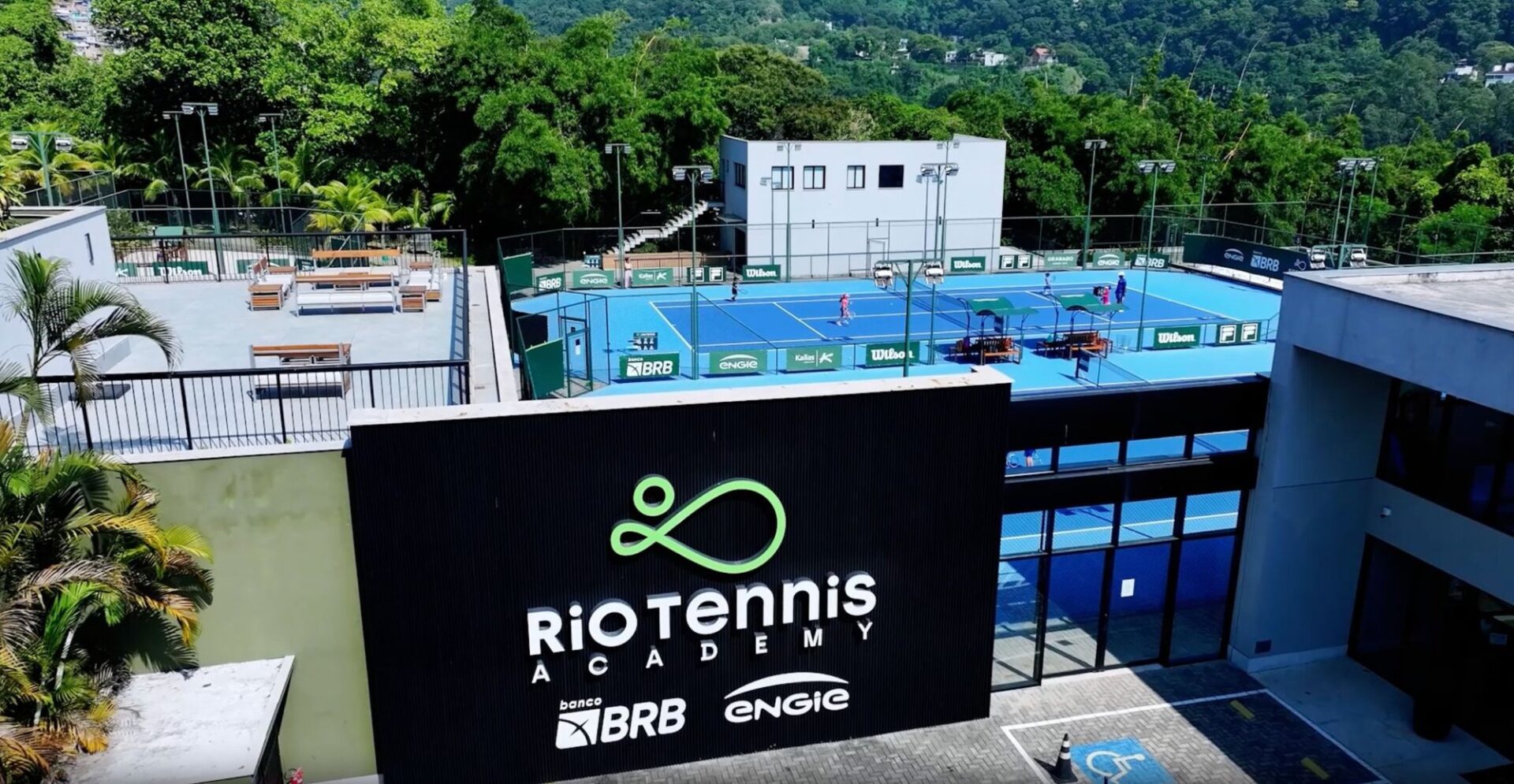
Rio Tennis Academy
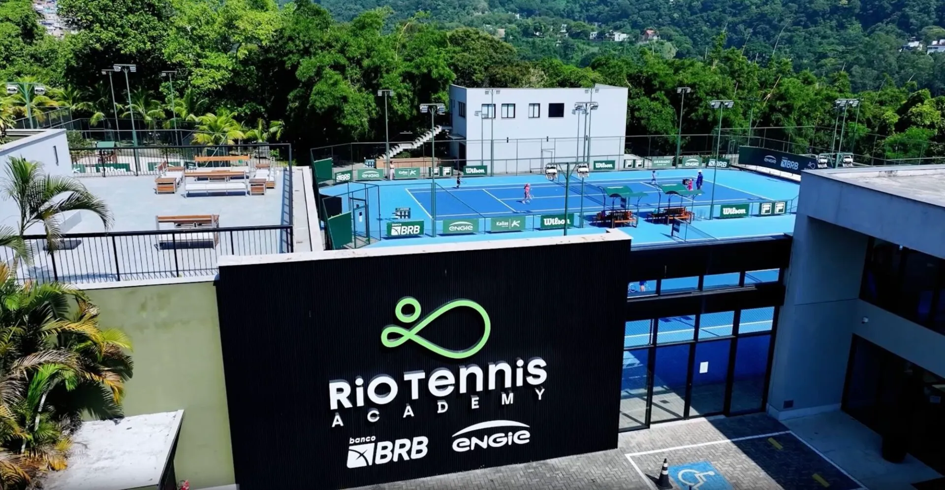
Rio Tennis Academy: the largest tennis complex in Rio de Janeiro opened with world-class facilities and a solid brand architecture.
Rio Tennis Academy
Long live tennis.
Industry
Sports · Performance · Wellness (sports complex)
What we did
Positioning and brand platform (Brand DNA)
Naming and brand architecture
Tone of voice and manifesto
Visual identity and design system
Signage and interior branding
Website UX/UI
360º communication, online and offline
Go-to-market: Rio Open activation
The challenge.
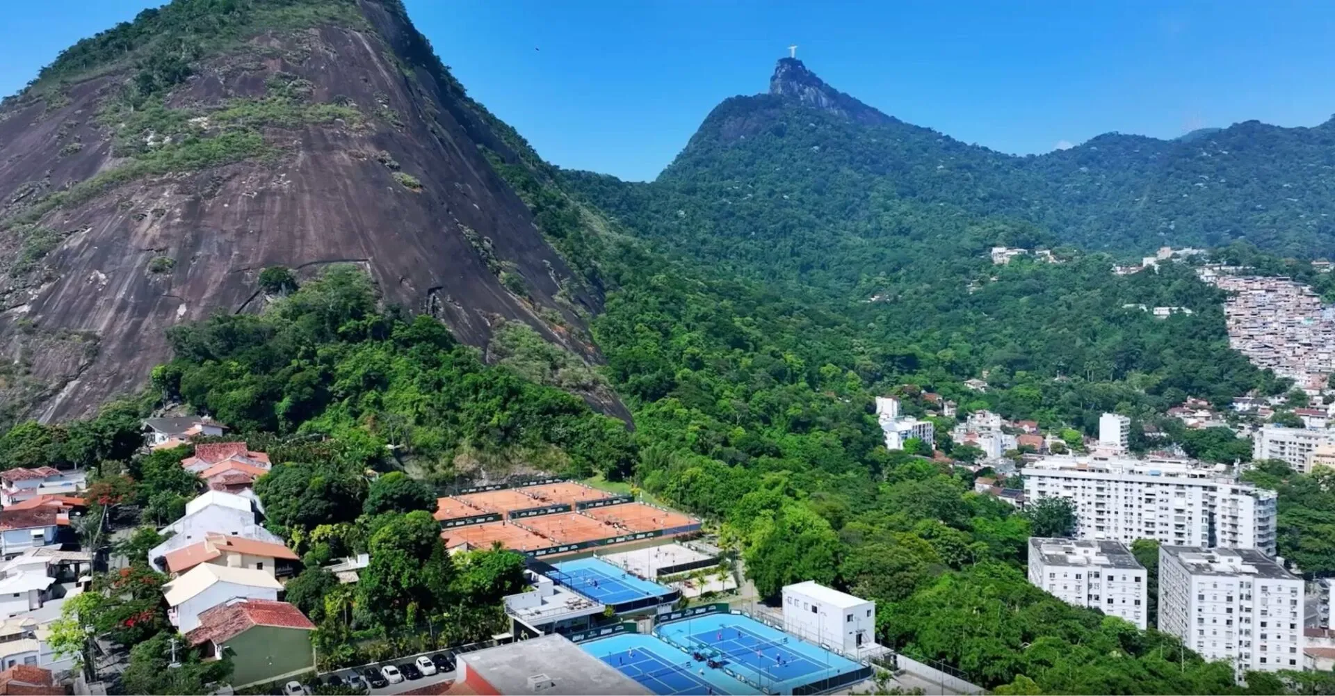
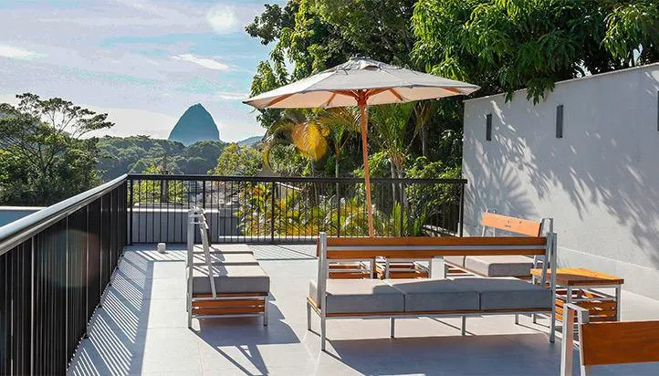
A sports complex doesn’t open in stages. Rio Tennis Academy launched as the largest tennis complex in Rio de Janeiro: clay and hard courts, beach tennis, a performance gym, physiotherapy, wellness, a restaurant, coworking, a lounge, an auditorium and a boutique. All at once, on a site between Christ the Redeemer and Sugarloaf.
The facilities were world-class. The brand did not exist: no positioning, no visual identity, no narrative. And the address still carried the memory of the club that had been there before, so anyone walking past would read “another tennis school”. Rio already had plenty of those.
The positioning.
The turning point was to stop competing in the “tennis academy” category and claim a different one: a brand that transforms lives through sport. Not a school, not a gym. The place where coaching, performance, physio and wellbeing happen under one roof, for the same person.
The territory fit into two words that drove everything after it: high tech + deep touch. Technology and data in service of an experience that ends in care, not in a report. And the purpose became a verb: inspire, teach, transform.
To make that survive day-to-day decisions, we built a brand compass: purpose at the centre, four pillars and eight attributes. They are transparency, diversity, power, transformation, excellence, achievement, fulfilment and knowledge. It lets the brand decide on its own when nobody from the project is in the room. In tone of voice, the passion for the sport became the thread running through everything the brand says.
The name.
Rio Tennis Academy is a name that doesn’t try to be clever. Academy is the suffix the category itself uses to say “people learn seriously here”. It is what Rafa Nadal, Bruguera, Barcelona and Soto all do. Attached to Rio, it delivers place and category in a single read, and it works the same in Portuguese and English, which matters when you host players from abroad.
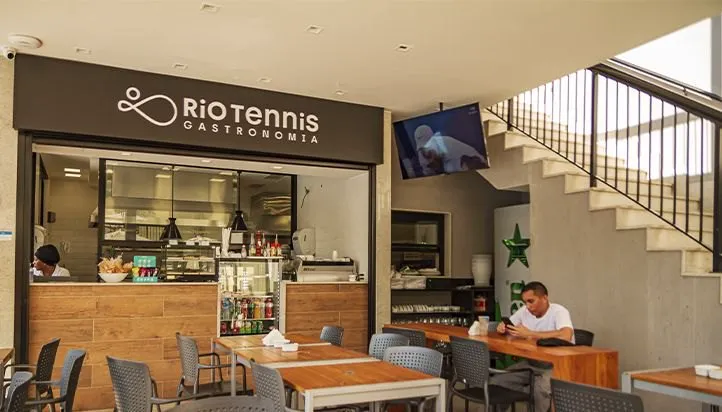
The brand architecture was designed to stretch without breaking. Rio Tennis Beach Tennis takes the sport’s literal name. Rio Tennis PFW (Perform. Fit. Wellness.) opens a new category for everything the word “gym” couldn’t hold. And the restaurant enters as Rio Tennis Gastronomia. Every new space is born inside the brand instead of becoming a brand of its own.
The symbol.
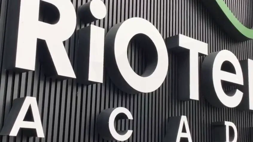
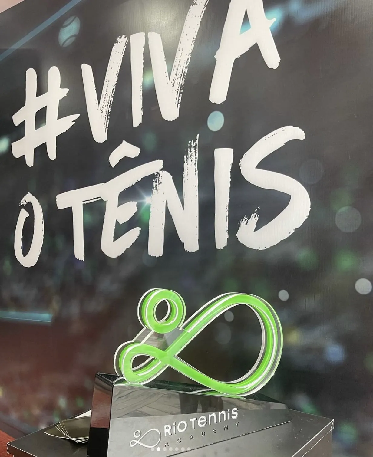
The symbol is a single stroke. The line leaves the silhouette of the hillside, passes through the serve motion and closes into a racket with the ball. Rio’s landscape, the player and the sport resolved without lifting the pen off the paper.
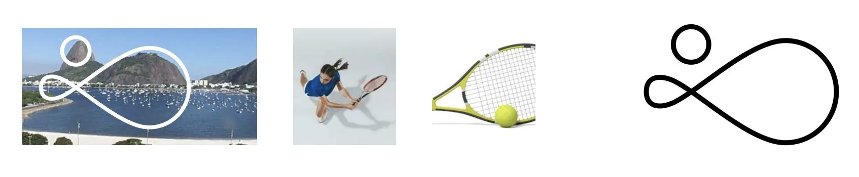
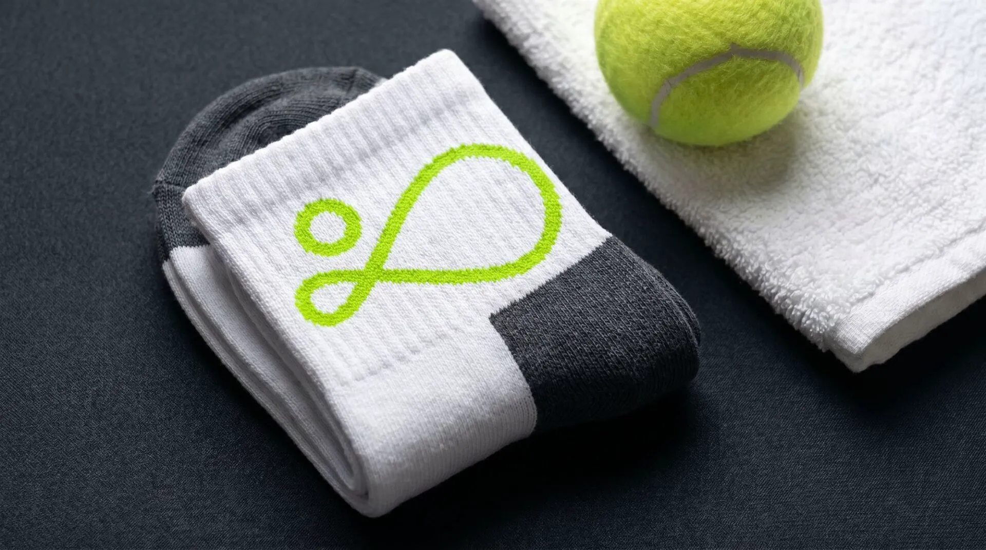
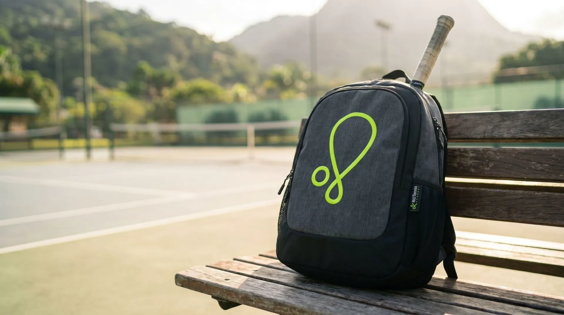
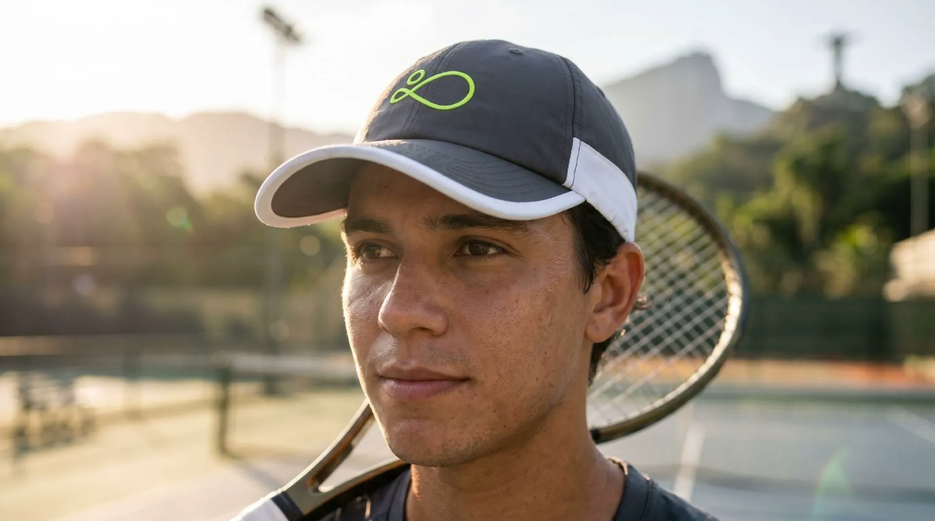
In acid green, that stroke holds up as a lapel pin, wall relief, embroidery on a sock and an award sculpture. It’s the test most sports brands fail: surviving small, monochrome and in relief.


The brand on the body.
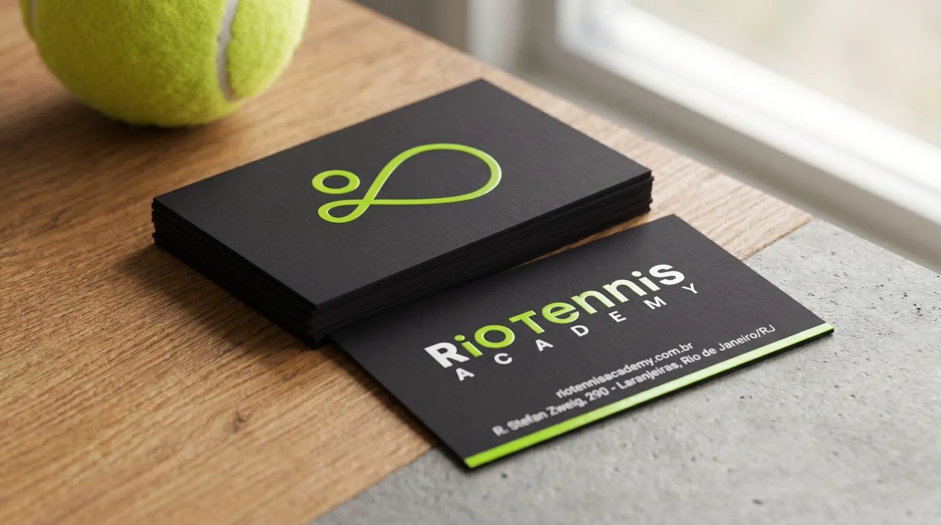
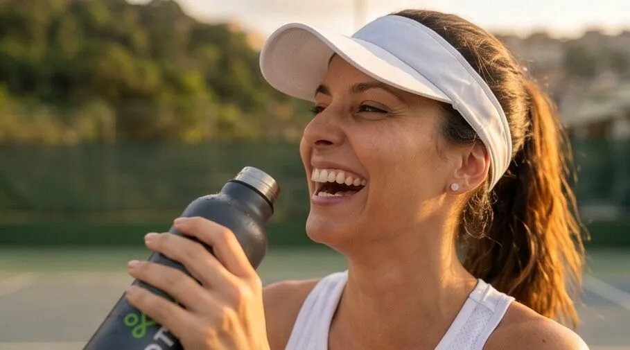
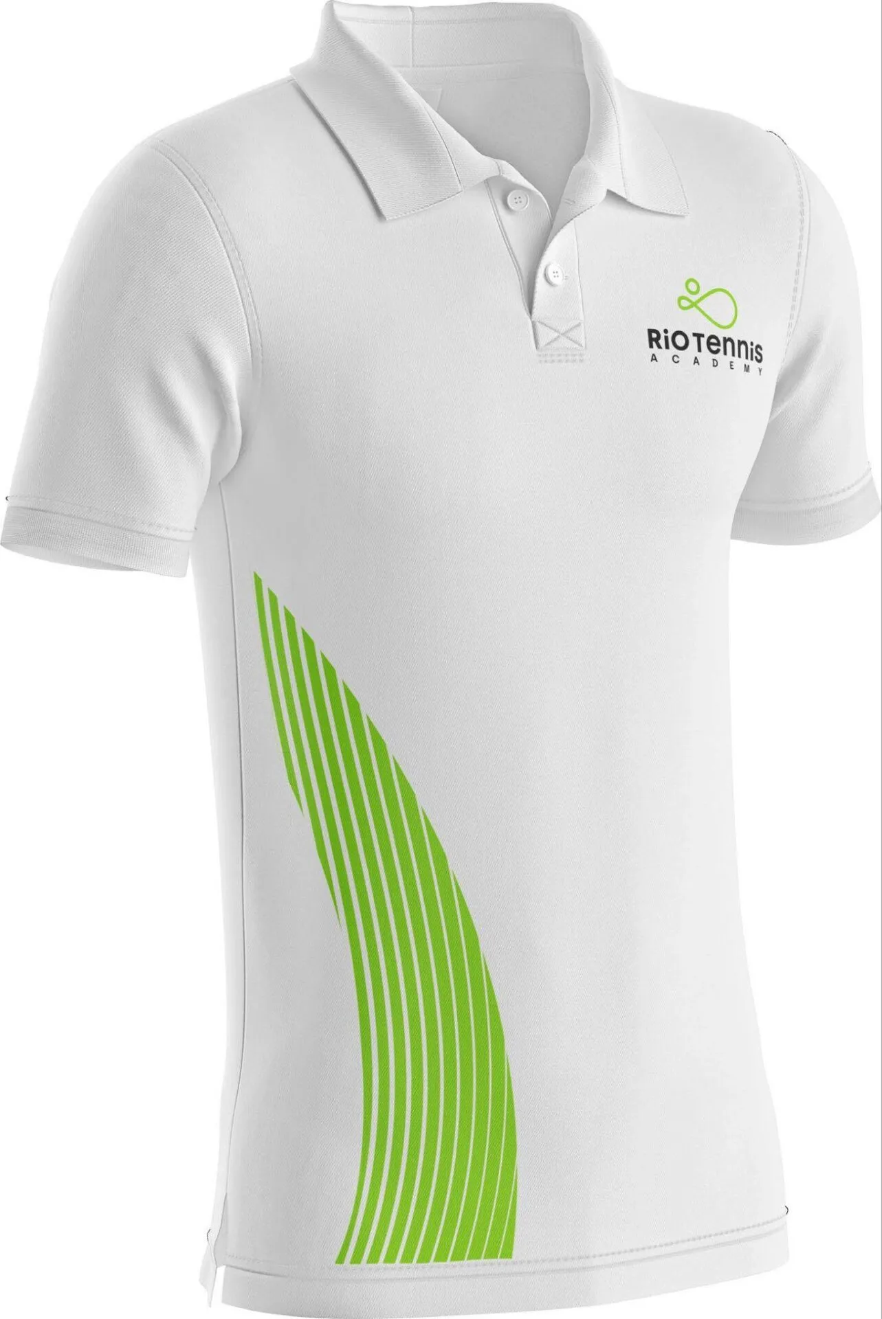
At a sports complex, the brand is worn before it is read. Cards, socks, towels, backpacks, caps, bottles and kit were treated as the first touchpoint, because that’s what leaves the court and keeps circulating around the city.
From graphics to space.
The graphic pattern wasn’t invented: it came from the chain-link mesh already fencing the courts. What had been there all along became the brand’s texture, in perforated metal, totems and walls.

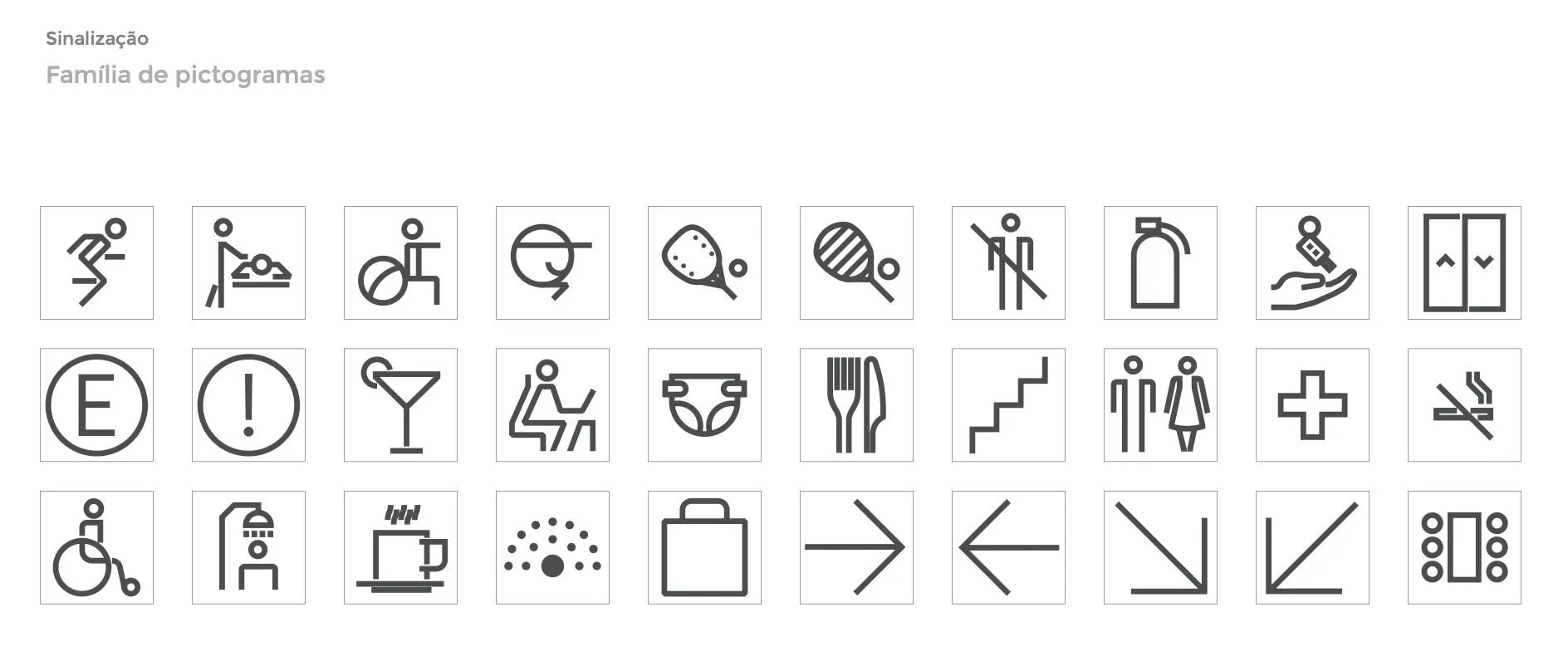
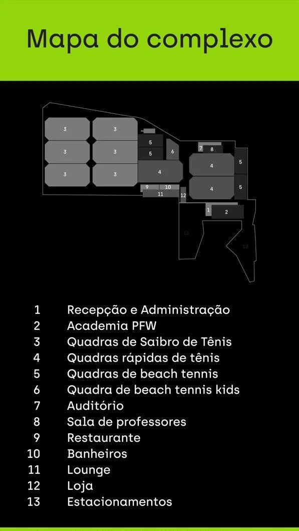
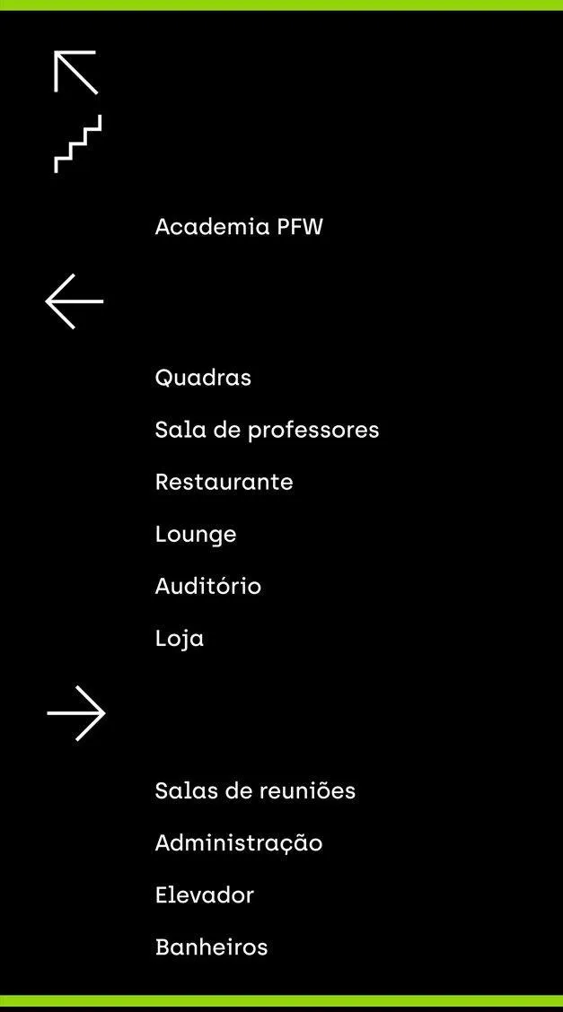
A complex with thirteen areas can’t let anyone get lost between reception and the court. We designed the pictogram family, the totem carrying the complex map and the directional signage. From there on the brand started guiding people, not just signing off.

Online and offline as one system.
The brand couldn’t live on the walls alone. Social media started speaking from the positioning, material was designed for every touchpoint, from the print at reception to the post, and the institutional website got its own UX and UI.
That’s what we call phygital: digital and physical operating as a single system, not as two campaigns that merely look alike. Whoever finds the brand on Instagram meets the same thing on the reception wall, and the other way around.
Viva o tênis.
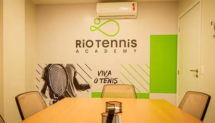
The manifesto ends on a line that became the signature: Viva o tênis, long live tennis. It works both ways, as invitation and as celebration, which is why it went straight from paper to the wall, to brand activations and to the Rio Open.
The launch at the Rio Open.
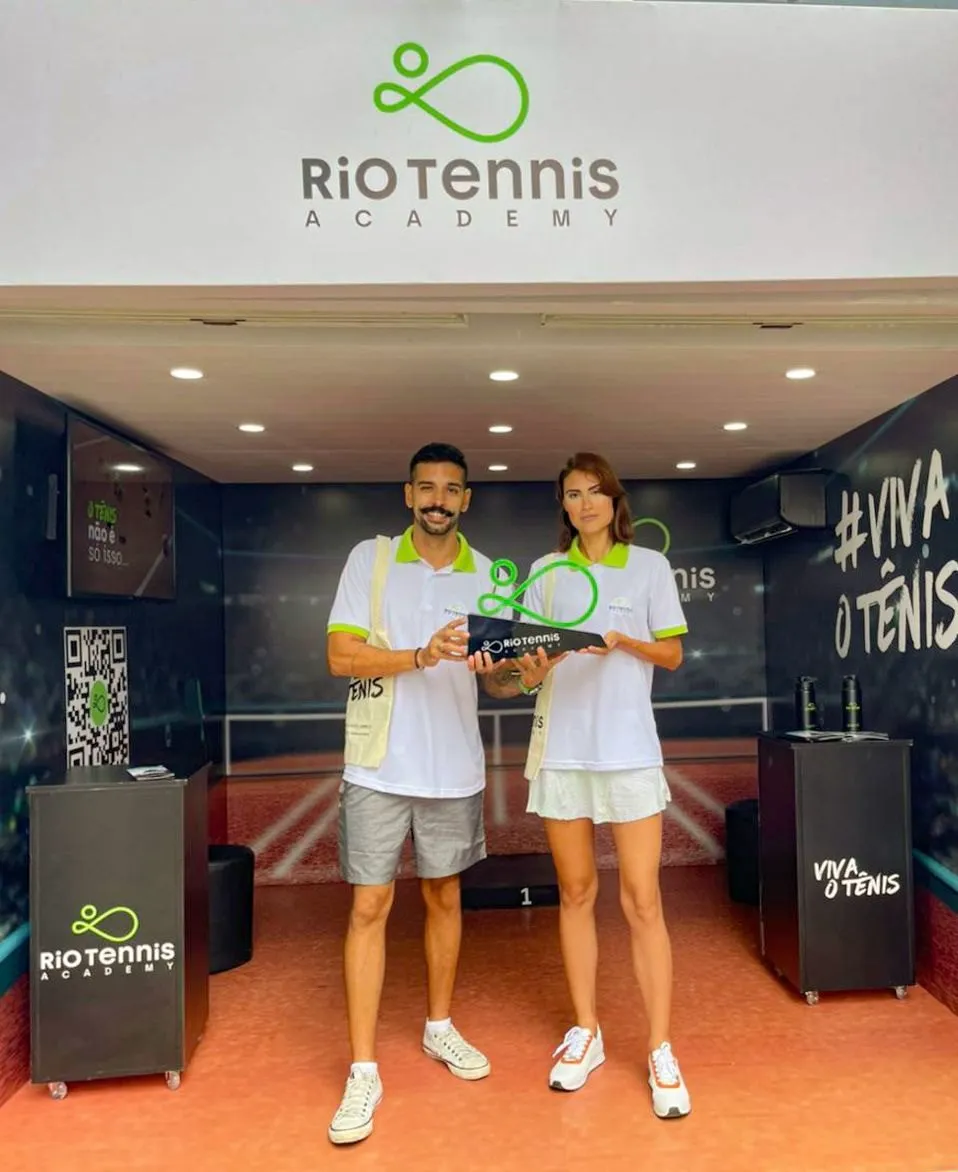
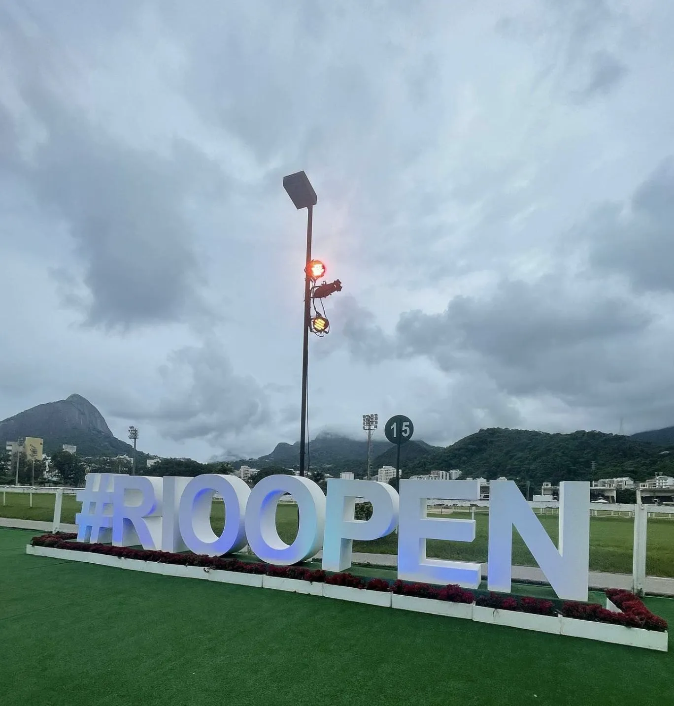
The go-to-market was to launch the brand inside Brazil’s biggest tennis event. Consultants on site talked to the public and a QR code led straight to pre-registration landing pages. The activation wasn’t handing out swag: it captured intent at the moment people were closest to the sport.
The results.
482 pre-registrations. No paid media.
The activation converted because it had substance, not a media budget. When brand, communication and activation operate as one system, paid media becomes an accelerator, not a crutch.
Before.
World-class facilities and no brand at all: no positioning, no visual identity, no narrative. A real risk of being read as the old academy at that address, and as just one more tennis school.
After.
A category of its own: a brand that transforms lives through sport, high tech + deep touch. A naming system that holds beach tennis, performance and the restaurant without spawning loose brands. A single-stroke symbol that runs from pin to totem. A space that guides whoever arrives. And a launch that brought in 482 pre-registrations without a single cent of paid media.
From the clay courts to the coworking, every part of the complex says the same thing. With no sign needed to explain what it is.
Viva o tênis.
Start now
Accelerate your results.
Talk to our team and get a free diagnosis.