Nestlé Nutre
Nestlé Nutre: Nestlé Health Science’s nutrition e-commerce stopped being named after what it delivers and started saying whose it is.
Nestlé Nutre
Nutrition for healthier lives.
Industry
Health · Nutrition · E-commerce
What we did
Brand strategy and positioning
Name and tagline
Archetypes and golden circle
Logo, endorsement lines and N+ short version
Brand for the Programa Nestlé Nutre
Palette, icons and graphic assets
Institutional and conversion key visuals
Social posts and website banners
Shipping box and merchandise
Where we started.
Nestlé Health Science sold its nutrition products through an online store called Nutrição até você (“nutrition to your door”). The name explained the service, home delivery, but did not say whose store it was. Someone arriving from a Nutren ad found nothing in the name assuring them they were buying from Nestlé itself.
The project had three fronts: rebranding the e-commerce, creating the concept and brand for a new patient support program, and a style guide with the rules of the new identity.
The name.
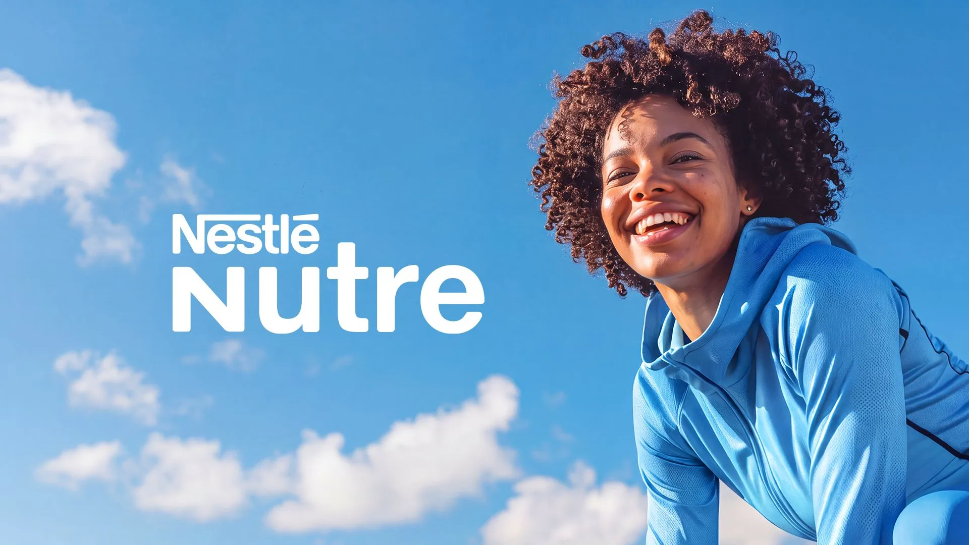
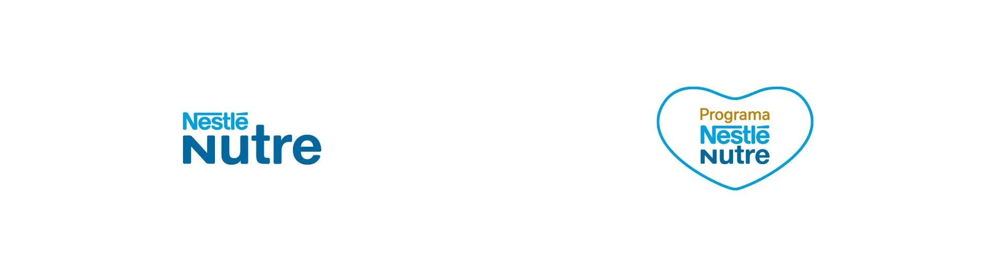
Nestlé Nutre puts the parent brand first and swaps a description for a verb: nutre means “nourishes”. It fits the supplement of someone who trains, the vitamin of someone past 50 and the specialized nutrition of someone in treatment. The tagline finishes the sentence: Nutrition for healthier lives.
The old name stayed in the house. Nutrição até você became one of the brand’s endorsement lines, used on pieces about buying and delivery. The same logic named the patient support program, Programa Nestlé Nutre, whose logo sits inside a heart.
The positioning.
Nestlé Nutre presents itself as Nestlé’s official channel for following each person’s nutrition, with goals that range from health and performance to beauty and clinical conditions that call for specialized nutrition. Product, content, specialist support and checkout live at the same address.
The personality blends four archetypes with set weights. The Caregiver accounts for 50%: the brand stays beside whoever needs it, including during treatment. The Sage, at 25%, brings nutrition knowledge. The Magician, at 15%, the science behind each formula. And the Hero, at 10%, speaks to people who have a goal and train to reach it.
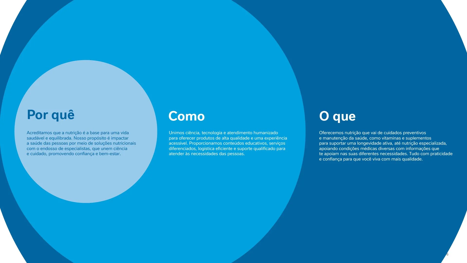
The golden circle organized the message in layers. The why is the belief that nutrition is the basis of a balanced life. The how brings together science, technology and human service, with educational content, logistics and support. The what runs from a vitamin for healthy aging to nutrition that supports medical conditions.
Photography.
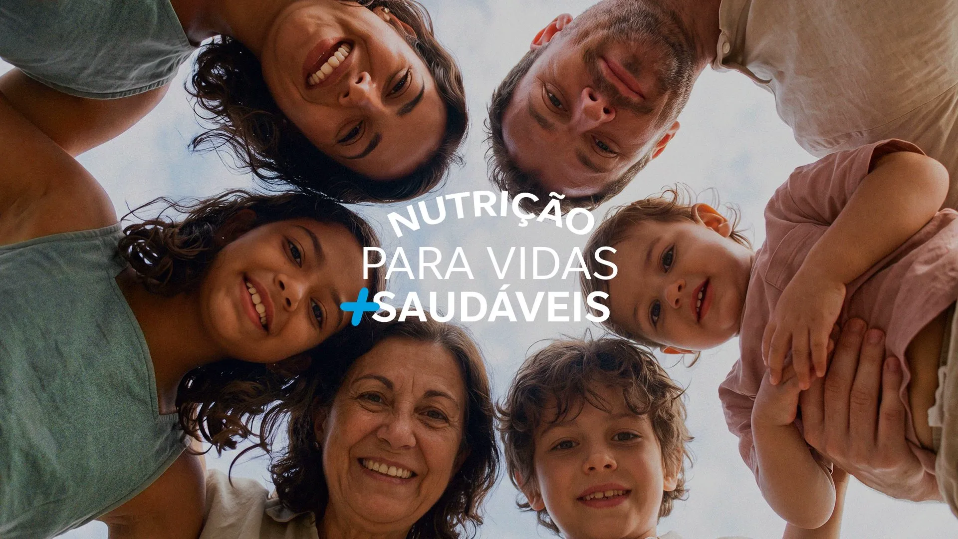
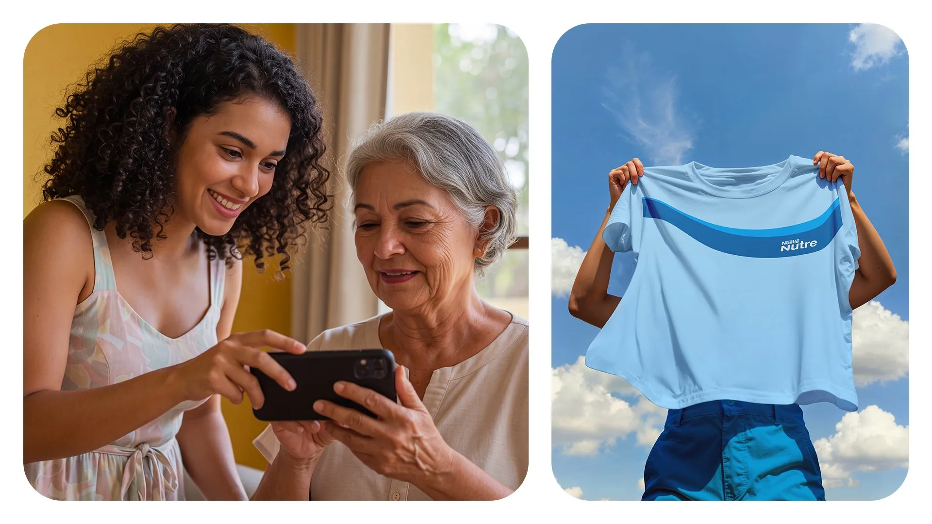
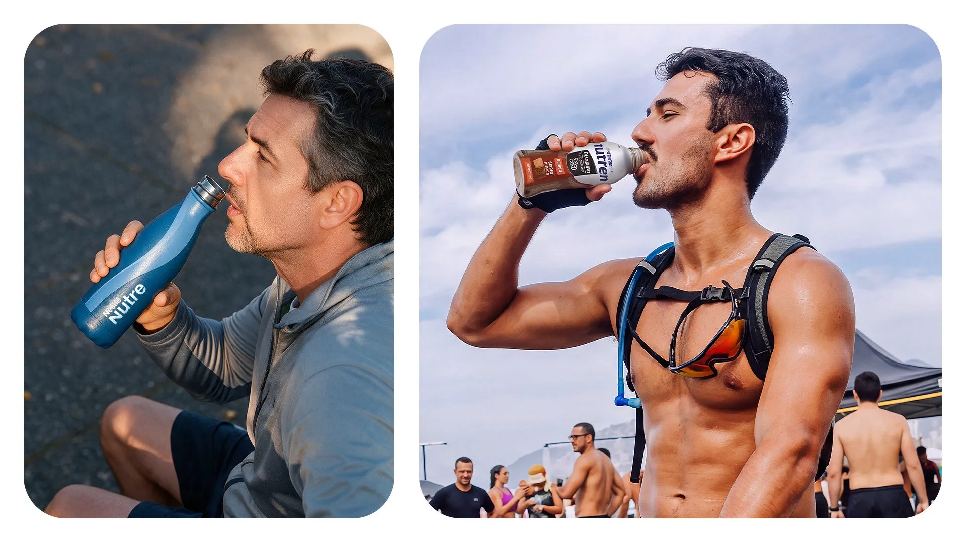
The moodboard defines who appears in the pieces: people of all ages in the middle of an activity, cooking with family, swimming, running on the beach or tending plants. Light is natural and warm, and the settings are home, beach and park.

The plus sign.
The + is the main asset of the identity and stands for addition: more health, more energy, more vitality. Its rounded shape reads as care, and a slight tilt suggests movement and support over time.
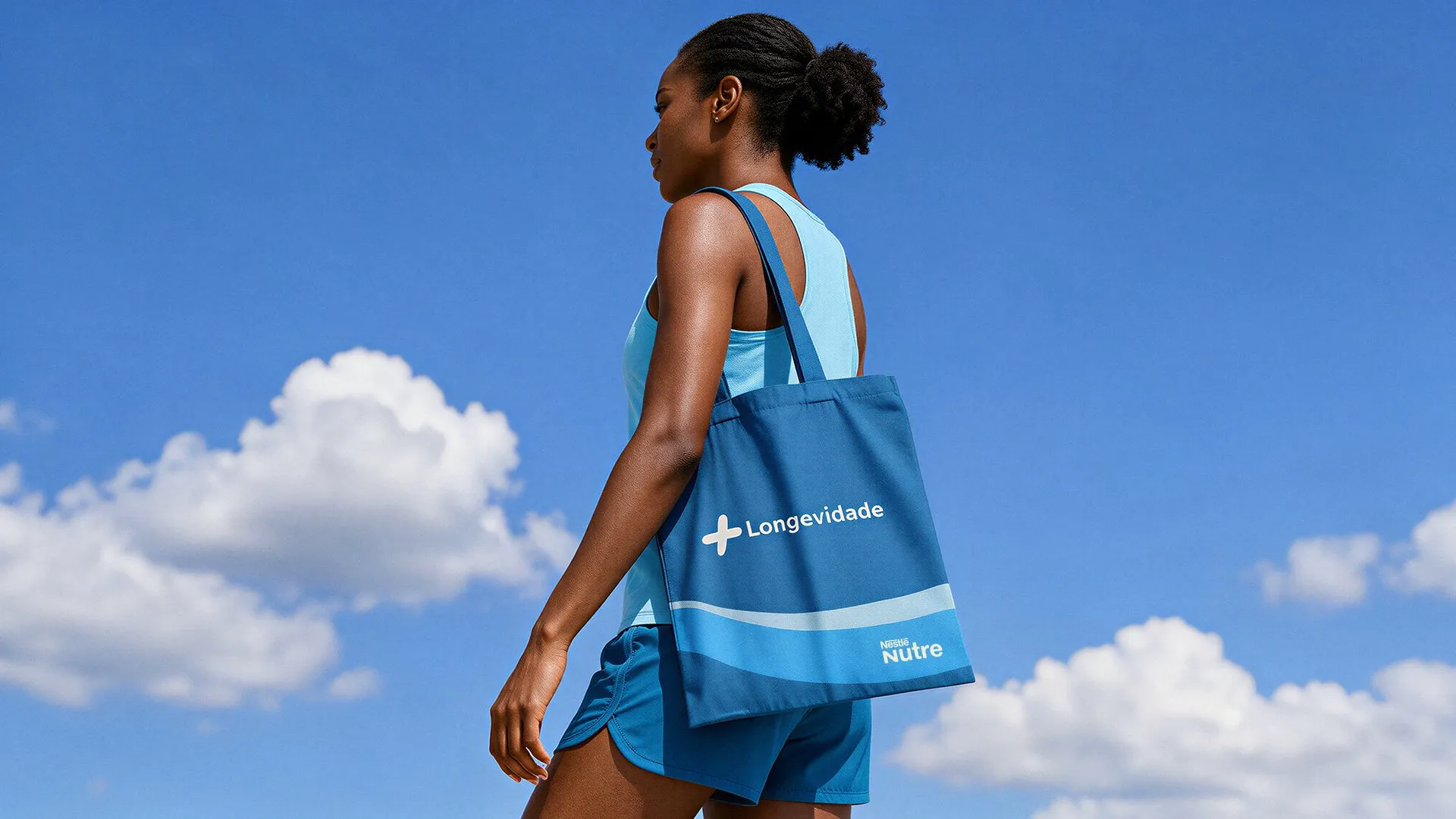
In the pieces it opens the endorsement lines, such as + Longevidade and + Saudabilidade, frames photos of people and highlights the word the brand wants to own in each context, such as care, science or performance.
The short version.
On an Instagram avatar, a WhatsApp profile picture or an app icon, the full logo loses legibility. For those spaces we drew N+, the brand’s initial with the plus sign, which stays readable at the size of a phone icon.
Color.
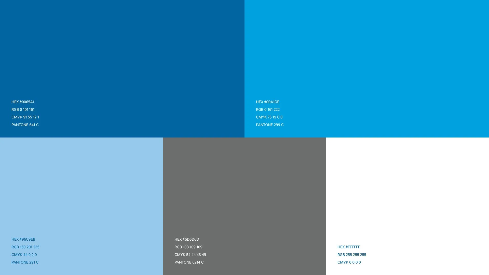
The colors come from Nestlé’s secondary palette, so the new brand still looks like part of the family. Three blues (#0065A1, #00A1DE and #96C9EB), a gray (#6D6D6D) and white, each with RGB, CMYK and Pantone equivalents.
The ribbon.
The secondary asset is a ribbon that runs across the pieces. It stands for the path of nutrition, which changes with each stage of life, so its thickness varies along the way. In the key visuals the ribbon separates photo from text and carries lines such as A jornada da nutrição (“the nutrition journey”).
Icons.
The line icon set covers the topics the store sells and explains: the 50+ audience, exercise, food, vitamins and supplements, and e-commerce. All share a single stroke in the palette’s main blue.
Key visuals and channels.
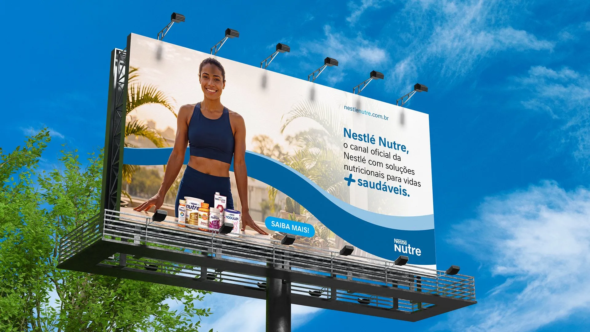
The key visuals are split by the job each piece does. Institutional ones present Nestlé Nutre as Nestlé’s official channel, with the product line in the foreground. Conversion ones sell a specific product, such as Nutren Senior and Nutren Control, with the offer up front.
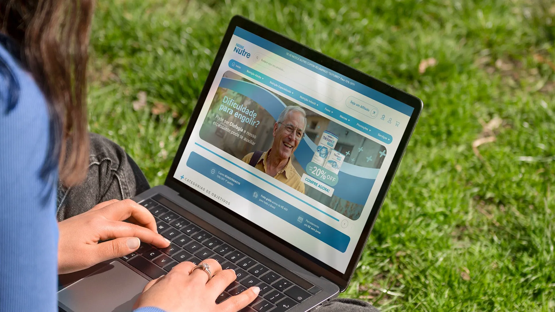
On social media, each post marks with the + the word tied to that post’s audience: comfort for people in cancer treatment, longevity for people past 50, performance for people who train. The website follows the same logic, with separate banners for consumers and patients.
Off screen.
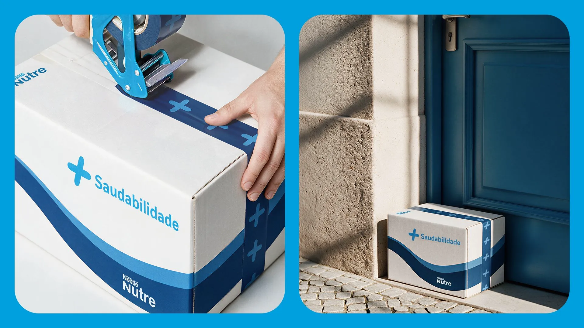
For someone who buys online, the first physical contact with the brand is the shipping box. It carries the blue ribbon and one of the endorsement lines, such as + Saudabilidade (“+ healthiness”).
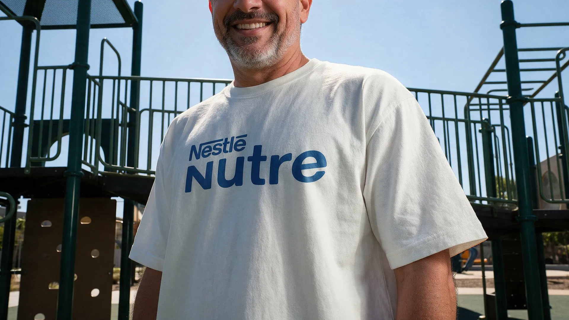
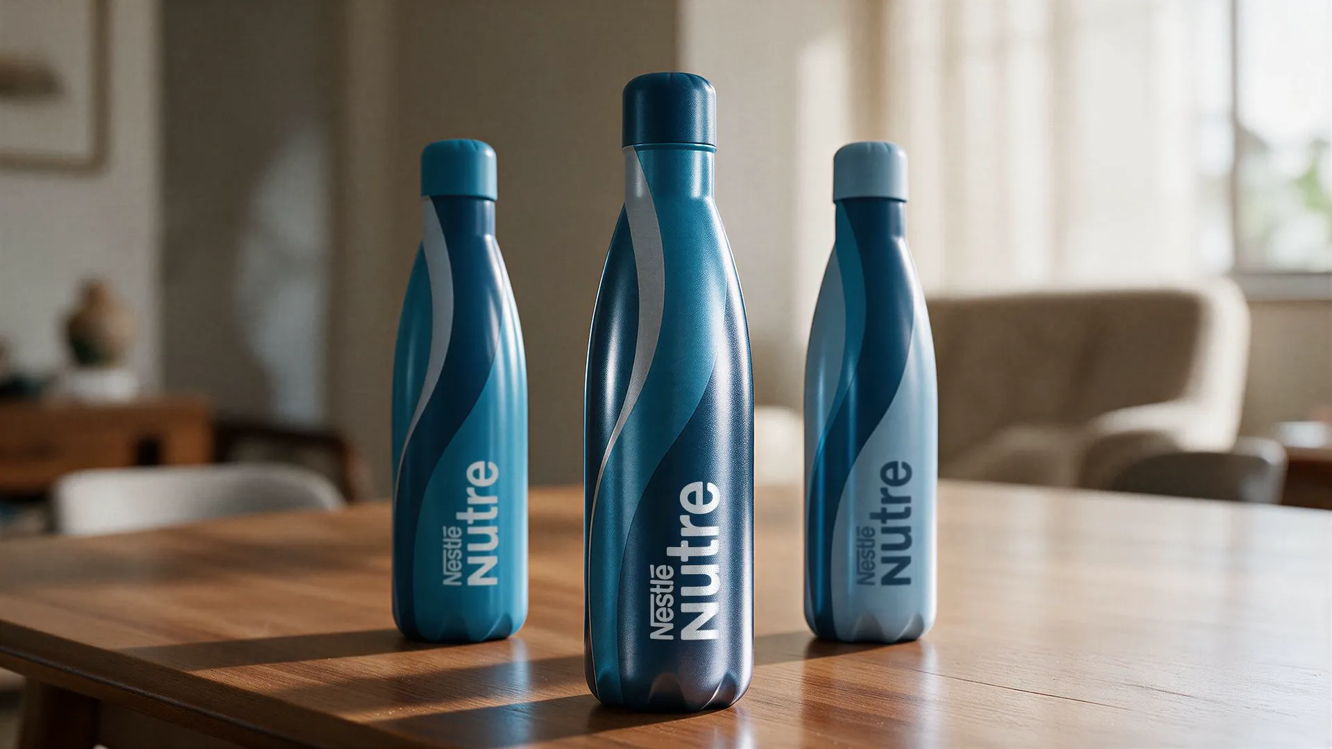
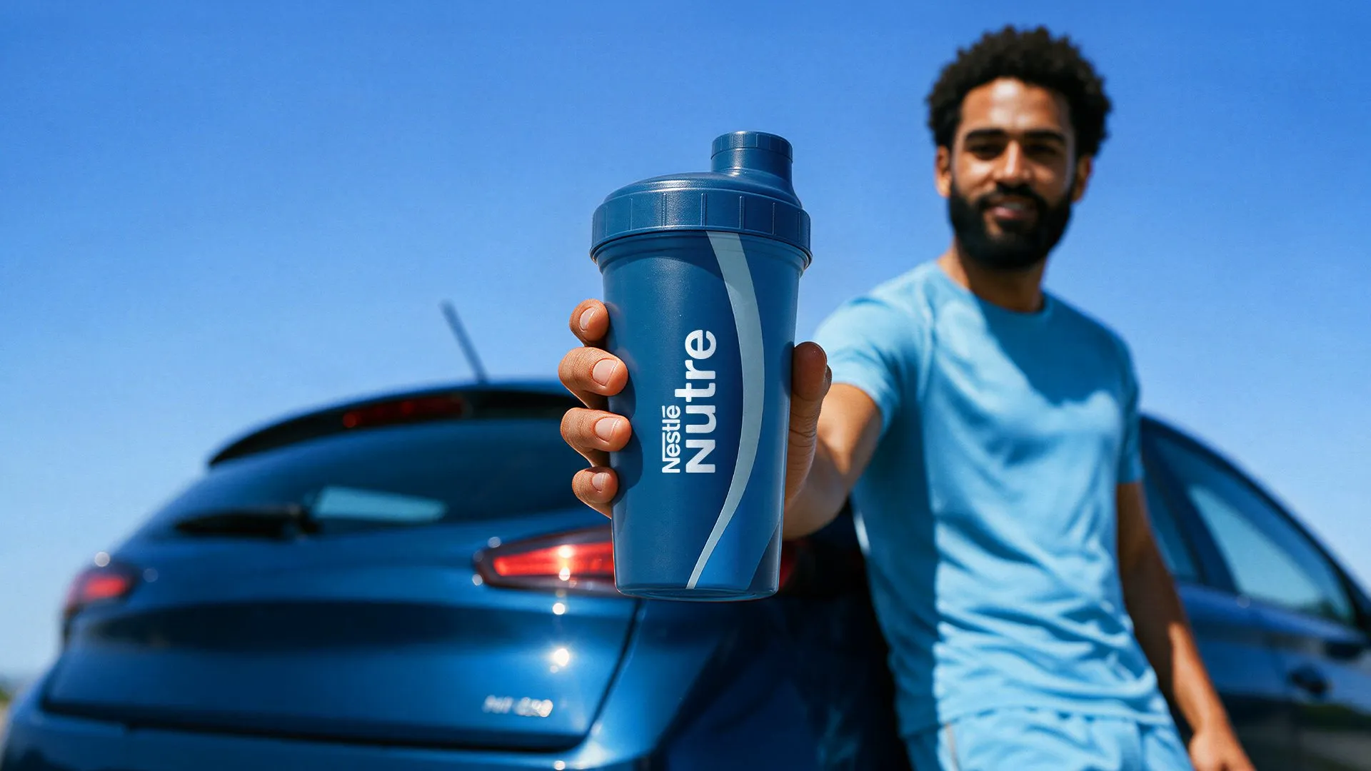
For promotional campaigns we proposed a merchandise line with a squeeze bottle, shaker cup, tote bag and T-shirts. Each item carries an endorsement line, such as + Longevidade on the shaker and Nutrição até você on one of the totes.
On the street.
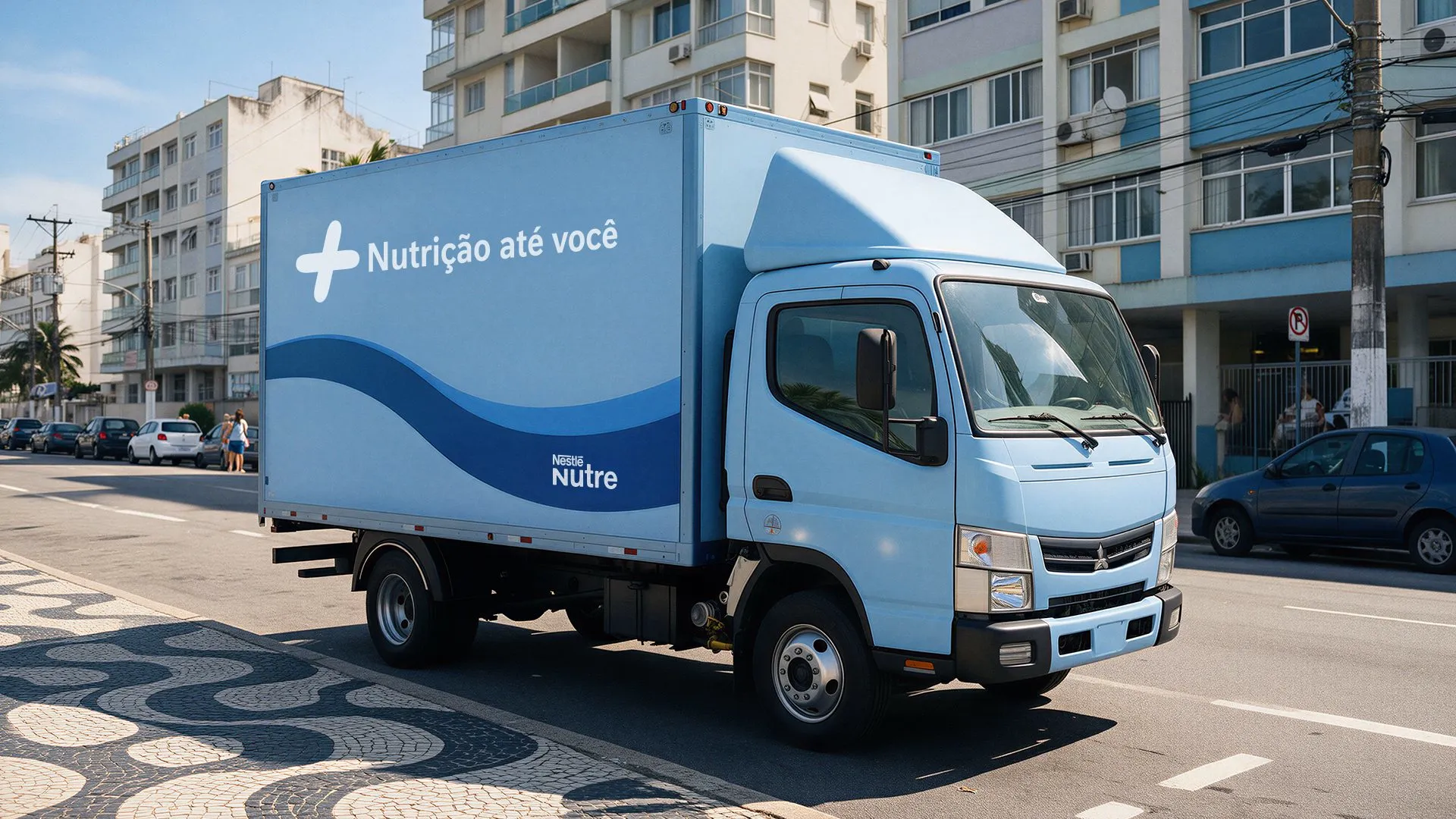
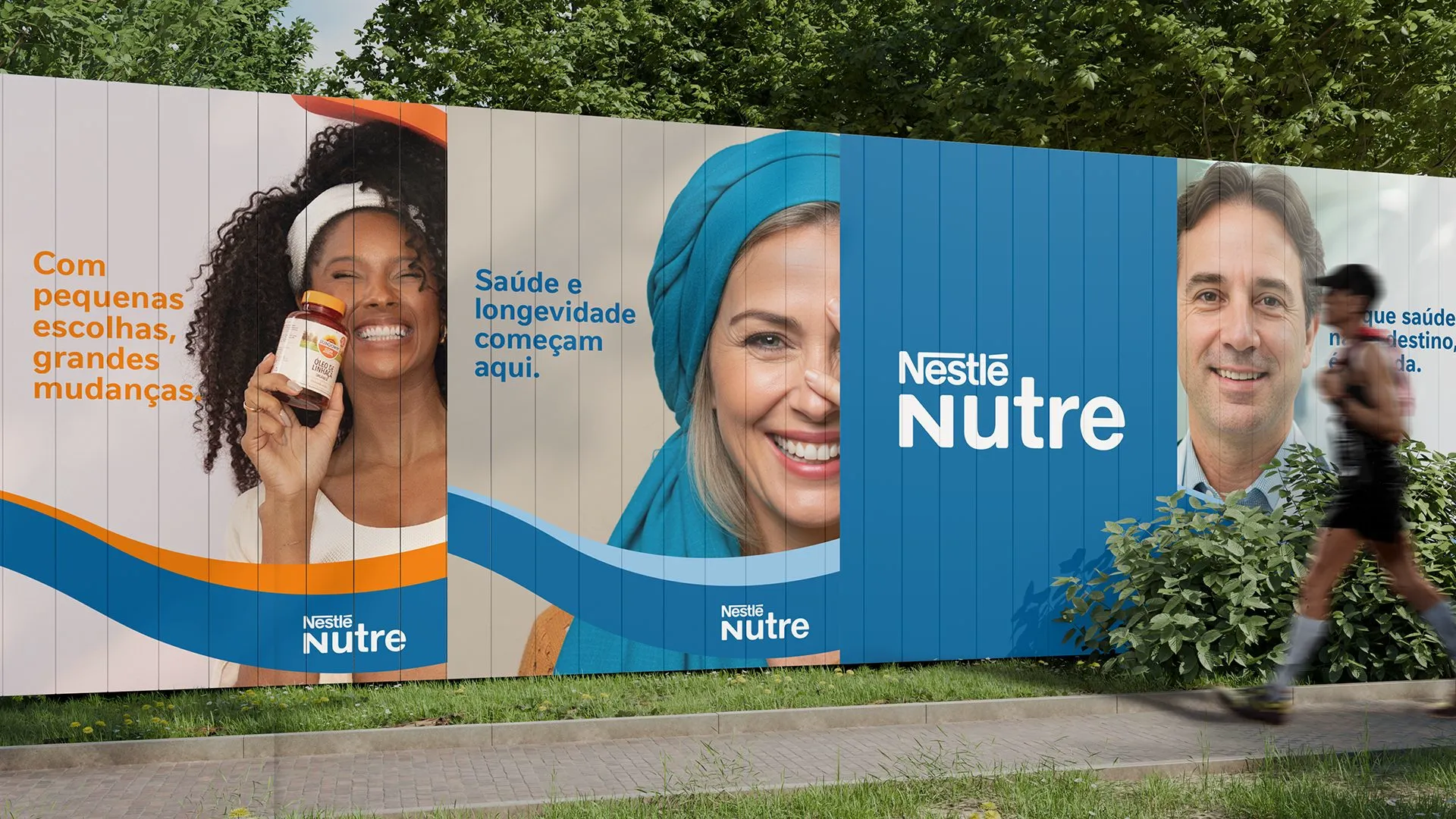
We also simulated the brand on the fleet and in out-of-home media: the delivery truck with Nutrição até você, a hoarding with three key visuals side by side and an institutional billboard. The simulations test whether the + and the ribbon stay recognizable from a distance, in formats very different from digital.
Before.
An online store with a descriptive name, Nutrição até você, that explained delivery but did not identify Nestlé. No positioning of its own and no visual system to speak at once to people who train and people in treatment.
After.
A name with Nestlé up front and a tagline. Positioning, four weighted archetypes and a golden circle. A logo with endorsement lines per audience, the N+ short version, a palette derived from Nestlé, the + and the ribbon as assets, icons, institutional and conversion key visuals, posts, website banners, shipping box and merchandise.
The + and the ribbon appear in every piece, from the app icon to the delivery truck. That keeps Nestlé Nutre recognizable even when the logo is small or out of frame.
Nutrition for healthier lives.
Start now
Accelerate your results.
Talk to our team and get a free diagnosis.