Brain | Algar Telecom
Brain: Algar Telecom’s innovation center got a brand that grows into new verticals without losing its core.
Brain
We explore the new, we create the future.
Industry
Technology · Telecommunications · Corporate innovation
What we did
Brand positioning and archetypes
Symbol refinement
Logotype redesign
Monolithic architecture for the verticals
Palette, gradients and brand typography
Key visuals and brand toolkit
AI asset generation
Social media templates
Uniform, badges, booth and merchandise
Where we started.
Brain is the Science and Technology Institute linked to Algar Telecom. It builds solutions, trains people and supports companies in IoT, 5G and cloud computing. The brand already existed and the people around it recognized it, so the work began with a constraint: move it forward without erasing what the audience already associated with Brain.
There was also a growth problem. The institute kept opening new fronts, such as Brain Solutions, and each one threatened to get a logo of its own. Without a rule, Brain would turn into a collection of look-alike brands.
The positioning.
Before touching any shape, we defined who the brand is. The ruling archetype is the Explorer: the curiosity of someone who tests a technology before it becomes market standard. Around it sit three supports. The Sage brings the knowledge the institute produces and shares. The Ruler brings the authority of a company ranked among the most innovative in Brazilian telecom. And the Everyman keeps the language grounded, so a manager with no technical background understands what they are reading.
That mix set the tone for everything that followed: confident, technical when it has to be, never cryptic.
The symbol.
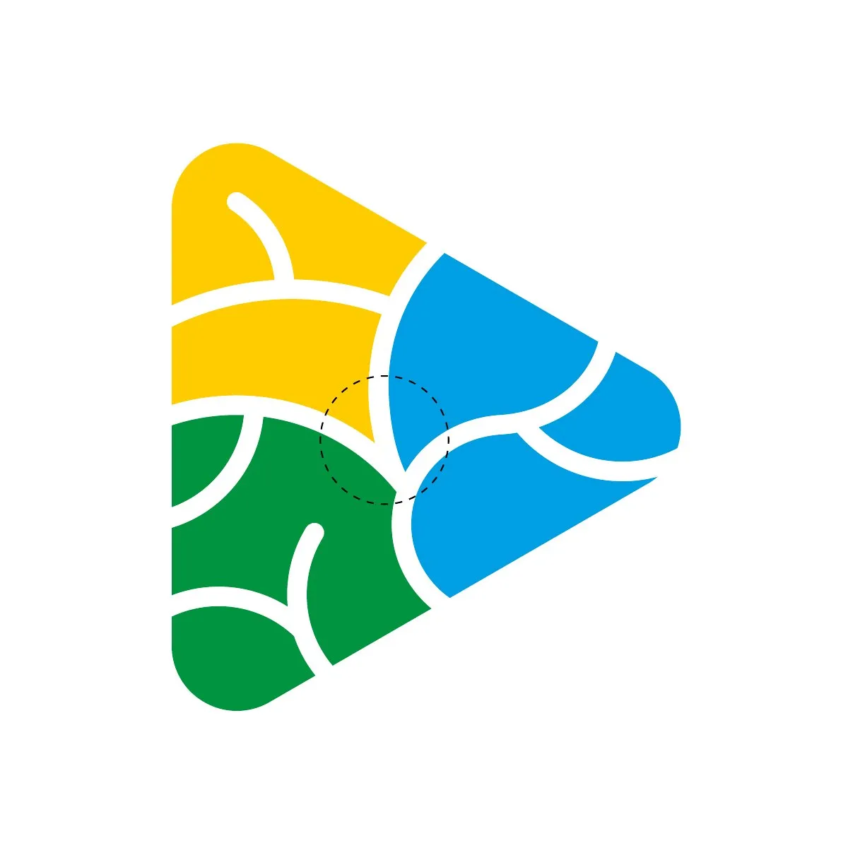
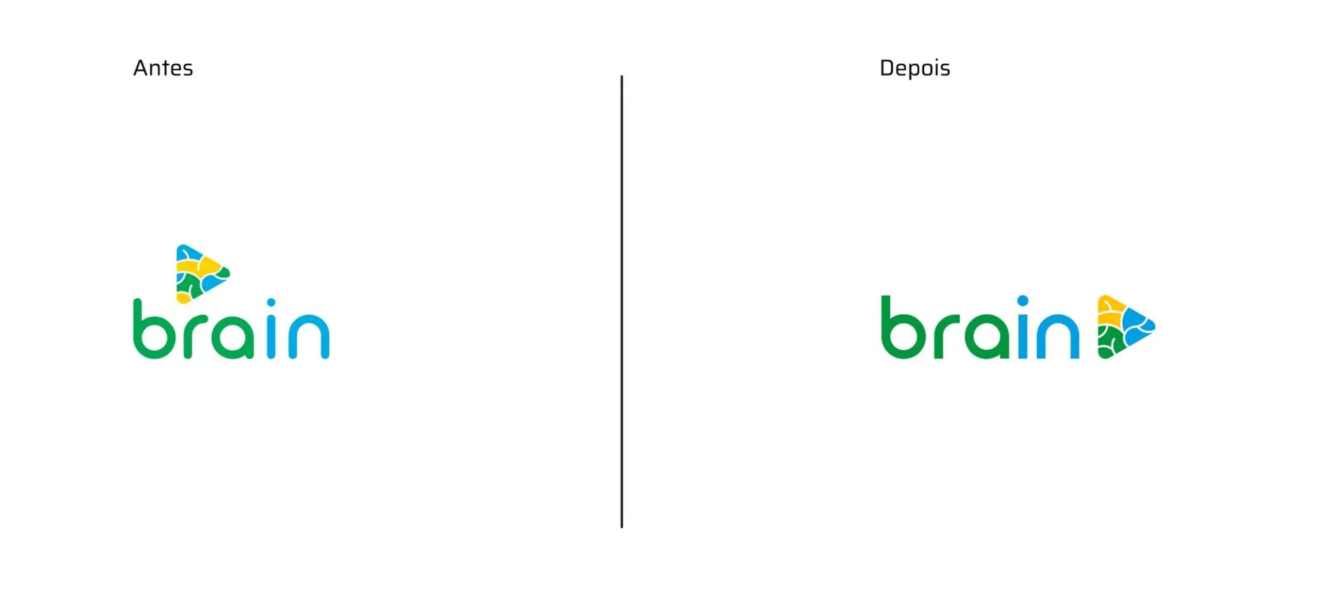
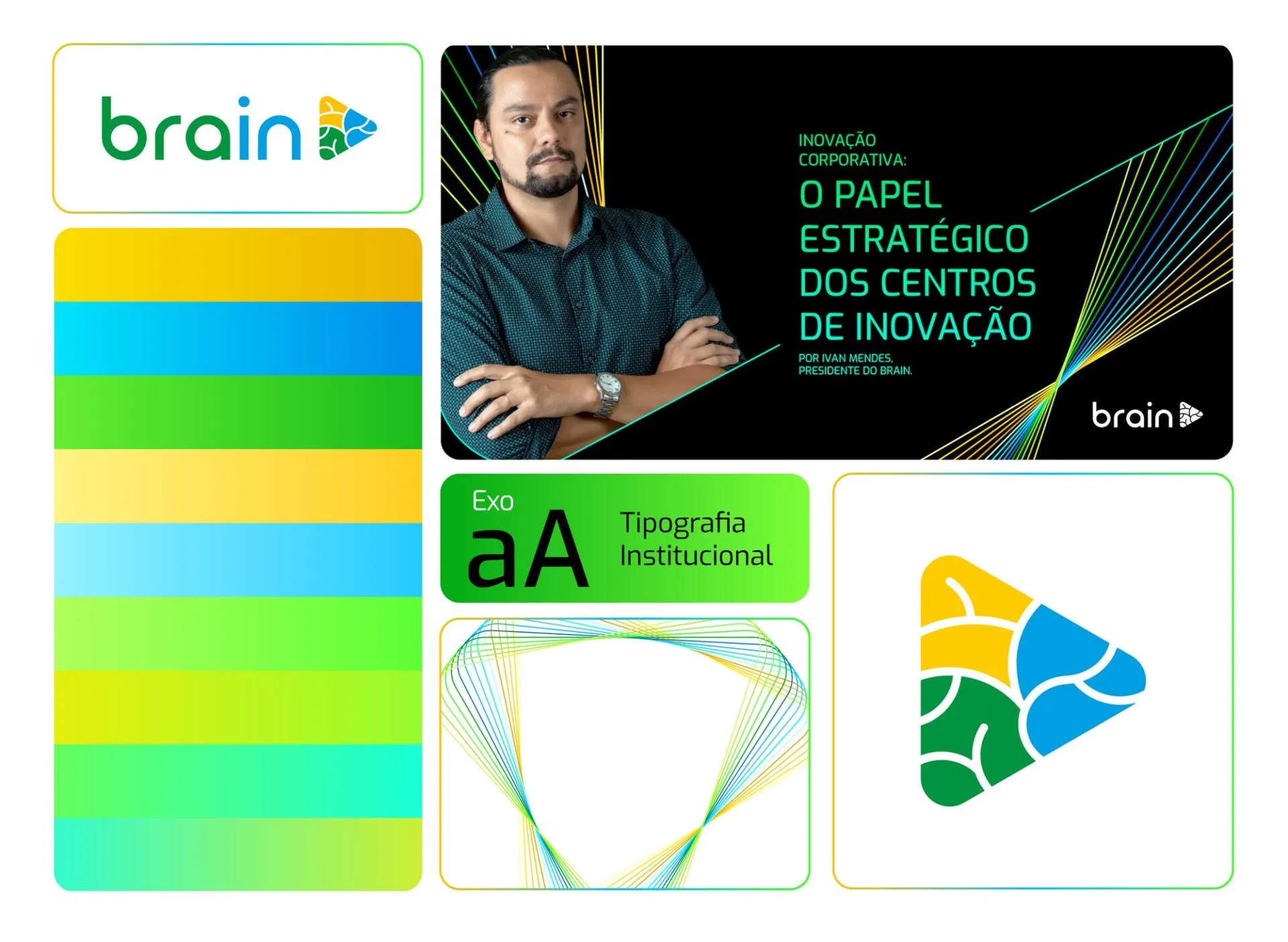
The play-shaped triangle, filled with three areas that recall the folds of a brain, stayed. We changed what was getting in the way. The cut-out at the center gained continuity and now splits the shape into three sections of equal size. The colors were organized in blocks, yellow, blue and green, each taking its own section.
The gain shows up at small sizes. With color in blocks, the details stay sharp in a 1 cm print, a social media avatar, an embroidered shirt or on a textured surface.
The logotype.
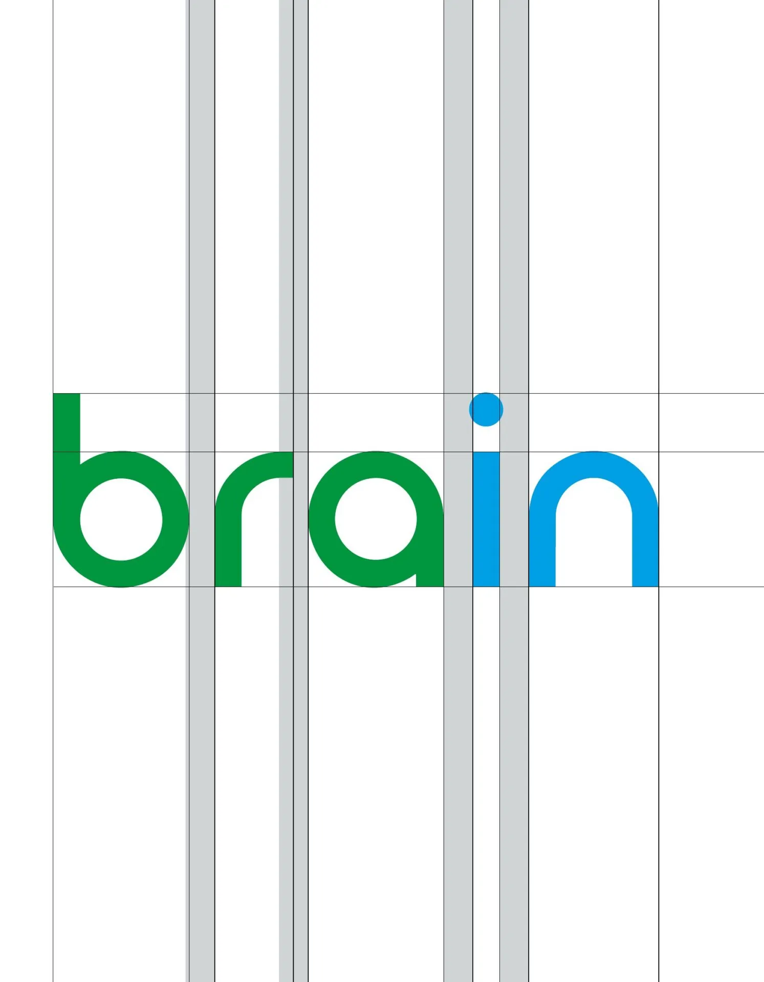
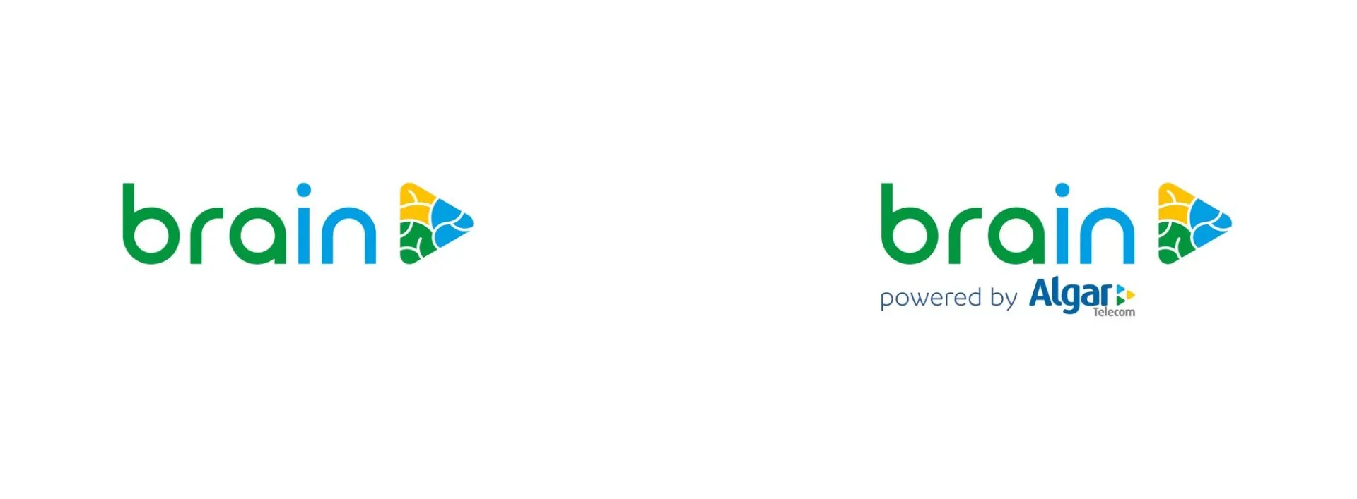
The rounded letter endings gave way to straight lines, which makes the word sturdier next to the symbol. We fixed the drawing flaws of the previous version, from kerning to the optical height of each character. The symbol, which used to sit stacked above the name, moved to its side, and the brand gained a horizontal version that fits a header, a badge and a video lower third.
The Algar Telecom endorsement moved to a supporting line below the name. The link to the group stays visible without competing with Brain. For smaller sizes the brand has three responsive versions: full from 4 cm, without the endorsement from 3 cm, and symbol only from 1 cm.
One brand, many verticals.
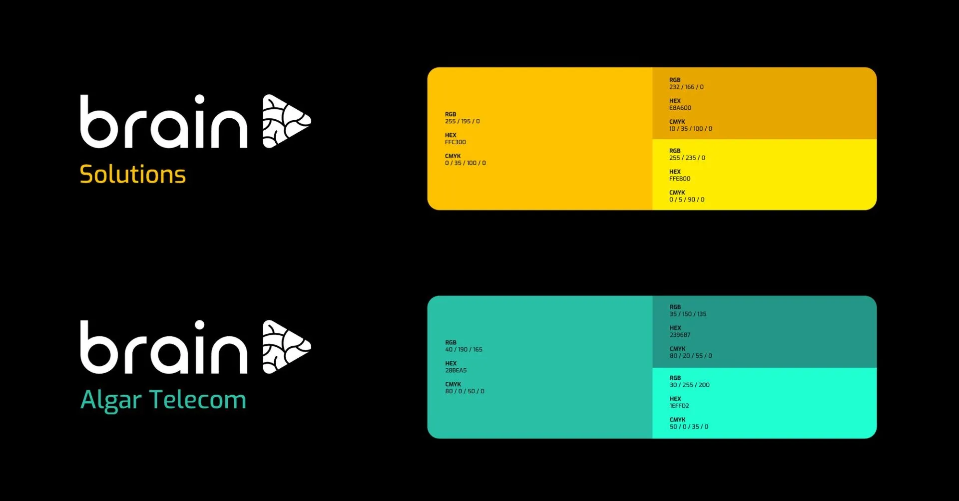
To stop every new front from spawning a separate brand, we proposed a monolithic architecture. The Brain mark always appears in its monochrome version, and the vertical’s name sits below it in Exo Medium, left-aligned, following the X spacing unit.
What sets one vertical apart from another is color. Brain Solutions takes the yellow family and Brain Algar Telecom takes teal. A new vertical is solved with a name and a palette, with no new logo.
Color and typography.
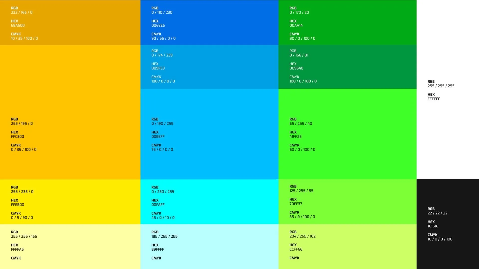
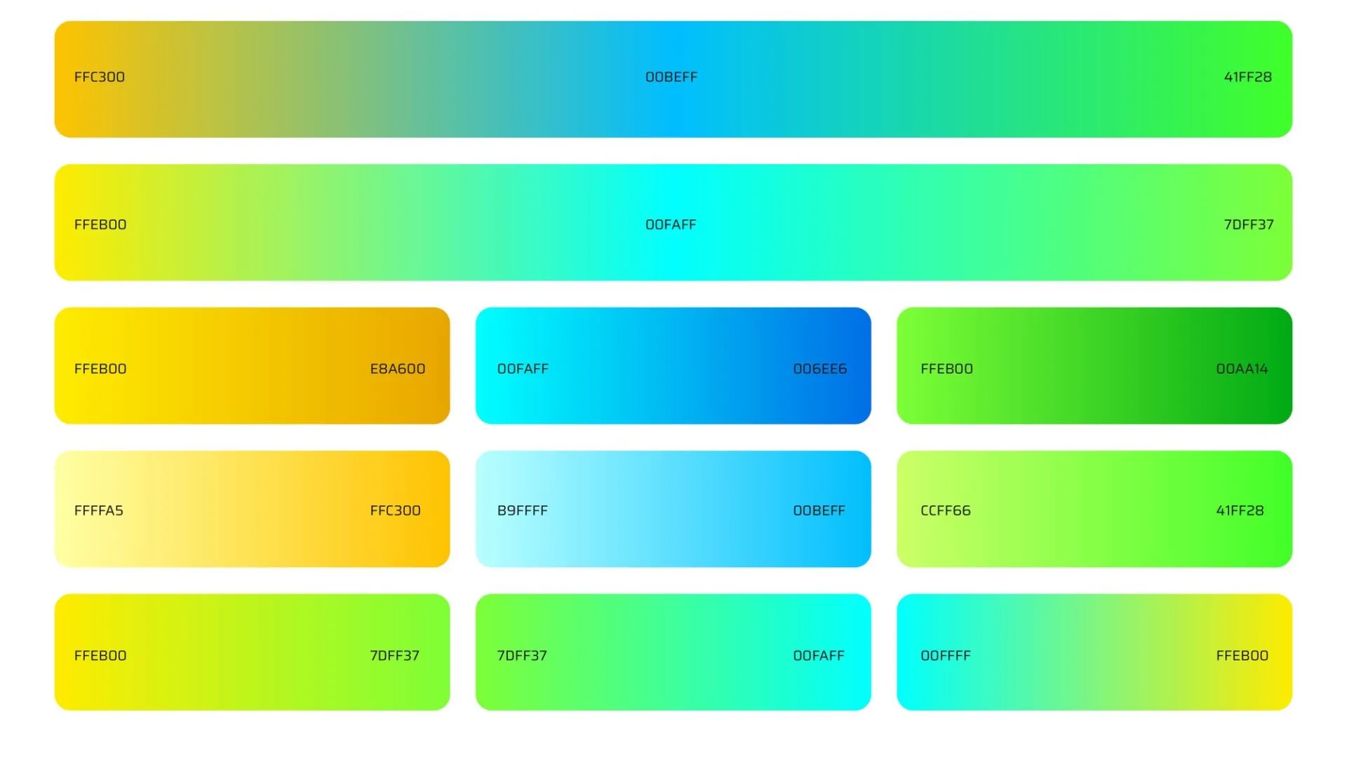
The palette starts from the three colors of the symbol and opens each one into five shades, from darkest to lightest, plus a base black (#161616) and white. Eleven gradients come out of it and bridge the families, such as the yellow that runs through blue into green.
The brand typeface is Exo, in six weights, used for headlines and brand pieces. For presentations, emails and everyday documents the choice was Segoe UI, the Windows system font, which is already installed on the computers and avoids broken files when a piece moves between machines.
The key visual.
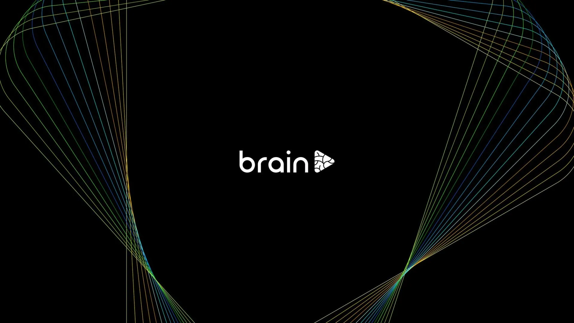
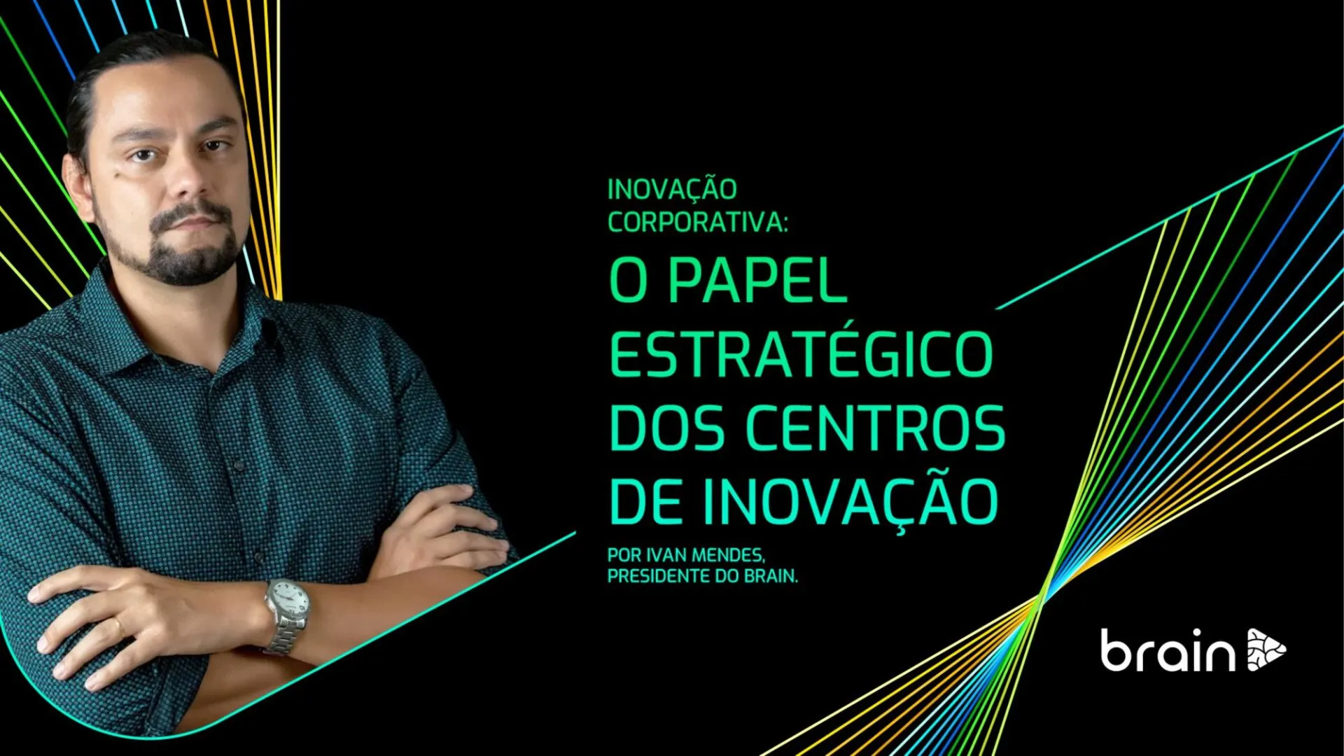
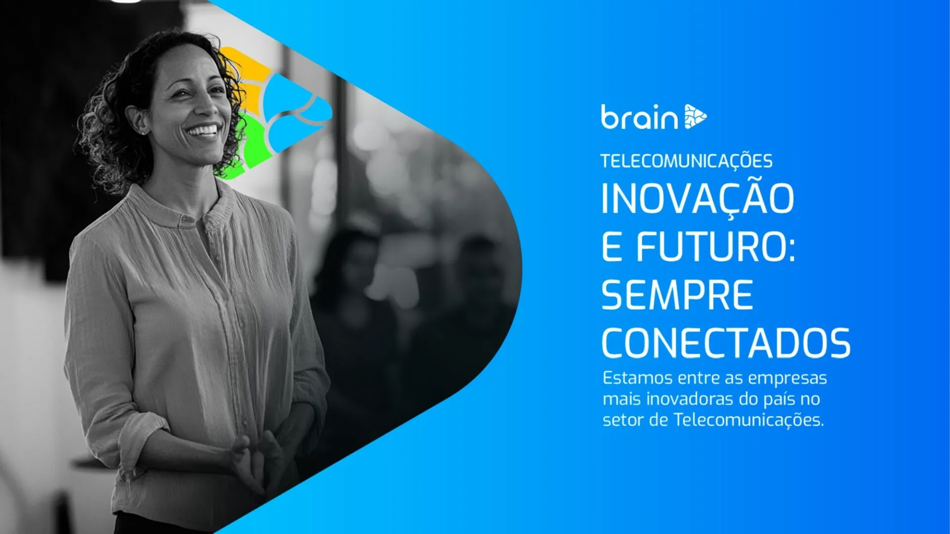
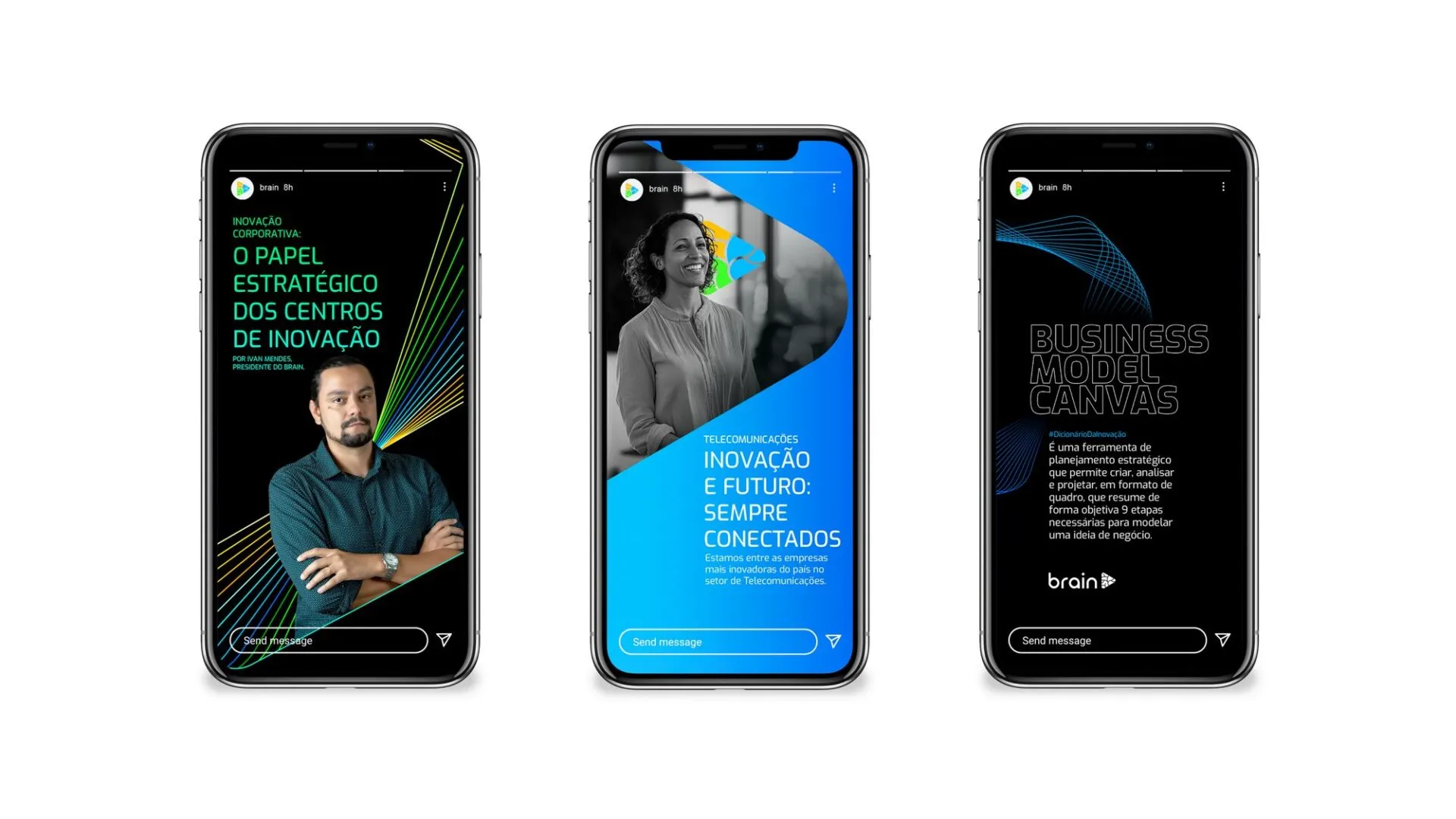
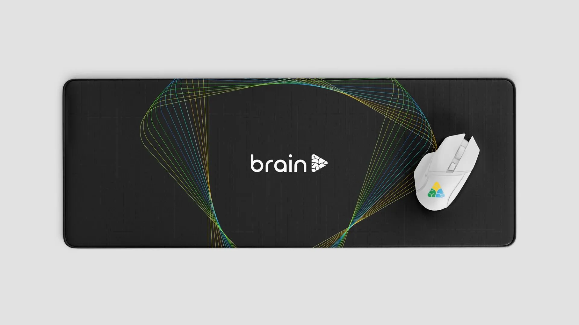
The triangle became a tool. As a mask, it crops photos of people and creates the curve that runs across the pieces. As a supporting element, it turns into a bundle of thin lines in the brand colors, shown on black, that works as a visual signature even without the logo. The system was designed in 1:1, 16:9 and 9:16 to serve feed, presentations and stories.
AI in asset production.
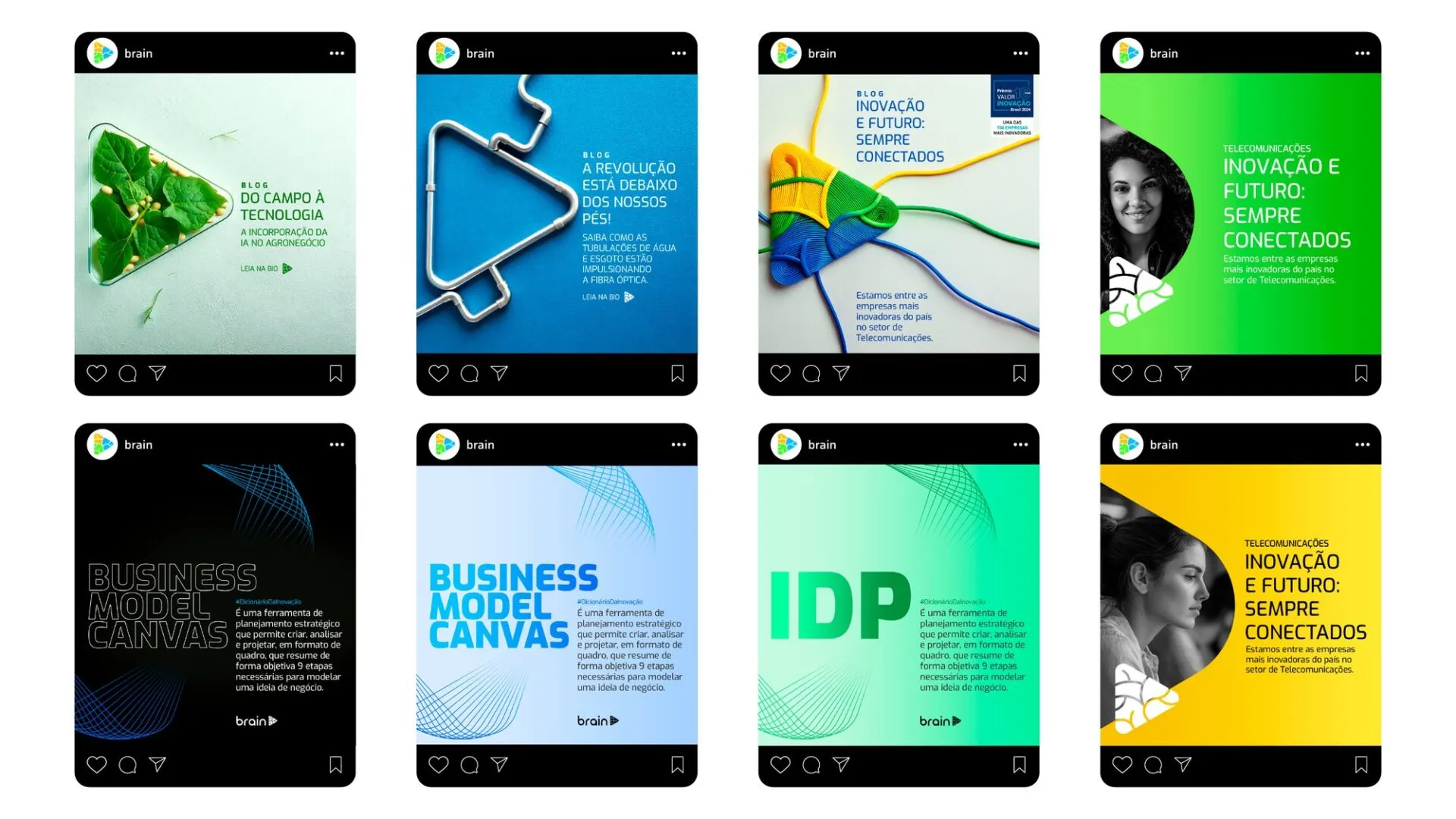
A technology institute that talks about AI had to use AI. We set up an image generation process in which the symbol goes in as the composition and a material reference goes in as the style. The output is Brain’s triangle made of network cable, circuit board, translucent glass or plastic parts, always in the three brand colors.
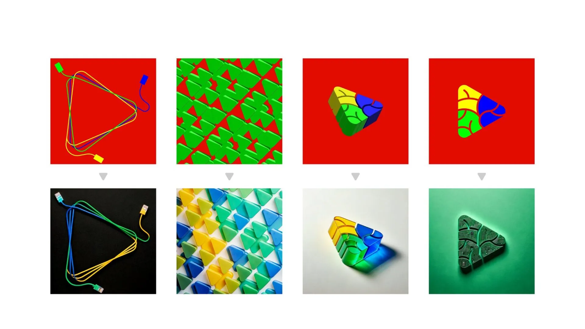
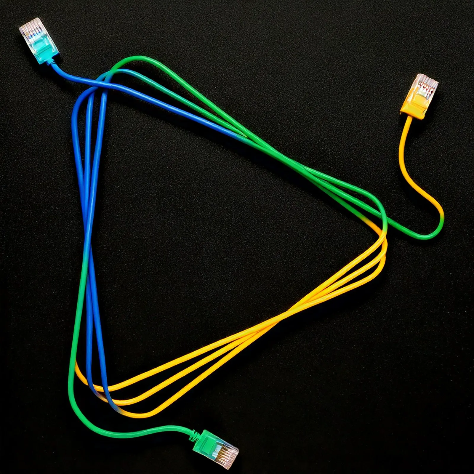
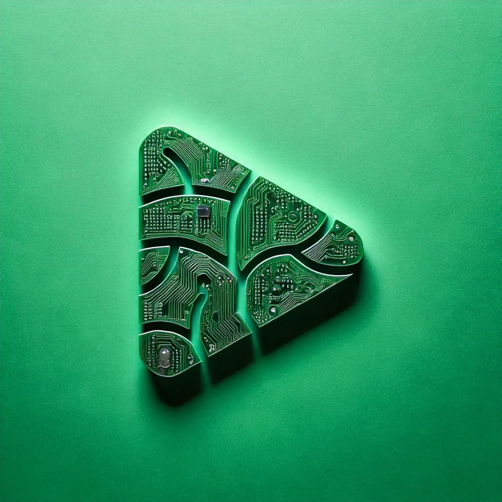
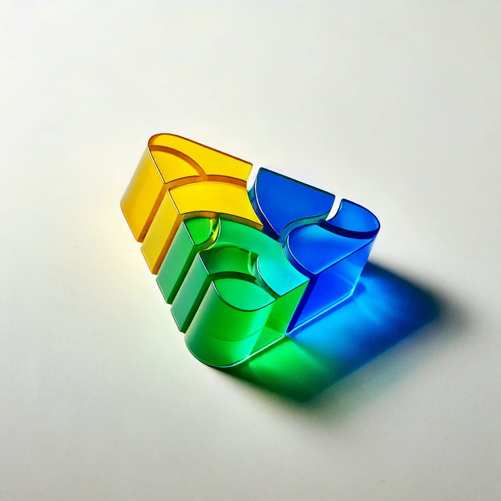
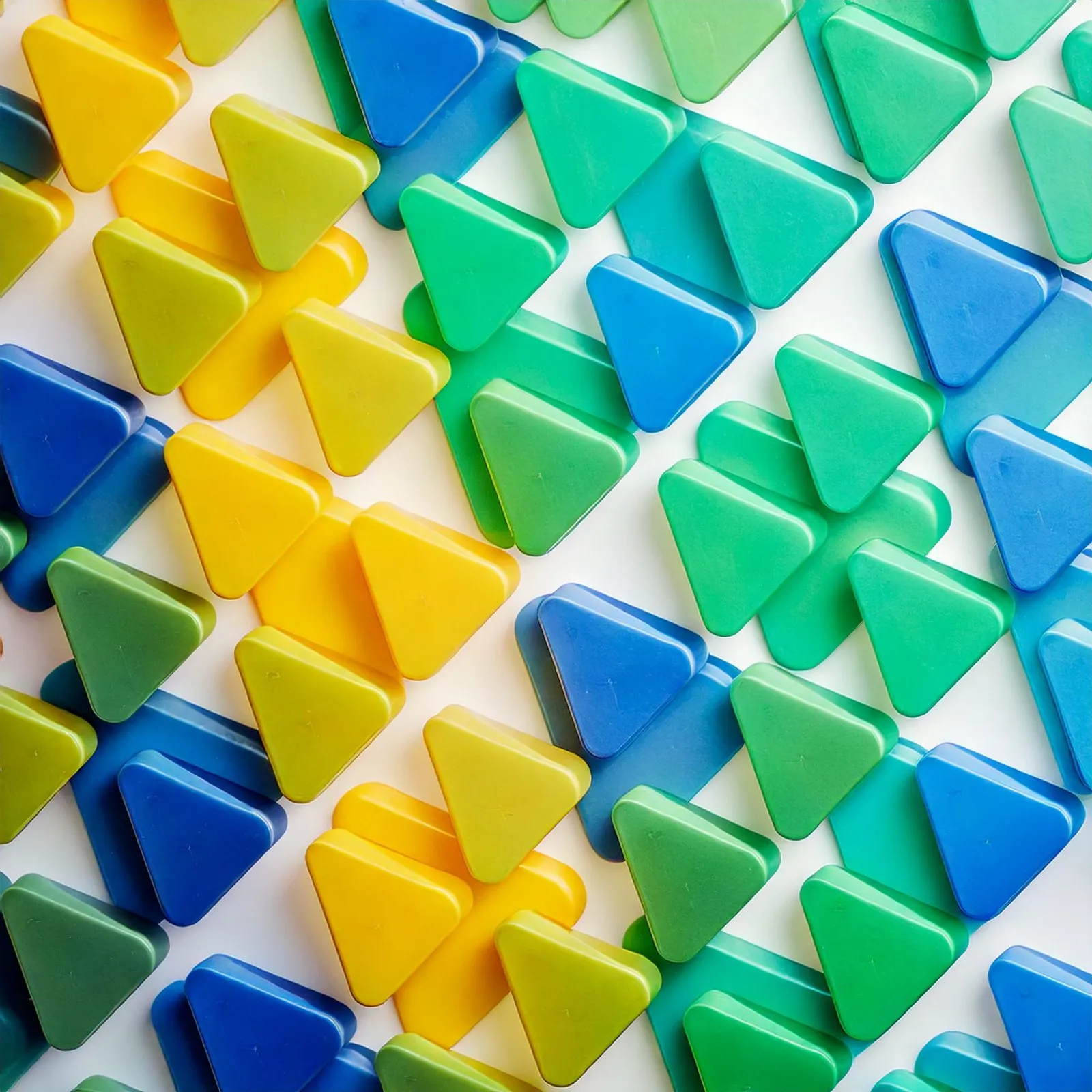
This way the team produces a fresh image for each topic, whether agribusiness, sanitation or telecom, without relying on generic stock or a photo shoot per post. Shape and colors stay locked to the guidelines. Only the material changes.
Social media.
The feed got template families with a defined job: blog teasers, the Innovation Dictionary (with entries such as Business Model Canvas and IDP), articles by the president, video talks and the year in review. Each family has its own color and structure, so followers recognize the type of content before they read the headline.

Off screen.
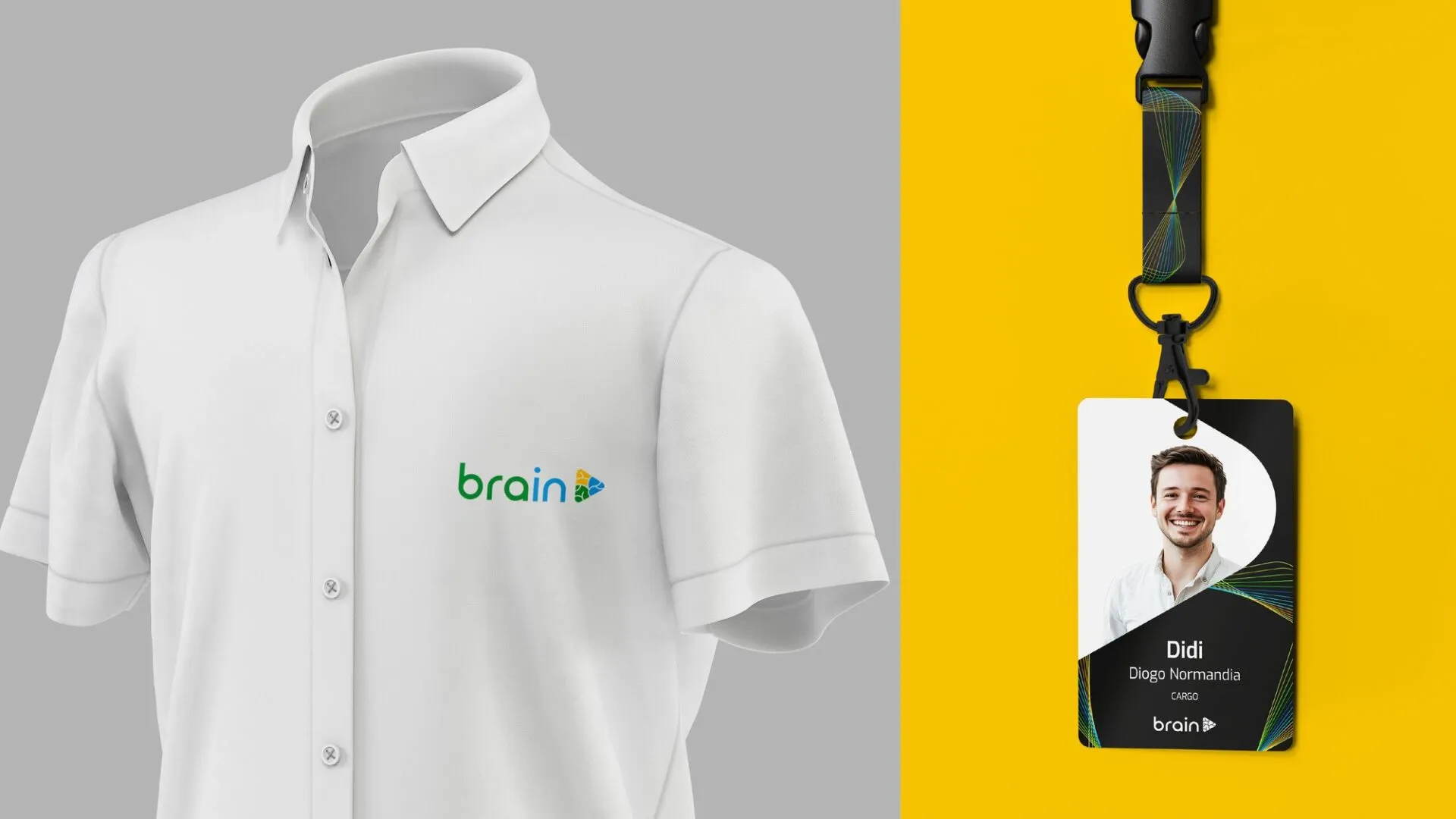
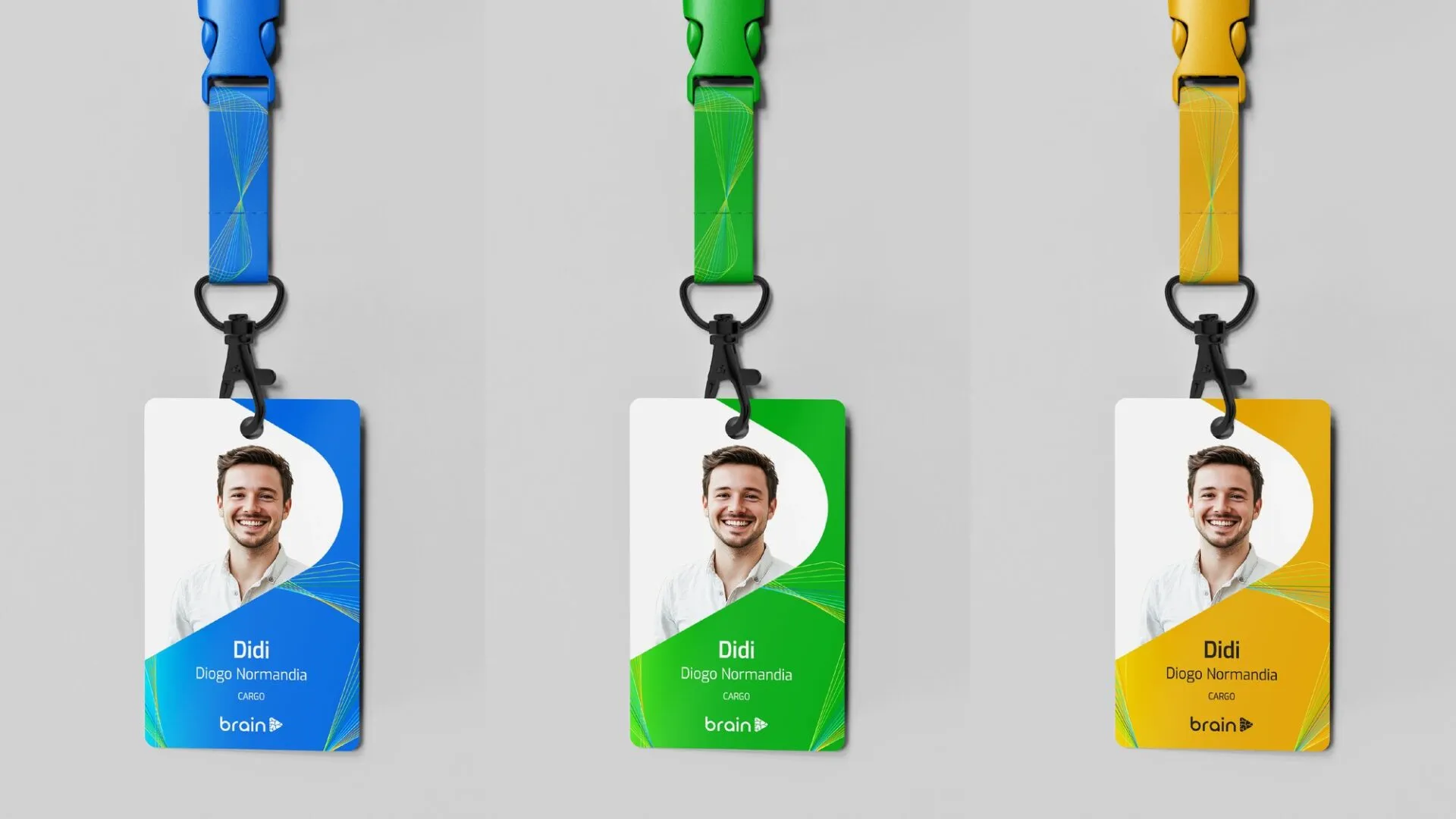
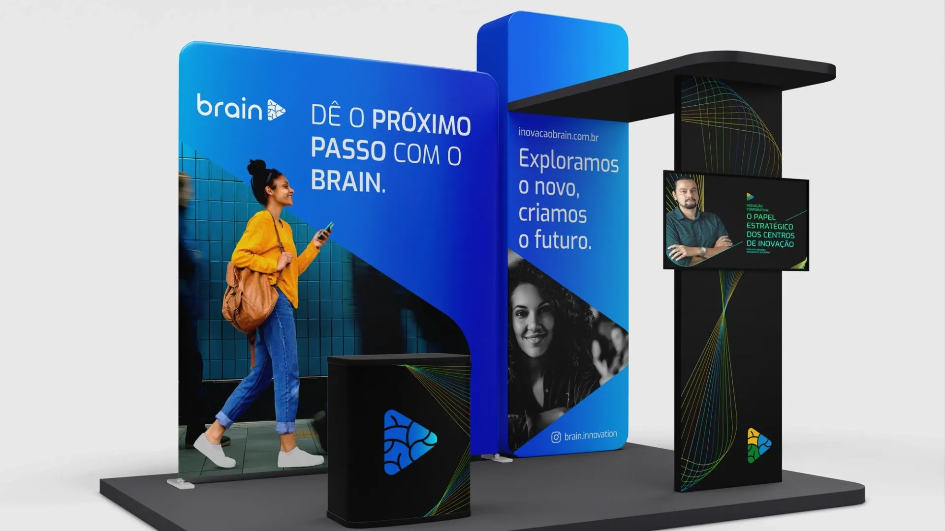
The brand also moved onto bodies and into spaces. The shirt carries the embroidered logo. The badges come in the three palette colors, with the line bundle on the lanyard. A mousepad and an event booth complete the kit, and the booth closes with the line that sums up the brand’s invitation: “Take the next step with Brain”.
Before.
A recognized brand, but with a symbol that lost definition at small sizes, rounded letter endings and a symbol stacked above the name. With no rule for verticals, each new front tended to become a brand of its own.
After.
A symbol split into three equal sections with color in blocks. A straight-lined logotype in a horizontal version with three responsive sizes. A monolithic architecture where each vertical is solved with a name and a color. A three-family palette, eleven gradients, Exo and Segoe UI. A key visual built on a mask and a line bundle, an AI image process, social templates and physical applications.
From a 1 cm avatar to a trade-show booth, Brain now has a rule for every application, and a new vertical fits into the system that already exists.
We explore the new, we create the future.
Start now
Accelerate your results.
Talk to our team and get a free diagnosis.